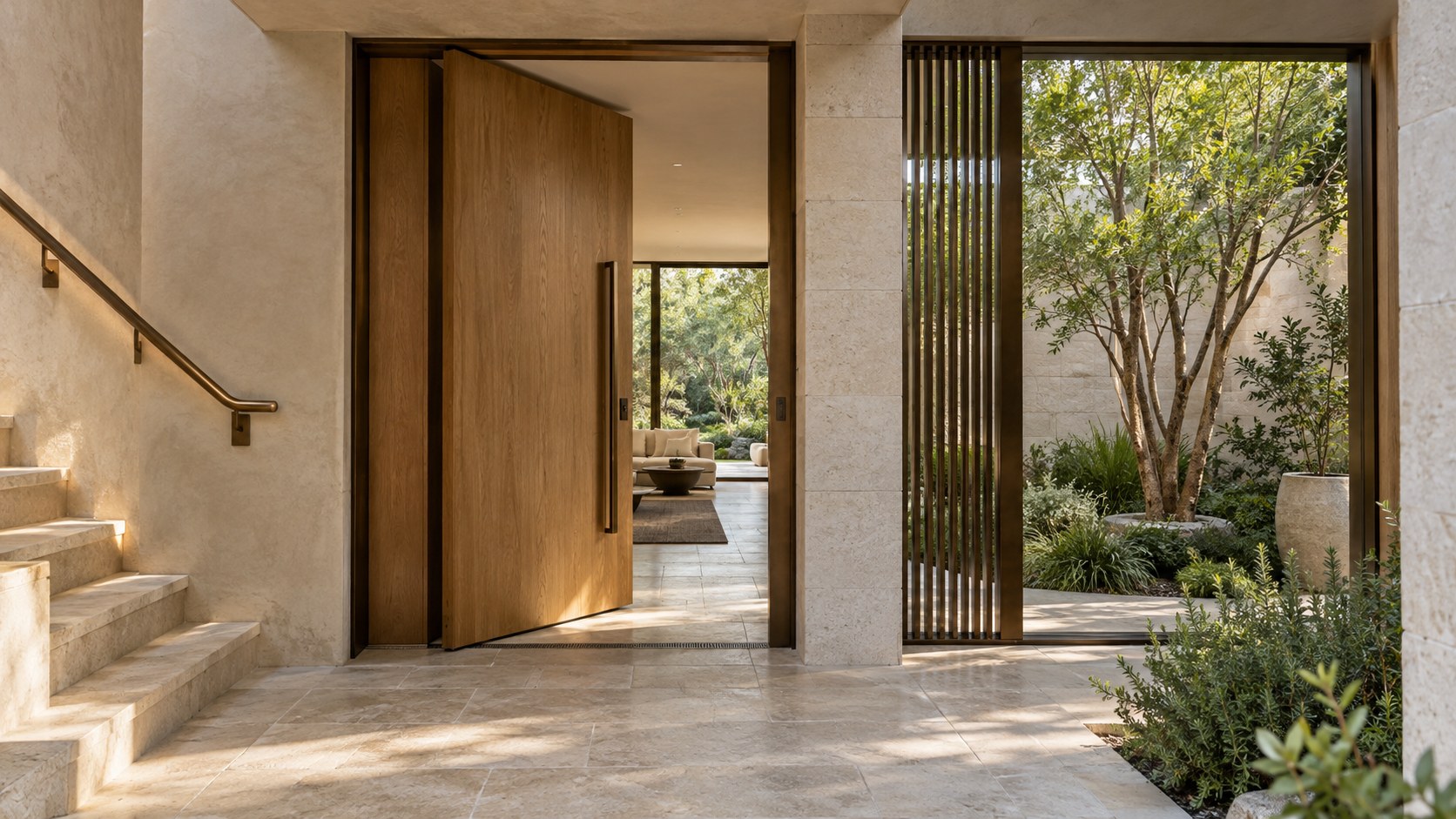
Bronze can define how a residence is entered, touched, and remembered. This essay examines door pulls, handrails, screens, and glazed openings through scale, fabrication, patina, weather exposure, material junctions, and maintenance, exploring when the metal brings lasting architectural value and when restraint makes a more convincing home.
Bronze occupies a curious position in residential architecture. It can be conspicuous enough to define the character of an entrance, yet some of its most valuable contributions are almost unnoticed: the pull that settles comfortably into a hand, the rail that makes a turn on the stair feel secure, the framed opening that holds a garden view without calling attention to itself. These are not ornaments attached after space has been organized. They are interfaces between a building and the bodies moving through it. Their proportions, finish, weathering, and connections influence whether a home feels considered in everyday use.
The attraction of bronze is frequently reduced to color. In images of contemporary interiors, a dark brown or softly golden metal can bring warmth to pale limestone, timber, and glass. But color is only one part of the material's architectural life. Touch gradually alters frequently handled surfaces; rain and exposure change exterior appearances; joints reveal how a handle is anchored or a frame accommodates its surroundings. An element that looks serenely monolithic from across a hall may be assembled from multiple pieces with quite different responsibilities. The apparent simplicity of a bronze detail therefore depends on decisions that remain largely invisible in the first photograph.
It also matters what is actually meant by bronze. Architectural descriptions sometimes use the word for solid or fabricated copper-alloy components, and sometimes for coatings or finishes merely intended to resemble that appearance. These choices do not have identical behavior, cost, repairability, or longevity. An honest conceptual residence can celebrate the character of bronze while recognizing that material identity and project-specific detailing must be established before performance is claimed. The distinction prevents a seductive visual idea from becoming a misleading promise.
This essay follows bronze through the house, from entry hardware to handrails, privacy screens, and window framing, then outward into weather. It examines how the metal meets other materials, how different parts acquire patina, and why restraint and maintenance access are part of lasting quality. The aim is not to select a product, calculate an alloy, or turn architectural design into a conservation manual. It is to understand when bronze enriches the experience of dwelling and what the architecture must provide for that enrichment to endure.
Bronze as a Material Encountered in Motion
A home is seldom experienced as one continuous image. A visitor approaches, finds the entrance, takes hold of a handle, passes through a doorway, follows a passage, and perhaps places a hand on the stair rail. Each action reveals the building at a different distance. From the street, bronze might register as a slim dark edge in a stone facade. At the door, it becomes a tangible object with weight and temperature. Along the stair, it is less an object to admire than a reassuring guide. Thinking through these successive encounters changes where the material is placed and how much of it is needed.
Scale governs the relationship. A monumental bronze sheet on a small entry might overwhelm the architecture, while a precisely sized pull could lend a modest timber door a clear point of arrival. Likewise, a fine metal strip can articulate the boundary between mineral plaster and glazed opening without requiring the entire wall to become metallic. The substance gains meaning through contrast with neighboring surfaces. Pale stone may make a dark patinated frame legible; oak can soften its presence; soft fabric nearby can prevent an entry hall from reading as a collection of hard, reflective finishes.
The idea of movement also exposes problems that static renderings conceal. A door pull needs space around its return for knuckles, and a person carrying a parcel should be able to operate it without an awkward grasp. A rail should continue naturally through a change in direction; its joints should not catch a hand. A screen that enriches the approach should not interrupt the clear walking width or create a hidden sharp corner. These are dimensional and experiential decisions before they are decorative ones. A beautiful object can become a poor architectural element if it is uncomfortable at the moment of use.
In an imagined contemporary residence, bronze can establish a recurring sequence without becoming a continuous theme. The entry pull, a restrained upper-gallery handrail, and a garden-door frame may share a family of tones and profiles while being appropriately different in construction. Their relationship can be sensed rather than announced. Such continuity helps the house feel coherent across rooms because it follows lived gestures, not a rule requiring the same metallic accent on every cupboard, lamp, and decorative object. The material has its greatest authority when a person discovers that the places it appears are precisely the places where its physical character matters.
Material Identity Beyond the Bronze-Colored Surface
The phrase architectural bronze can describe markedly different assemblies. A handle formed from a copper-based alloy is not equivalent to a painted aluminum profile finished in a bronze hue, nor is a thin decorative facing automatically interchangeable with a substantial fabricated metal piece. Each can be architecturally appropriate, but the distinction should remain legible to the designer. True material selection affects section thickness, weight, joinery, surface aging, maintenance, and the ability to renew a damaged edge. A color specified from a photograph establishes none of those qualities.
This does not mean that authenticity requires every visible bronze-toned element to be solid metal. Large glazed openings have demanding structural, thermal, and operability requirements; the most sensible solution may use a carefully designed framing system whose exposed character is bronze or bronze-like without insisting on a single material everywhere. Small interior fittings, by contrast, may justify more substantial material at the points where fingers repeatedly meet the building. The architectural question is whether the surface and the supporting assembly perform honestly together, rather than whether one prestigious material can be applied universally.
Terminology deserves similar care. Different bronze alloys and manufacturing processes can produce different colors, tolerances, strengths, and reactions to the environment. A uniformly dark sample is not a guarantee that every long profile, cast fitting, and exterior plate will weather identically. Nor is a deliberately treated patina equivalent to the natural changes produced over years of touch and exposure. A designer should identify the intended visible condition and how much variation is acceptable. It is reasonable to desire a living surface that changes; it is equally reasonable to require a controlled appearance at a frequently used public-facing door. Neither intention should be concealed behind the vague promise of permanence.
Concept images often erase manufacturing seams and surface differences to create a perfectly unified composition. A more convincing image would acknowledge slender shadow joints, separate handrail sections, credible fixings, and the thickness of surrounding walls. These features need not distract. They show where one piece ends, how it can be installed, and how it might eventually be removed for repair. Material intelligence begins when the designer moves beyond the surface color to the physical sequence that makes the visible line possible. A bronze detail can be quietly luxurious precisely because its material identity, support, and long-term behavior have been thought through rather than assumed.
The Entry Door: Weight, Reach, and First Contact
The entrance gives bronze a privileged role because it concentrates anticipation, security, weather protection, and daily handling in a small area. A bronze pull may be the first element a visitor touches, but the surrounding door, frame, and reveal determine whether that interaction feels natural. A deeply recessed entry creates shelter and a clear place to pause; a handle set at a sensible reach can be located in the thicker part of the door leaf rather than perched unconvincingly on a fragile edge. Good architecture brings the human body, hardware, threshold, and exterior wall into one coherent composition.
The proportion of the pull should follow the door rather than theatrical ambition. An enormous vertical bar can create a striking photograph, yet it may be visually unbalanced or tiring to operate if its size is unrelated to the leaf's movement and weight. A smaller shaped pull, well placed and comfortable to grip, can offer greater refinement. Its tactile profile matters: softly eased contact edges, a credible distance from the door surface, and an uninterrupted grasp all affect its quality. The surface may become brighter at habitual touch points, making the passage of occupants subtly visible over time. That change can be a welcome aspect of the design if anticipated.
Entry hardware also has less romantic obligations. Locking components, hinges, closers, seals, and accessible service access belong to the same door assembly even when they are not intended as focal points. A bronze escutcheon or pull must coexist with those mechanisms and with the door's movement at the threshold. Rain can reach the exposed edge; wet hands can contact the metal; cleaning practices may affect nearby stone or timber. A protected entry canopy and thoughtful drainage reduce the strain on both the metal and surrounding materials. Surface choice cannot rescue a doorway whose weather logic is unresolved.
A persuasive conceptual image might show a natural oak entrance leaf within a substantial pale-stone wall, a dark bronze pull catching a quiet side light, and a narrow glazed panel establishing an oblique garden view. The effect would arise from placement, depth, and light rather than from an oversized decorative gesture. Inside, the same handle would remain satisfying during ordinary arrivals with groceries, luggage, or a child in tow. That is the measure of a successful threshold detail: it retains its dignity in use, not simply in the first view from the driveway.
Handrails: Architecture at the Scale of the Hand
A handrail makes a clear argument for bronze as more than a visual finish. It is touched while the body is moving, sometimes without conscious attention. Its profile must invite a secure and comfortable grasp, and its position must make sense in relation to the stair, landing, and adjacent wall. A beautifully dark metal strip might look elegant in elevation yet be too broad or too sharp to hold comfortably. Conversely, a rail whose curvature and continuity feel right can give an otherwise simple stair exceptional material presence. Its value is measured in repeated contact.
The handrail should be considered together with the balustrade and structural support, even if their visible languages differ. Bronze might form the graspable top while slender posts, glass infill, or other components perform separate duties. A continuous visual ribbon can be assembled from practical segments with concealed or deliberately expressed joints, but the hand must meet a smooth transition where pieces connect. At a stair turn, awkward mitering can expose the difference between a line composed on paper and an element that has been tested through motion. The route should feel coherent from the first tread through the landing and onward.
Touch can modify patina unevenly. The central upper surface of a rail may become polished by regular use while its underside retains a darker tone; an infrequently used gallery rail may age differently from the principal stair. This variation need not be treated as failure. It offers an intimate record of occupancy, provided that changes in appearance do not indicate unresolved deterioration or produce surfaces unpleasant to touch. The designer can make this distinction through expectations set early, appropriate detailing, and a maintenance approach that does not demand impossible uniformity across every portion of the building.
There is also an important question of visual weight. A dark bronze rail against pale limestone can trace a stair without competing with the stone treads. A warmer metal against oak may create a subtler boundary, especially under daylight rather than strong theatrical lighting. In a restrained stair hall, the handrail can become the one carefully considered line uniting different levels. It does not need a sweeping spiral or a suspended spectacle to deserve attention. The most convincing staircase treats the rail as a dependable route for the hand, aligned with a dependable route for the feet, with material craft making that reliability feel graceful.
Screens and Filters: Privacy with Material Depth
Bronze screens can mediate between openness and privacy without requiring a room to become sealed. A series of narrow vertical members beside an entry might interrupt a direct view into the living area while allowing borrowed light and a sense of further space. On a terrace, a more substantial perforated or slatted screen can give a sheltered seating position some visual separation from a neighbor or path. The pattern should emerge from the view and enclosure desired rather than from an arbitrary decorative motif. Material depth, spacing, and the angle of approach determine whether the screen is genuinely useful.
As a spatial element, the screen is rarely effective when treated as an infinitely thin graphic plane. Real members occupy depth, cast shadows, need attachment to a floor or frame, and may move or sound under wind. Their spacing influences how much one can see through at different distances and oblique angles. A pattern appearing private when viewed head-on may be surprisingly transparent from a side passage. The architect should test the experience from seated and standing positions, inside and outside, both by day and when the illuminated interior is more visible at night. The resulting geometry can produce privacy without extinguishing connection to landscape.
Bronze brings a particular character to these filters because light collects differently along edges and recessed faces. A softly patinated surface can emphasize thickness and joinery, while a brighter finish may catch more attention than the intended view. Exterior exposure adds rain marks and potential variation between protected and wet faces. Some bronze-like finishes may offer a visually consistent alternative when broad uniformity is essential, but then the behavior and repair strategy differ. A concept should not imply that every screen will weather into one perfect, evenly colored field irrespective of its exposure.
Screen placement must also respect circulation and care. A lower support should not interrupt a step-free garden route, and planting should not be squeezed into an unmaintainable slot between closely spaced members. Hinged or removable sections may be helpful where glazing behind a screen requires cleaning. Solid support walls, base joints, and drainage provisions can be quietly integrated into the composition. In a well-designed home, bronze screens feel less like decorative panels hung in front of the building and more like the building's ability to reveal or withhold views. Their quality lies in how they edit the experience of space across changing light, movement, and time.
Framed Openings: Bronze Between Interior and Landscape
A framed opening is a place where architecture must reconcile outward vision with structural and environmental boundaries. Bronze can give that boundary a strong but restrained visual identity. A dark patinated mullion against a pale courtyard may read as a fine line that organizes the view, while a warmer frame inside an oak-lined passage can make the transition toward glass feel more tactile. Yet no frame is simply a line. Its head, sill, jambs, seals, supporting structure, and interface with glazing occupy real physical depth. An editorial image becomes more persuasive when those layers are believable.
The framing rhythm should be developed from the room's occupied positions. A seated person looking toward a tree might need a clear central pane rather than an uninterrupted parade of narrow divisions. The door that opens to a terrace should align with a practical circulation route, not with the center of the photographer's composition at the cost of function. Bronze elements may provide sightline definition or hand contact, but the complete assembly must still accommodate movement, drainage, temperature differences, and eventual glass replacement. Material expression and envelope performance are not opposing concerns; they are designed together.
Coastal humidity, garden irrigation, wind-driven rain, and strong sunlight can make the exterior face behave quite differently from the interior one. Drips collecting beneath profiles may affect adjacent limestone; sheltered upper corners can develop a different appearance from exposed sills. These effects suggest careful geometry, cleanable surfaces, and appropriate paths for water rather than an expectation that patina will be uniformly picturesque. A slim exterior frame cannot be assumed to perform satisfactorily merely because bronze itself is associated with endurance. The entire glazing system and its details need project-specific verification.
At an internal courtyard, a shallow bronze-framed window could provide a deliberately composed view into a garden, preserving enough solid wall for a seat or storage beside it. The frame would offer a precise meeting between mineral plaster, glazing, and the outdoor world. That is often more architecturally rewarding than glazing every available wall. Bronze then becomes a tool for calibrating the threshold: sufficiently present to mark the edge, sufficiently restrained to let the garden remain the principal subject. Its success depends not on the area of metal used but on the clarity of the aperture it helps create.
Casting, Fabrication, and the Visible Logic of Assembly
Bronze architectural elements are often judged by the smoothness of the final surface, but fabrication decisions shape their spatial possibilities long before the finish is applied. A small handle, a long rail, and a broad screen cannot automatically share the same construction method. Their scale, required tolerances, support, and installation sequence differ. Casting may be appropriate for a shaped fitting, while assembled profiles or plates can create a more disciplined framework. A convincing design takes these distinctions seriously instead of asking every component to appear as one seamless, mysteriously formed piece of metal.
The shape of a fitting can reveal its making without becoming ostentatious. A cast pull might have gentle changes in section that invite the hand to locate a comfortable grasp. A fabricated screen might show an orderly rhythm of members separated by precise gaps. Both can be luxurious, but not through identical kinds of perfection. The cast object offers local shaping and subtle variation; the fabricated assembly offers alignment and repeated discipline. A design that suppresses every joint and tolerance risks losing the evidence of how the component can be anchored, leveled, repaired, or replaced.
Long elements present a special challenge because the building surrounding them also moves and varies. Wall planes are not abstract, perfectly flat surfaces; timber expands and contracts; masonry and stone are installed with joints; the stair itself has structural relationships that may influence its finishes. A continuous bronze handrail or screen should accommodate installation in manageable pieces while preserving a calm visible line. Carefully positioned transitions at landings or structural bays may look more convincing than a promise of uninterrupted length. Good joint location can turn a necessary assembly break into a subtle architectural rhythm.
Fabrication also affects the order of construction. An entry pull may be installed late and adjusted independently, while a window frame can depend on the surrounding wall's completed dimensions. A broad exterior screen may need fixings planned before the stone base or timber soffit is finished. If these relationships are discovered only during installation, visible patches and awkward brackets can compromise the intended refinement. Conceptual planning should therefore reserve believable connection zones and allow tolerances rather than depicting every component fused effortlessly into its neighbor. The finest metalwork often appears simple because complexity has been resolved behind a carefully chosen boundary.
Where Bronze Meets Stone, Timber, Plaster, and Glass
The edges of a material often reveal more about a building than its broad surfaces. Bronze is particularly effective at making these moments visible because its color and texture contrast with common residential materials. A narrow bronze frame set into pale limestone can sharpen an opening; a handrail against oak can establish a measured tactile difference; a slender metal edge beside mineral plaster can mark a junction without requiring ornate trim. None of these relationships is simply a palette choice. Each material has its own dimensional behavior, fixing needs, and tolerances, and the junction must allow the assembly to work.
Against stone, the decision concerns depth and staining as much as color. A bronze plate flush with limestone may look beautifully precise, but the stone needs adequate bearing and a thoughtful edge detail. Water running from an exposed metal surface can leave marks on adjoining porous finishes. The architectural response may involve drips, setbacks, or intentional breaks in the plane, not an attempt to hide every gap. A well-designed joint lets the eye understand the relationship while protecting the materials from avoidable damage. It also leaves the assembly serviceable should a fitting need attention.
Timber offers another set of choices. Its grain and warmth make an appealing counterpart to a patinated metal handle, yet wood can move in response to changes in surrounding conditions. Rigidly tying a broad metal face to a timber panel without considering that movement can create future stress or visible distortion. Discreet fasteners, appropriate clearances, and well-positioned backing help the elements coexist. A bronze pull should feel integral to the door without making the door dependent on a mechanically implausible connection. The same principle applies to bronze accents along built-in cabinetry: the joinery must remain repairable and functional when the finish begins to show use.
Glass and plaster demand still different transitions. Glazing frames must coordinate seals, anchorage, and water management, while plaster returns need clean termination details that tolerate reasonable building movement and future refinishing. A bronze edge can make the boundary legible without disguising the wall's real thickness. In an entry hall, for example, a deep plaster reveal might surround a small dark-framed sidelight, while a timber door carries a simple bronze pull. The composition feels rich because each material has a distinct task, not because all of them have been mixed on every surface. A restrained junction is an act of architectural clarity: it connects materials while allowing each to remain what it is.
Interior Patina: The Quiet Record of Occupation
Patina is often described as though it were a single decorative finish that can be specified once and held constant forever. In a residence, the more interesting condition is the difference between surfaces that are frequently touched and surfaces that remain relatively undisturbed. A door pull may brighten at its most comfortable grip. The upper face of a stair rail might develop a smoother sheen than its underside. A decorative bronze screen located beyond reach may preserve a more uniform appearance. These variations are neither automatically defects nor automatically virtues; they are evidence of where human activity meets material.
The designer can anticipate this pattern by considering the frequency and manner of contact. A family entrance operates repeatedly, in warm and cold weather, with dry and wet hands. An occasionally used guest-room pull may change more slowly. A bronze edge protecting an exposed cabinet corner may experience bumps and abrasion that a recessed wall frame does not. These are reasons to be specific about what degree of aging contributes to the desired character. A surface meant to appear pristine and uniform indefinitely may be poorly matched to an object constantly handled by many people. Conversely, a deliberately living patina should not excuse a fitting whose surface becomes uncomfortable or whose operation deteriorates.
Lighting complicates the interpretation. Under a broad window, gentle daylight can reveal subtle marks along a rail as the hand approaches. Under a tight spotlight, the same variation may become exaggerated and visually noisy. A finish selected from a small, evenly illuminated sample may behave differently along a long horizontal surface or at the corner of a door. Material selection should therefore be considered at the scale of the actual detail, using believable changes in daylight and occupation. Uniformity on the day of installation tells little about the experience after years of use.
Cleaning and touch should be compatible rather than adversarial. Excessively aggressive polishing may remove the very character that was intended to develop; neglect may leave deposits that are not part of a desirable aging process. The suitable care regime depends on the actual alloy, finish, surface treatment, and location, so a conceptual essay cannot prescribe one universal routine. The architectural point is to decide whether the design welcomes gradual visual change and to communicate that expectation honestly. A home can hold both types of surface: an interior rail whose brightened contact line is an intimate record of everyday life, and a more controlled feature whose appearance requires deliberate upkeep. The enduring quality is not perfect sameness but a thoughtful relationship between use and visible time.
Exterior Exposure: Rain, Shelter, and Uneven Weathering
Bronze at the exterior lives in a more complex environment than bronze in a sheltered interior. Rain reaches some faces while a deep canopy protects others; wind may carry moisture toward edges that appear recessed; runoff can concentrate beneath a projecting member. The surrounding air and the orientation of the surface contribute to its long-term appearance. A door pull outside a generous roof overhang is not exposed in the same way as a screen at an open terrace edge. Any promise that both will achieve an identical patina after a fixed period mistakes the variety of architectural conditions for a decorative recipe.
Shelter is therefore part of the material strategy. A well-proportioned entry recess can keep frequently handled hardware more comfortable and reduce direct wetting, while a metal screen deliberately placed outdoors may be allowed to age more visibly. The stone or plaster around either component needs its own protection. Bronze-associated staining, water trails, and deposits are not automatically attractive simply because the metal develops a pleasing color. Surfaces below exposed elements may require careful drainage paths or separation details. The design should make the movement of water legible rather than relying on the prestige of a durable material to compensate for poor geometry.
The shape of the component influences wetting. Horizontal surfaces can hold water, while projecting edges may channel drips toward the wall. Closely spaced screen members can trap debris or make cleaning awkward. A handrail that continues from inside to outside crosses not only a visual boundary but also a change in exposure and potentially a change in thermal conditions. Its assembly may need distinct detailing on the two sides. These are not reasons to avoid bronze outdoors. They show how an architect can use the material with respect for the actual climate and the surrounding envelope.
A garden terrace offers a useful conceptual comparison. A dark bronze-framed door beneath an oak canopy may retain a relatively stable appearance, while a nearby open-air balustrade displays more varied weathering. The relationship can feel coherent without either element being forced into identical treatment. Under a soft overcast sky, surface distinctions would read quietly against stone paving and planting; after rain, moisture would reveal the importance of sill details, drainage, and accessible cleaning. Such a scene is more believable than an exterior metal composition rendered perpetually dry and spotless.
Weathering should be understood across the life of the building, not merely as a picturesque final state. Installation, first exposure, intermediate change, and later maintenance all affect what occupants see. In places where consistent appearance is essential, a carefully controlled finish or different material strategy may be the wiser choice. Where variation is welcomed, the architect can design the supports, runoff routes, and neighboring surfaces to accommodate it gracefully. The quality of bronze outdoors comes from its partnership with shelter and detail, not from immunity to the environment.
Light, Reflection, and the Changing Perception of Metal
Bronze can appear almost black in subdued light and unexpectedly luminous when a grazing beam catches its edge. This responsiveness makes it useful in architectural compositions, but it also means that material color should never be judged independently of illumination. A dark rail beside a pale stair may be clear in daylight yet recede under warm evening lighting. A polished handle might become visually prominent only when someone approaches it. A broad metallic screen can sparkle excessively if each member catches a direct spotlight. Light should reveal the function and shape of the element without turning every touch point into a theatrical display.
The quality of the surrounding materials changes the effect. Against matte plaster, bronze may give a fine, legible outline. Near richly grained oak, a warm bronze tone can become quieter and more integrated. Beside polished stone or large panes of glass, reflections may multiply the visual emphasis beyond what the designer intended. An entrance with too many glowing metallic accents can become visually fragmented, despite the quality of each individual fitting. The stronger approach is to establish a few moments where bronze catches attention, leaving other surfaces subdued so the eye can understand the geometry of the room.
Artificial light deserves particular restraint. A concealed wall wash may reveal a textured bronze screen at night, yet its position should avoid glare from the usual approach. A shaded source near a reading chair can illuminate a handrail or cabinet pull incidentally rather than needing a dedicated fixture for each feature. Exterior lighting should make steps, handles, and thresholds visible while preserving a sense of darkness in adjacent planting. Metal surfaces can reflect small bright sources strongly; a fitting that appears elegant in a static image may distract when encountered from multiple positions. Lighting design should therefore be tested through actual movement.
Daylight introduces a slower rhythm of change. Morning side light might reveal the uneven sheen of a rail; a cloudy afternoon could make its patina read as a nearly uniform dark line; sunset may warm its color against cool stone. This variation can enrich the experience of a home without requiring the architecture to change physically. But successful response to light should not be confused with a claim of consistent finish or perfect color stability. A conceptual photograph captures one condition among many.
The most persuasive use of bronze invites noticing without demanding attention. A visitor remembers the comfortable door pull, the gentle gleam along a stair turn, or the precise edge of a garden frame because these qualities coincide with meaningful moments in the building. Light supports those moments. It does not need to transform the entire home into a catalogue of metallic highlights.
A Hierarchy of Use: Where Bronze Earns Its Cost
Residential architecture has many opportunities to introduce expensive or visually distinctive material, but opportunity does not establish architectural value. Bronze can be more rewarding when concentrated at a handful of physically important points than when spread indiscriminately across walls, ceilings, cabinetry, and decorative objects. The question is where its weight, touch, aging, or precision will be experienced. A stair rail encountered several times a day may justify greater care than a large ornamental plate high above eye level. An entry pull can have disproportionate experiential value because it concentrates the ritual of arrival into one small contact surface.
A useful material hierarchy begins with primary interfaces: doors, rails, and framed openings. Secondary details can follow where they reinforce the same architectural language. The relative quiet of adjacent elements is part of the design; without restraint, the privileged details lose their significance. Bronze need not be a visible brand of luxury stamped throughout the home. Its scarcity can clarify the transition between spaces and distinguish places where movement changes, hands reach, or views are framed. This approach also makes future replacement and care less burdensome.
Cost should be understood beyond the purchase of material. Fabrication complexity, special fixing arrangements, finishing processes, maintenance expectations, and access for repair can influence whether an element is appropriate. A long custom-made screen may consume resources that could instead support better glazing, shelter, or comfortable circulation. A large bronze-clad door may demand complicated coordination while delivering little improvement over a well-designed timber door with a carefully shaped fitting. Architectural judgment includes the capacity to reject an impressive detail when it does not improve the room.
Restraint is especially valuable in conceptual luxury imagery, where the temptation to intensify each surface can produce an interior that is expensive-looking but difficult to inhabit. A calm limestone hall with one dark rail and a warm door handle may feel more assured than a room of continuous reflective metal. The surrounding building gives the bronze object its setting and significance. A planted courtyard can soften the view beyond a frame; a plaster wall can make the thin line of a screen perceptible; tactile oak can contrast with the cool firmness of metal at a door.
The resulting hierarchy is not austerity. It is an investment in the details whose contribution survives novelty. Bronze earns its place when removing it would materially diminish the route, threshold, or experience of touch. Where its absence would make little difference, a simpler or more maintainable alternative deserves consideration. Luxury is strengthened by discrimination: the willingness to make a few connections exceptionally well rather than many connections conspicuously.
Maintenance, Replacement, and the Right to Inspect
An architectural detail is not durable merely because its visible surface seems robust. Its fixings can loosen, neighboring finishes can suffer from water or wear, and the building may require adjustments over its life. Bronze handrails, pulls, screens, and frames need inspection routes appropriate to their function and exposure. The most refined design anticipates that fact without surrounding every fitting with conspicuous access panels. A small removable cover or a planned fixing zone may preserve an otherwise uninterrupted line while making essential work possible.
Maintenance begins with knowing what is installed. A bronze alloy, a coated bronze-colored surface, and a specially treated finish may require different responses to cleaning and damage. Residents should not be led to believe that any dark metal can be scrubbed, polished, or treated in the same way. The relevant manufacturer's or specialist's guidance belongs to the actual project, but the architectural design can make ordinary care straightforward: accessible surfaces, no impossible dust-catching cavities, and clear separation between metal and sensitive adjoining materials. Detail design can reduce the frequency and difficulty of intervention without pretending to eliminate it.
Replacement is equally important. A door handle should be removable without destroying the finished timber leaf; a screen should not trap the only route to clean glazing; a rail fixing should remain reachable without dismantling a complete stair wall. Long members assembled with intelligible joints can allow localized work where a supposedly seamless object would require wholesale removal. This does not mean every component needs to be visibly modular. It means the design should have an answer to the practical question of how an element comes apart. That answer often improves the clarity of the original assembly.
Exterior details should allow inspection of runoff paths and adjoining stone. Planting can soften the base of a metal screen, but dense foliage pressed against its fixings may create an inaccessible wet zone. A terrace rail placed immediately over a complicated waterproofed edge may require careful coordination so that later attention to the rail does not compromise the enclosure. Similar concerns arise indoors where fittings pass through timber or plaster; hidden damage is harder to address when every surface has been designed as permanently untouchable.
The most lasting refinement is an equilibrium between visual calm and practical stewardship. A bronze pull can acquire an attractive touch pattern while remaining mechanically sound. A patinated external screen can change color while its support and water routes remain inspectable. A glazing frame can retain its disciplined proportions while permitting necessary service. Such outcomes are not guaranteed by an evocative image or by the material name. They depend on the provision of actual access, reasonable joints, and a household's ability to care for the architecture without sacrificing it.
Longevity as a Relationship Between Material and Home
An enduring material does not make a room timeless on its own. Architectural longevity emerges when proportions, use, enclosure, and maintainable detail remain sensible as habits and surfaces change. Bronze can contribute because it belongs comfortably to both modest tactile fittings and larger architectural boundaries, but its use should be adaptable to the real life of the residence. A carefully placed rail may remain useful through changes in furniture and decoration; a coherent garden-frame rhythm may continue to structure a view even as plants mature. These elements carry significance because they are tied to the building's spatial logic.
Adaptation becomes harder when the metal is treated as a decorative skin covering every assembly. A room whose identity depends on a continuous series of special panels may resist future access, alteration, or repair. A room whose bronze is concentrated in discrete, well-supported elements can change around them. Furniture can be replaced, a wall can receive new art, a sheltered terrace can develop new planting, and the underlying architectural details remain. Their patina can become an asset rather than a reason for comprehensive refurbishment, provided the material and its expected changes were honestly understood from the outset.
Time can also reveal mistakes in the original hierarchy. An elaborate feature that looks exciting during commissioning may later demand tedious maintenance while rarely being touched or appreciated. A simple handrail may prove indispensable precisely because it is used without thought. The lesson is not that decorative pleasure has no place in residential design. It is that the most durable pleasure is often attached to an action, an orientation, or a material transition that continues to matter. A bronze threshold element is likely to remain meaningful if it helps explain where one environment ends and another begins.
Imagined architectural interiors offer an opportunity to explore such relationships without pretending that every technical question has already been answered. A conceptual image may show the desired contrast of dark bronze, pale stone, oak, and garden foliage; the architectural evaluation then asks how those elements would be fixed, touched, exposed, cleaned, and replaced. That scrutiny enriches rather than diminishes the creative idea. It separates an attractive color composition from a credible proposal for living with material across decades.
Bronze is therefore best understood as a participant in domestic continuity. It records some touches, resists or responds to exposure according to its actual assembly, and sharpens moments of transition within the plan. Its most lasting contribution is neither shine nor darkness, nor even patina considered in isolation. It is the ability to connect the sensory experience of a home with details that remain useful and intelligible as the home itself evolves.
The architectural value of bronze becomes clearest when it is followed through ordinary movements. At the entrance it offers a deliberate point of contact; on the stair it guides the hand; at a screen it adjusts privacy; around a garden opening it gives definition to the meeting of wall and glass. Each role calls for a different scale and assembly. None is adequately described by color alone.
Patina gives those elements a relationship with time, but time does not act uniformly. Interior touch, rain, shelter, cleaning, and neighboring materials produce varied changes. An enduring design welcomes appropriate variation while making damage, water management, and maintenance concerns legible and manageable. It allows the bronze to be itself without expecting the material name to guarantee performance. Joints, supports, and access may be visually quiet, but they are central to the credibility of the work.
In a conceptual luxury residence, bronze can sit beside limestone, timber, mineral plaster, and glass without overwhelming the architecture. A few well-chosen details will often be more powerful than an exhaustive metallic theme. Their contribution is felt when a door opens naturally, a stair is comfortable to navigate, or a framed view has exactly the right degree of enclosure. The most persuasive longevity is not an untouched finish preserved for photography. It is an architecture that remains satisfying to see, sound to maintain, and rewarding to touch after the initial impression has passed.
AI disclosure: This Architecture Journal essay explores architectural and design principles through conceptual and AI-generated inspiration. It does not claim a real-world client, architect, address, or built project.