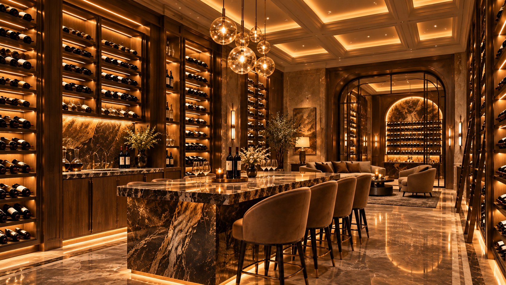
A luxury wine cellar can become far more than storage when proportion, lighting, material depth, bottle display, and tasting space are composed as one architectural experience. This AI-generated concept offers a useful framework for thinking about intimacy, ceremony, symmetry, and atmosphere without treating the room as a conventional basement utility.
A wine cellar can be one of the most atmospheric rooms in a luxury residence because its function already carries a strong sense of ritual. Bottle storage, selection, tasting, conversation, and collecting all invite a slower pace than the circulation-driven spaces of everyday life. The AI-generated concept shown here takes that idea seriously. Rather than treating the cellar as a hidden service room lined with racks, it imagines a tall, symmetrical interior in which storage becomes part of the architecture and the tasting area becomes a destination in its own right.
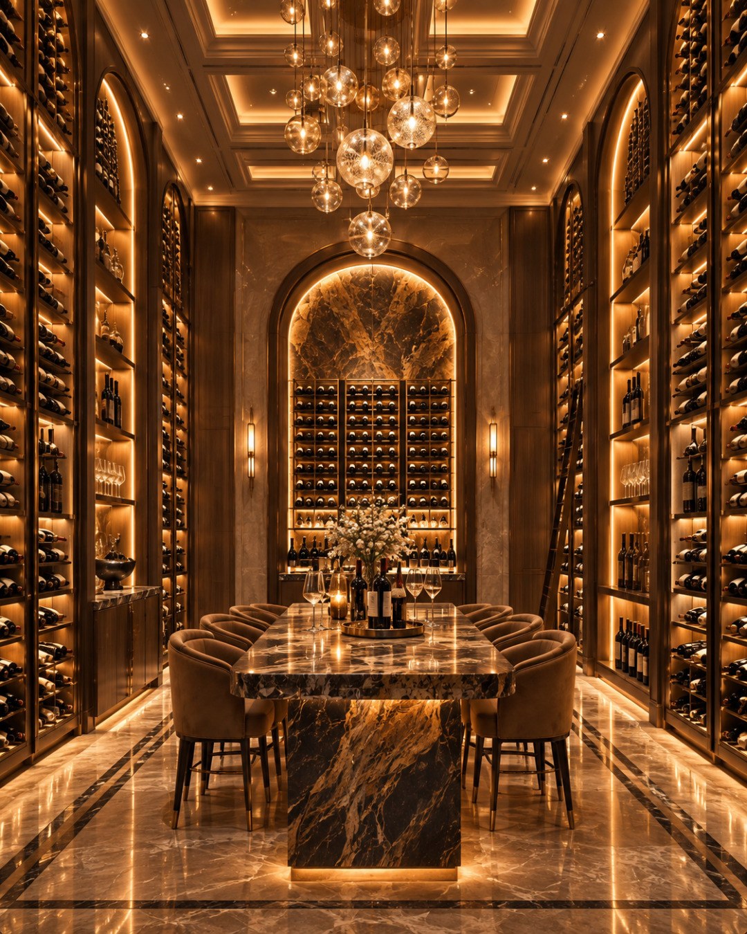
The image is not a photograph of a built project or a real-estate listing. It is conceptual architectural inspiration generated with AI, and its value lies in the design questions it raises. Floor-to-ceiling bottle displays rise along both sides of a long room. Warm walnut-toned cabinetry frames the collection. Arched illuminated niches create vertical rhythm. A polished dark stone tasting table occupies the center, surrounded by upholstered chairs. Above it, a cluster of glowing glass pendants hangs beneath a coffered ceiling. The floor is equally reflective, allowing the lighting, cabinetry, and table to register as a coordinated composition rather than as separate decorative gestures.
What makes the image compelling is not any single luxurious material. The strength comes from hierarchy. Storage defines the perimeter, the table defines the social center, the far wall creates a visual destination, and lighting binds those layers together. The room feels ceremonial because the architecture makes arrival, selection, and tasting legible as a sequence. At the same time, the scale is controlled enough that the space remains intimate despite its dramatic height.
For designers, homeowners, and architecture enthusiasts, the concept is a useful prompt for thinking beyond the familiar image of a cellar as rows of bottles behind glass. A successful wine room can combine environmental discipline, visual order, material richness, comfortable circulation, and a clear social purpose. The most convincing versions do not merely display a collection; they create a setting in which the collection, the room, and the act of gathering feel inseparable.
Make Storage the Architecture
The clearest lesson in the concept is that bottle storage does not need to behave like furniture applied to a finished room. It can become the room’s primary architectural order. In the image, tall illuminated racks extend almost continuously along both side walls, creating a strong vertical cadence. This gives the collection a monumental presence without requiring a separate decorative wall treatment. The bottles are not hidden behind a secondary layer of cabinetry; they are the texture, rhythm, and visual evidence of the room’s purpose.
That approach works because repetition is disciplined. Narrow vertical bays, shelf lighting, dark bottle silhouettes, and warm timber tones repeat at a consistent scale. The repetition makes the room feel calm even though the amount of visual information is high. A less ordered layout could become busy very quickly, especially when hundreds of bottle shapes, labels, glass reflections, and accessory pieces are visible at once.
For a real design, the exact storage system would need to respond to the collection itself: bottle formats, display priorities, access frequency, case storage, and the distinction between long-term holding and bottles intended for regular use. The architectural principle, however, is transferable. Establish a clear rack module, repeat it consistently, and integrate lighting and trim into that module from the beginning. When storage is treated as a wall system rather than an afterthought, the room gains coherence.
The concept also uses occasional breaks in the bottle grid for glassware, decanters, and display objects. Those interruptions are important because uninterrupted storage can become visually flat. A few larger niches allow the eye to rest while reinforcing scale. The result is not a retail wall and not a decorative library of bottles. It feels residential because the collection is abundant but still organized around a limited number of architectural gestures.
Use Symmetry to Create Ceremony Without Stiffness
The room’s symmetry is one of its strongest organizing devices. Tall racks mirror one another across the central axis, the tasting table sits precisely in the middle, and the far wall terminates the view with an arched focal composition. This creates a ceremonial sense of arrival: entering the room means immediately understanding where to look, where to move, and where to gather.
Symmetry can sometimes make an interior feel formal to the point of rigidity, but here the architecture avoids that problem through variation in light, bottle placement, material veining, flowers, glassware, and the suspended pendant cluster. The underlying geometry is stable while the smaller elements remain irregular. That balance is useful in luxury interiors. A strong axis can provide calm, while texture and objects prevent the room from feeling staged or institutional.
The far arched niche is especially effective because it gives the long room a destination. Without a visual termination, two parallel storage walls and a central table could read like a corridor. The arch slows that linear movement and makes the end wall feel significant. The illuminated stone panel within it adds another layer of depth without introducing a competing program.
In a buildable interpretation, strict symmetry would not need to control every service condition. Doors, climate-control grilles, access panels, or secondary storage could be absorbed more discreetly into one side. The important idea is that the principal visual field remains composed. Symmetry works best when it guides perception rather than forcing every technical element into artificial duplication.
Design the Tasting Table as the Social Center
The central dark stone table changes the room from a storage chamber into a social environment. Its scale is substantial enough to support a group, yet it remains narrow enough to preserve circulation along both sides. Upholstered chairs soften the harder surfaces of stone, glass, timber, and bottle racks, giving the center of the room a more comfortable residential character.
This is an important distinction. A wine cellar that includes seating does not automatically become a useful tasting room. The table must be positioned so people can sit comfortably without blocking access to storage, and there must be enough clearance behind chairs for others to pass. The concept communicates this well visually: the table occupies the center, but the room still reads as continuous around it.
The table also acts as a material anchor. Its dark, expressive stone contrasts with the warmer timber surrounding it, and its polished surface catches the amber light from above. Because the room contains many narrow vertical elements, the table’s broad horizontal plane provides a valuable counterpoint. It makes the composition feel grounded.
In practice, a tasting surface can support much more than glasses and bottles. It may need room for decanting, serving, note-taking, small plates, water, or presentation trays. That does not mean it should resemble a dining table or bar. The most convincing solution is one that remains proportionally tied to the cellar and keeps storage visually dominant. A tasting table should make the collection easier to experience, not replace it as the room’s primary identity.
Layer Warm Light Instead of Simply Making the Room Bright
Lighting is arguably the defining atmospheric element in the image. Nearly every architectural layer contributes: concealed illumination within the bottle racks, glowing edges around the arched niches, recessed ceiling lights, integrated ceiling coves, wall sconces, and a dramatic cluster of glass pendants above the table. The result is warm and immersive, but it works because the light is layered rather than uniformly intense.
A luxury cellar benefits from selective emphasis. Storage needs enough illumination for bottles to be read and handled comfortably, but not so much that every shelf becomes equally bright. The concept uses light to outline the architecture and create depth. Bottles become silhouettes against warmer backgrounds, while the central table receives a more decorative pool of light from above.
The pendant cluster performs an additional spatial role. The ceiling is tall, and without an intermediate element the distance between table and ceiling could feel excessive. The suspended globes occupy that vertical volume and visually lower the center of gravity. They create a middle layer between furniture and ceiling, making the room feel more intimate despite its height.
For a real wine-storage environment, lighting choices would also need to account for heat output, maintenance, glare, and the effects of prolonged light exposure on stored wine. Low-heat, well-controlled sources and carefully aimed illumination would be more appropriate than decorative brightness everywhere. The conceptual takeaway is simple: use light to reveal hierarchy. The collection, the table, the niches, and the ceiling should not all compete at the same level.
Balance Reflective Stone With Warm Timber
The material palette is intentionally rich, but it is also tightly edited. Warm walnut-toned cabinetry dominates the vertical surfaces, while polished stone appears at the floor, table, and focal niche. Glass pendants, bottles, and stemware add smaller reflective notes. This limited family of materials allows the room to feel luxurious without relying on a long list of finishes.
The contrast between timber and stone is especially effective. Timber absorbs light and introduces warmth, grain, and softness. Polished stone reflects light and gives the room visual weight. Used together, they prevent the space from becoming either too dark and enclosed or too glossy and theatrical. The timber makes the stone feel more residential; the stone makes the timber feel more formal.
The polished floor intensifies the evening atmosphere by doubling reflections from the illuminated cabinetry and pendants. That effect is visually dramatic, although a real design would need to balance appearance with practical considerations such as slip resistance, acoustic comfort, and maintenance. A honed or lightly textured stone could preserve material continuity while reducing glare and slipperiness in circulation zones.
The image also demonstrates the value of material repetition. The dark stone at the tasting table echoes the expressive stone at the far wall, while the warm cabinetry wraps the room continuously. Repeating a small number of materials at different scales creates cohesion. Luxury does not require a new finish at every surface; often it feels more convincing when a few materials are used with depth and precision.
Control Scale So Drama Does Not Overwhelm Intimacy
The concept is intentionally dramatic: tall walls, long sightlines, a large pendant installation, a substantial tasting table, and a visually dense collection. Yet the room still feels intimate because the architecture repeatedly brings the scale back down to the human body. Chairs define a comfortable social zone. Shelf divisions break the walls into smaller modules. Wall sconces sit at eye level. The table establishes a clear horizontal plane within the tall volume.
This layering is essential in any high-ceilinged interior. Height can create grandeur, but height without intermediate reference points can feel remote. The best large rooms contain multiple scales at once: the overall room volume, the architectural bay, the furniture grouping, and the hand-scale objects people actually touch. The wine cellar naturally supports that hierarchy because bottles, glasses, shelves, chairs, and tables all introduce familiar dimensions.
The arched niches also help by subdividing the elevation. Instead of reading as one continuous wall of cabinetry, the room is punctuated by larger framed moments. This makes the tall side walls feel composed rather than endless. The pendants perform a similar function overhead, occupying the air between the coffered ceiling and the table.
A more restrained interpretation could use the same principles at a smaller scale. The room does not need to be monumental to feel special. A lower ceiling, shorter table, and fewer storage bays could still create a strong destination if the hierarchy remains clear. Drama is most effective when it emerges from proportion and sequence rather than from size alone.
Treat the Cellar as a Sequence, Not a Single View
Although the image presents one symmetrical frontal view, the most useful architectural idea is the implied sequence of use. A person enters, reads the collection along the walls, moves deeper into the room, selects a bottle, and arrives at the tasting table. The far niche provides a visual endpoint, while the illuminated racks make the perimeter active along the entire route.
Thinking in sequence changes how a cellar should be planned. The entry can establish a compressed or quieter threshold before the main room opens. Frequently accessed bottles can sit closer to the tasting area. Less frequently used storage can occupy higher or deeper zones. Glassware, decanting accessories, water, and serving elements can be integrated near the social center without interrupting the visual rhythm of the racks.
Circulation should also remain intuitive when chairs are occupied. The concept suggests side aisles between the table and storage, which is a sensible organizational model because it allows the room to function during both quiet use and gatherings. The central axis remains ceremonial, but everyday movement can happen along the edges.
A successful cellar should therefore be evaluated from more than one camera position. What does the entry reveal? What does a seated guest see? How easy is it to move from storage to table? Where do service functions disappear? How does the room feel when only one or two people are present? The strongest architecture creates a complete experience across these moments rather than relying on a single dramatic elevation.
The most memorable quality of this AI-generated wine cellar is its sense of intention. Storage, lighting, symmetry, material, and social use are all organized around a clear idea: the collection deserves an architectural setting rather than a purely functional enclosure. The room feels luxurious because the bottle displays are integrated into the walls, the central table creates a reason to stay, the lighting builds depth, and the material palette remains controlled.
That does not mean every real wine cellar should reproduce the same degree of height, symmetry, polished stone, or decorative lighting. The more transferable lesson is to establish a hierarchy. Let storage remain the primary function. Give the room a social center without turning it into a generic lounge. Use lighting to guide attention rather than flatten the space. Repeat materials with discipline. And make circulation, access, and environmental performance part of the concept from the beginning rather than additions after the visual design is complete.
Because this image is AI-generated conceptual inspiration, it should be read as a design study rather than documentation of an existing project. Its value is in showing how a wine cellar might move beyond utility and become a carefully composed interior destination: intimate enough for quiet tasting, formal enough to feel special, and architecturally coherent enough that the collection and the room appear to belong to one another.
Related Visual Inspiration
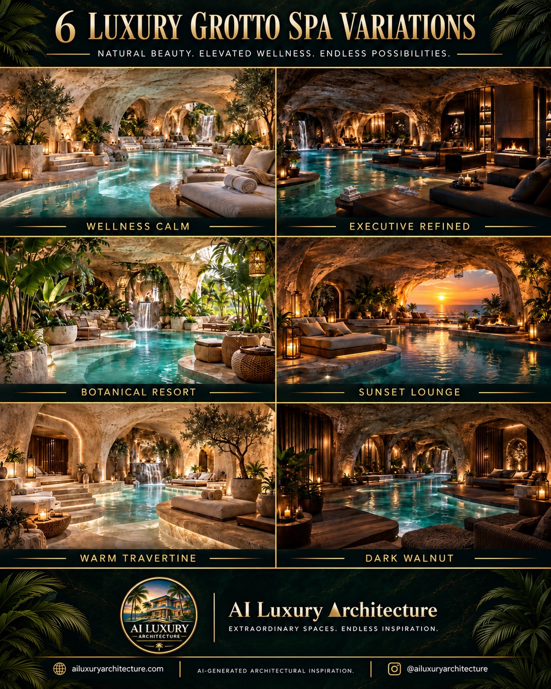
Additional AI-generated architectural studies connected to the ideas explored in this article.



AI disclosure: This article explores AI-generated architectural inspiration and conceptual design ideas. It does not describe a claimed real-world property, client, architect, or built project.