Skyline Crown Penthouse is an AI-generated conceptual residence imagined as an expansive single-level home above the city. The source material describes approximately 620 square metres, four bedrooms, five bathrooms, private terraces, panoramic glazing, and gallery-grade interiors. The seventeen selected scenes develop that premise across arrival, social life, work, collecting, privacy, wellness, entertainment, and outdoor living. They should be understood as architectural inspiration rather than a real-estate listing, built commission, or verified property.
The strongest continuity across the tour comes from a compact set of design decisions. Pale marble and mineral surfaces create a luminous base. Walnut and dark millwork provide visual weight. Smoked glass, black metal, and large window frames sharpen the architecture. Brushed-brass-toned details appear selectively, especially in the bar and lighting. Warm concealed illumination repeatedly contrasts with blue-hour and nighttime city views. This makes the skyline a constant atmospheric presence without requiring every room to use the same layout.
Because the property is conceptually single-level, the tour is less about moving vertically through a house and more about moving laterally through changing degrees of openness, privacy, activity, and enclosure. The foyer establishes a formal arrival. The living room, kitchen, and dining room create the social center. The office, bar, and art gallery introduce focused secondary programs. The primary suite, closet, guest suite, and bathroom shift toward privacy. The gym and spa create a wellness sequence. The theater and entertainment room support two different kinds of leisure. Finally, the outdoor living room and balcony extend the residence into elevated exterior space.
The images are especially useful when read for relationships rather than as isolated room portraits. Repeated glazing aligns interior life with the skyline. Ceiling coves and linear light establish room boundaries without heavy ornament. Furniture is generally low and restrained, preserving long views. Darker millwork is concentrated where storage, work, display, or intimacy matters. Brighter marble appears where cleanliness, reflection, and openness are useful. These patterns create a recognizable architectural language across very different functions.
The tour also illustrates the difference between image-level inspiration and real-world project resolution. A penthouse at this scale would involve high-rise structural constraints, mechanical distribution, fire separation, acoustic control, elevator and service access, façade performance, terrace waterproofing, wind conditions, and extensive coordination with a host building. None of those technical systems can be verified from conceptual imagery. The value of the tour is therefore editorial: it shows how program, material, light, furniture, and views might be composed into a coherent urban residence.
Tour Overview
The tour begins with arrival and immediately establishes the core visual language: warm perimeter lighting, light wall planes, dark reflective flooring, and a framed skyline at the far edge. From there, the living room expands dramatically, using pale seating and fire elements within a tall glazed volume. The kitchen and dining room then compress the scale into more controlled, functional compositions. Together, these first four scenes define the public side of the penthouse.
The next sequence moves into focused residential programs. The home office is dark, tailored, and storage-rich, with an executive desk set against illuminated shelving. The private bar amplifies that evening character through a long serving counter and an illuminated back-bar display. The art gallery transforms circulation itself into a destination, using a long axis and deliberately spaced works. These rooms show how the concept creates variety without abandoning its broader material vocabulary.
The private suite shifts the mood again. The primary bedroom is calm and low-lit, with the bed clearly dominant against the skyline. The walk-in closet turns inward, surrounding the occupant with glass-fronted and open wardrobe storage. The guest suite is smaller and darker in tone, maintaining the hierarchy between primary and secondary sleeping spaces. The primary bathroom returns to pale surfaces and glazing, placing a freestanding tub, vanity, and shower within a bright perimeter condition.
Wellness comes next through contrast. The gym is open and active, with multiple equipment types arranged against panoramic glass. The wellness spa is intentionally quieter, with treatment and relaxation functions set within warm stone and timber. The home theater then creates the darkest room of the tour, focusing all attention on one screen and organized seating. The entertainment room reopens the volume around a central billiards table, using social seating and a circular pendant to establish a more informal leisure environment.
The final two scenes move outdoors. The outdoor living room is deeply sheltered and fully furnished, functioning as an exterior lounge rather than an empty terrace. The balcony is more exposed and compact, emphasizing height and the urban panorama. Ending the tour with these spaces reinforces the penthouse's core idea: the skyline is not just something seen through glass. It is an environment the architecture repeatedly frames, filters, and eventually enters.
Scene-By-Scene Guide
Foyer: A Formal Arrival Oriented to the Skyline
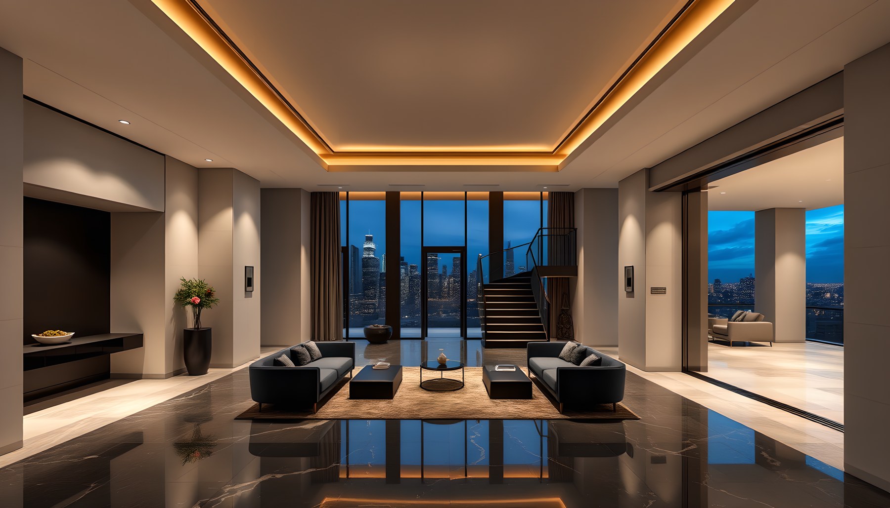
The foyer establishes the penthouse through symmetry, reflection, and a direct visual pull toward the city. Two compact dark sofas face each other across a rug and low tables, creating a contained waiting or greeting zone without turning the arrival space into a full living room. The floor is highly reflective and dark, while the walls and ceiling remain pale, so the seating composition appears grounded within a brighter architectural frame. A continuous warm ceiling cove traces the perimeter overhead and gives the room a strong rectangular order.
At the far end, tall glazing opens to the skyline, making the exterior view the principal visual destination. A dark stair-like element rises near that glazed edge and becomes a strong graphic feature, while an open connection on the right reveals another perimeter seating area beyond. Because the source property is described as a single-level penthouse, the image is best read for its arrival composition rather than as evidence of a verified multi-level plan. The important architectural effect is the clear axis from entry zone to view. Sparse planting, recessed wall niches, and controlled lighting keep the space formal without resorting to hotel-lobby ornament. The foyer therefore introduces the residence through contrast: dark polished floor below, warm light above, and cool city light beyond.
Living Room: Monumental Scale With a Controlled Seating Field
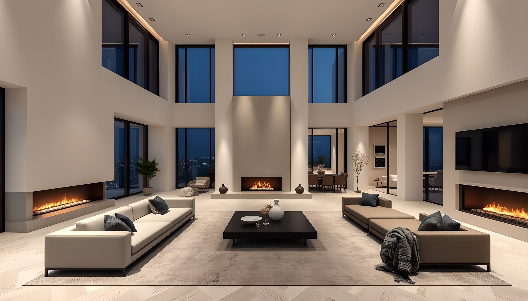
The living room is the most expansive interior in the tour. Pale walls rise around a tall central fireplace wall, while large areas of glazing wrap the perimeter and reveal the city after dark. The principal seating arrangement remains concentrated at floor level: two long low sofas face inward across a large dark coffee table on a broad neutral rug. This creates a legible social field even though the surrounding room is much larger than the furniture group.
Three visible linear fire elements—one centered on the tall focal wall and two placed along opposing side walls—introduce repeated warm horizontal lines within the otherwise vertical composition. Their visual repetition is striking and gives the room an almost gallery-like symmetry. Recessed ceiling fixtures and concealed perimeter light keep the upper surfaces quiet so that glazing and fire provide most of the atmosphere.
The furniture scale is intentionally low, which preserves sightlines across the room and allows the architecture to remain dominant. Secondary chairs sit near the perimeter without competing with the central grouping. Openings at the edges reveal adjacent rooms, reinforcing continuity through the penthouse rather than enclosing the living room as an isolated salon. The scene's main architectural idea is the balance between very large volume and a comparatively simple domestic arrangement: the room remains readable because the seating, fireplaces, and skyline establish clear layers of focus.
Kitchen: A Monolithic Island Against a Panoramic Edge
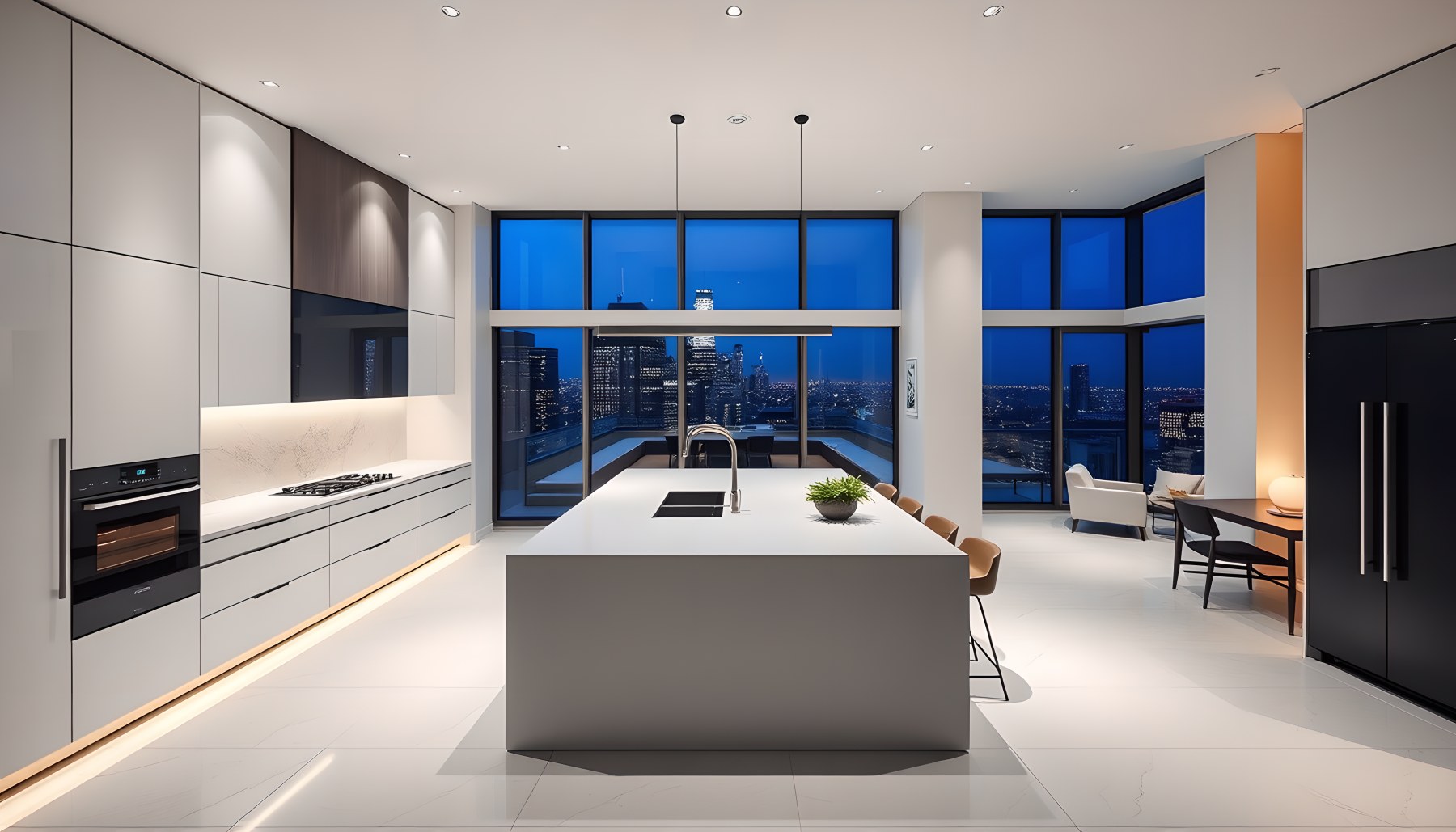
The kitchen is bright, highly controlled, and immediately legible as a working room. A single large white island occupies the center, with an integrated sink and dark inset work surface. Seating is aligned along one side rather than distributed around the perimeter, preserving a generous circulation zone. Behind it, a long wall of white cabinetry contains integrated cooking equipment, worktop space, and a cooktop, while a tall dark refrigerator volume anchors the opposite side.
The material palette is deliberately minimal. White cabinet fronts, pale flooring, and a light work surface create an almost continuous luminous field. Dark appliance faces and window frames provide contrast without fragmenting the composition. A long suspended linear fixture above the island reinforces the room's axis and visually connects the work zone to the panoramic glazing beyond.
The skyline is visible directly behind the island and through corner glass at the right, but the kitchen does not sacrifice function to the view. Storage and appliances remain concentrated on solid walls, leaving the perimeter glazing to provide light and outlook. A small table and chair zone near the window reads as an informal secondary use without competing with the principal island. The scene demonstrates a useful high-rise strategy: keep the hard-working elements dense and integrated, then allow the primary work surface to face the horizon. This preserves both functionality and the elevated character of the penthouse.
Dining Room: A Linear Table Framing the Evening Horizon
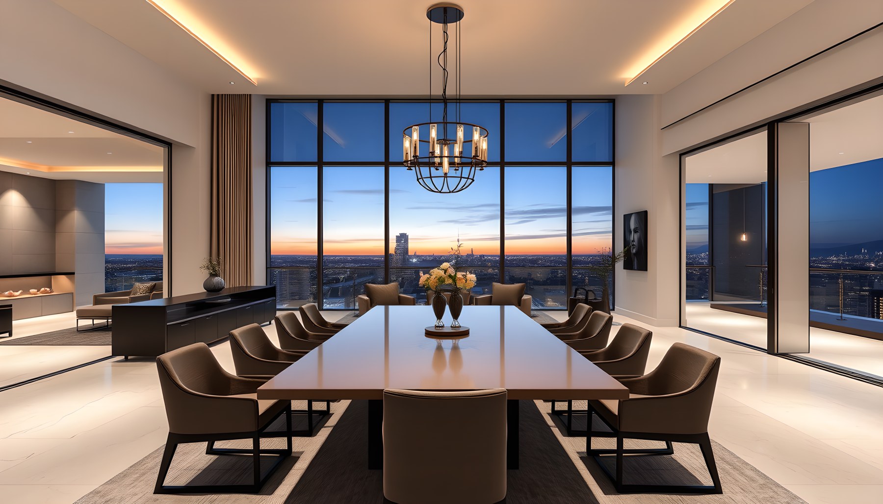
The dining room is organized around one long rectangular table with a coherent set of chairs, making its function unmistakable. The table runs directly toward the glazing, so the visual axis extends through the centerpiece to the distant skyline. This alignment gives the room ceremonial clarity without requiring elaborate decoration. A circular sculptural pendant hangs above the center of the table and provides a warmer ornamental note within the otherwise restrained envelope.
The perimeter is defined by pale walls, light flooring, recessed ceiling light, and extensive glass. A darker rug beneath the table gives the dining group enough visual weight to hold the center of the room. On the left, an open connection reveals part of the broader social interior and a low fire element, allowing the dining room to feel related to the main living spaces while remaining distinct.
The city beyond is shown at the transition between sunset and night, providing a gradient of warm horizon light and cooler blue sky. That exterior color becomes part of the dining atmosphere, while concealed ceiling illumination keeps the room from depending entirely on the view. Circulation around the table appears generous on all sides, which is especially important in a formal dining setting. The scene demonstrates how a relatively simple composition—one table, one pendant, one view axis—can create a strong sense of occasion through proportion and alignment.
Home Office: Dark Millwork and a Focused Executive Work Zone
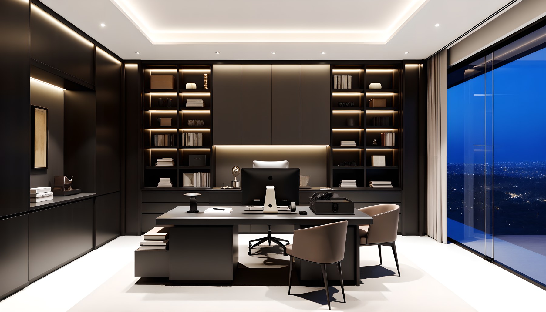
The home office shifts decisively away from the pale social rooms into a darker, more concentrated atmosphere. A substantial executive desk occupies the center and is paired with a primary work chair and two guest chairs, creating a clear working and meeting zone. Behind the desk, full-height dark millwork incorporates shelving, storage, books, and warm integrated lighting. The cabinetry frames the desk rather than acting as background decoration, making work and storage the dominant functions of the room.
The perimeter glazing on the right opens to the city at night, but the desk orientation keeps the office grounded in the interior rather than turning it into a viewing lounge. The dark palette reduces reflections and gives the illuminated shelves more visual importance. Ceiling coves and recessed light create a clean luminous border overhead, while the desk itself remains uncluttered enough to preserve a professional residential character.
The contrast between this room and the kitchen is instructive. Both are highly functional, but the kitchen uses brightness and openness while the office uses enclosure and visual concentration. The office's architecture supports focus through darker surfaces, controlled light, and limited furniture. At the same time, the skyline prevents the room from feeling sealed off. It becomes a private workplace that still belongs clearly to the penthouse's urban setting.
Bar: Illuminated Display as the Center of Evening Hospitality
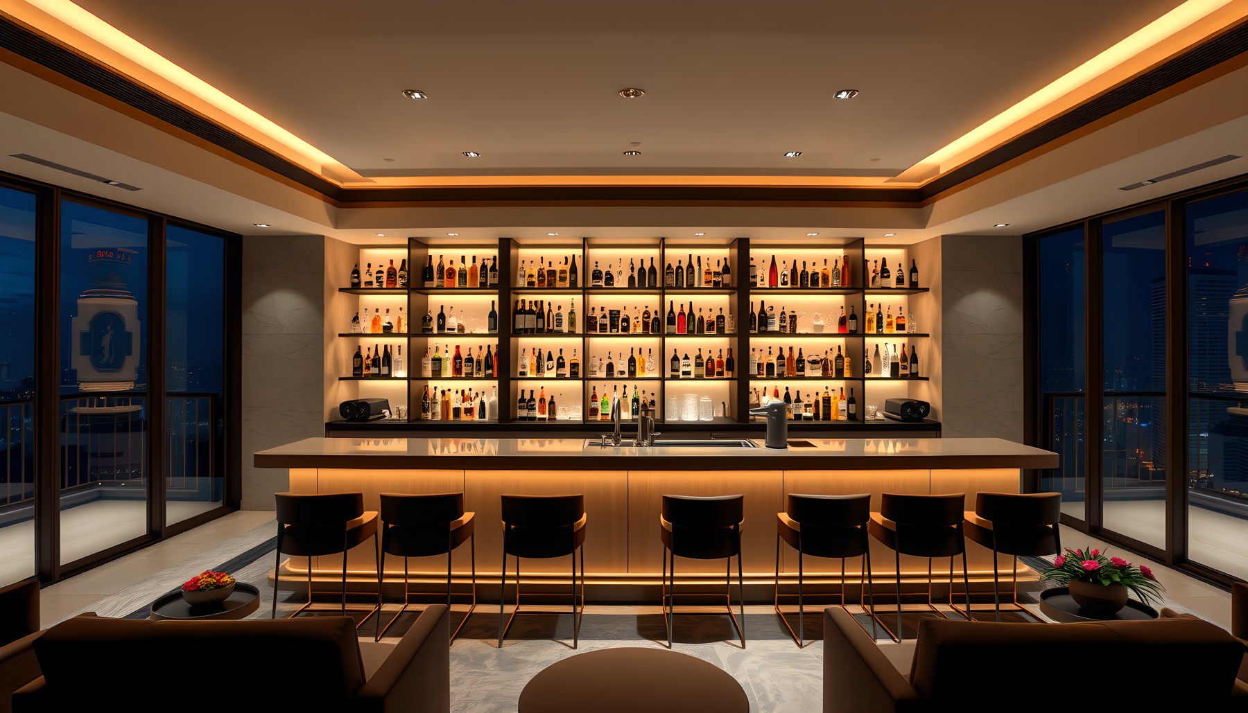
The private bar is organized around a long serving counter with a row of stools and a large illuminated back-bar display. Bottles and glassware are clearly visible across multiple shelf levels, making the entertainment function immediately readable. The display occupies much of the rear wall and is framed by warm amber light, turning storage itself into the principal visual feature of the room. This is one of the clearest expressions of the penthouse's evening-oriented character.
The counter is substantial enough to separate service from seating without feeling commercial. Dark stools line the guest side, while the surrounding cabinetry and ceiling remain restrained. Low lounge seating appears in the foreground, extending the bar into a more relaxed social zone. Panoramic glazing at both sides keeps the city visible, but the bright shelving competes successfully with the view, creating an interior focal point after dark.
The material language is richer here than in the kitchen: dark cabinetry, warm metallic accents, illuminated glass, and a darker floor establish intimacy. Yet the geometry remains clean and residential. The bar does not rely on signage or decorative theming; its identity comes from the counter, stool rhythm, bottle display, and lighting. In the sequence of the tour, it provides a bridge between the refined public rooms and the more specialized entertainment spaces that appear later.
Art Gallery: A Residential Axis for Collecting and Circulation
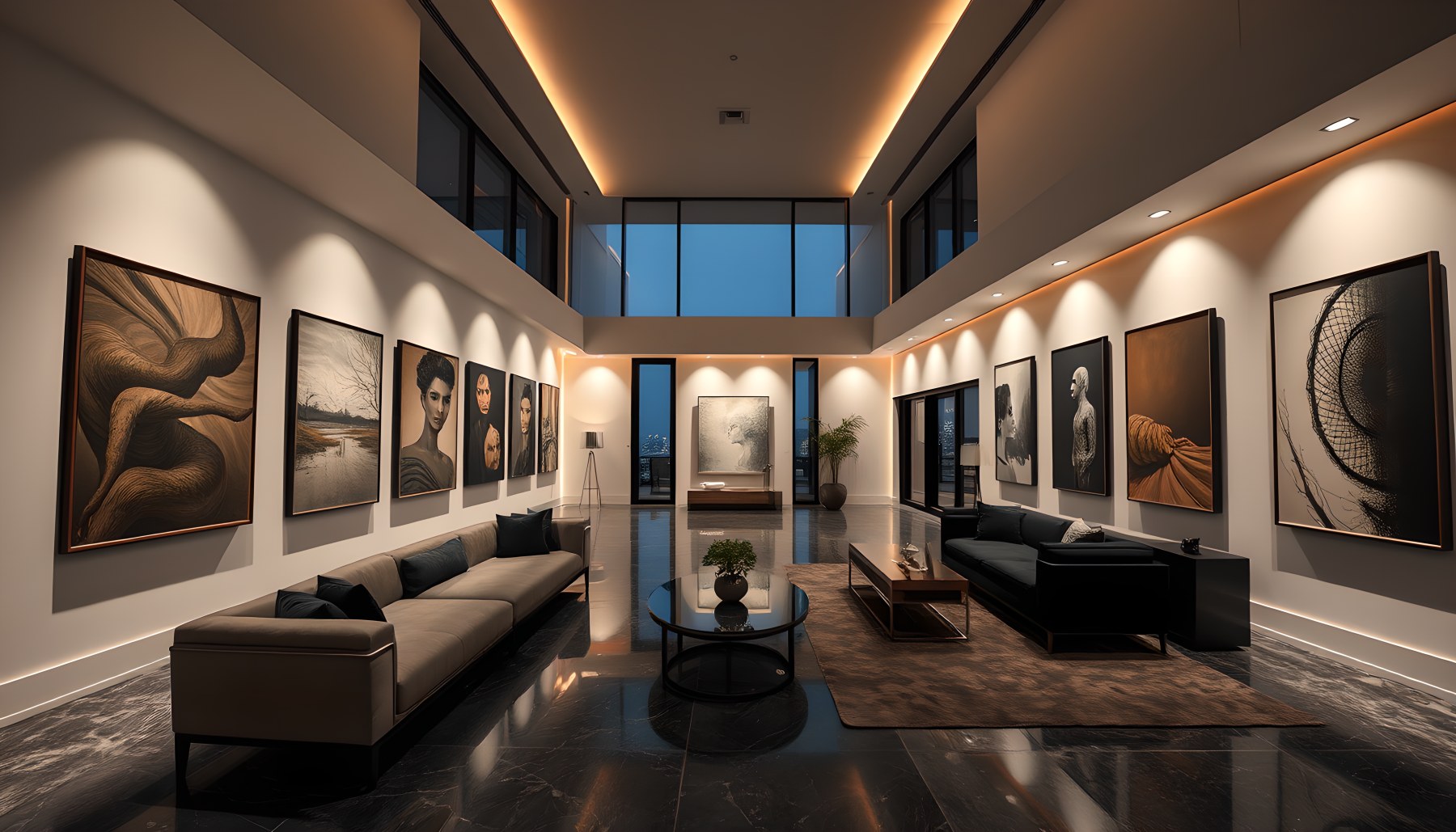
The art gallery turns a long interior passage into a curated residential experience. Large artworks are spaced deliberately along both sides, with enough wall area around each piece to create visual separation. The composition remains domestic through the inclusion of low benches, side tables, a rug, and a central seating moment rather than adopting the scale or emptiness of an institutional museum.
Warm linear lighting runs along the ceiling edges, while focused wall illumination gives the artworks presence. The floor is dark and reflective, creating a visual echo of the frames and lighting above. At the far end, a brighter opening and a final artwork establish a destination, giving the corridor a clear directional axis. This is important because a gallery inside a home still needs to function as circulation; the art should enrich movement rather than obstruct it.
The works vary in scale and subject, which produces a rhythm as the eye moves down the corridor. Furniture stays low and sparse so viewing distances remain relatively clear. The material palette also connects the gallery to the rest of the penthouse: pale wall planes, dark flooring, warm concealed light, and selective black detailing. The scene demonstrates how collecting can shape architecture by turning transitional space into an intentional sequence rather than requiring a separate, museum-like room.
Primary Bedroom: A Quiet Sleeping Zone With City Exposure
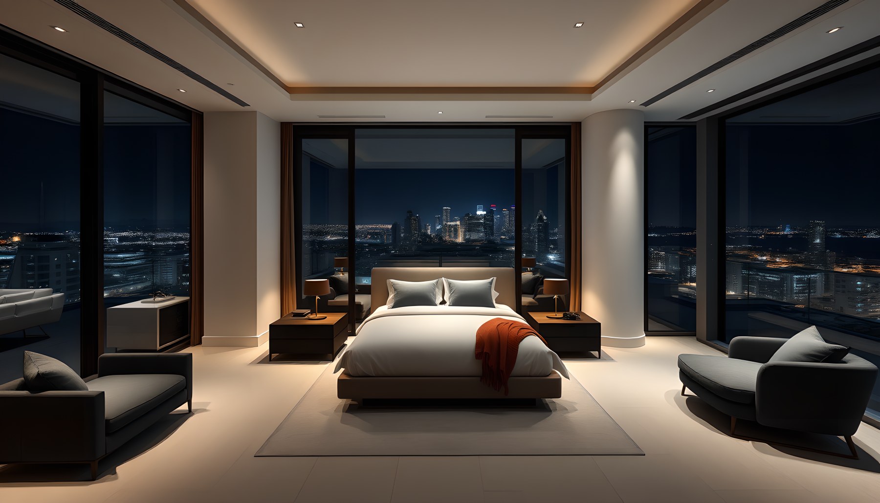
The primary bedroom is organized around one bed placed centrally against the skyline. The bed remains the unmistakable focus, with a simple headboard composition, matching bedside elements, pale bedding, and a warm rust-colored throw that introduces a single stronger color note. A large neutral rug defines the sleeping zone and keeps the floor composition calm.
Panoramic glazing wraps the perimeter, allowing the city to remain visible from the bed, but the room includes substantial dark wall and ceiling planes that preserve a sense of enclosure. Low lounge chairs sit near the corners rather than forming a separate living room, supporting the private-suite function without competing with the bed. Concealed ceiling illumination adds warmth while keeping fixtures visually quiet.
The atmosphere is notably more subdued than the living and dining rooms. There is less reflective surface, fewer objects, and a darker ceiling edge. This makes the city feel more distant and the interior more protective. The furniture is also lower and softer, reinforcing the horizontal character of a sleeping space.
As a conceptual bedroom, the scene is strongest in its restraint. It does not depend on decorative abundance. Instead, it uses the relationship between one bed, controlled lighting, dark framing, and the skyline to create privacy within an exposed high-rise condition. The result feels connected to the wider penthouse while clearly belonging to the quieter private sequence.
Walk-In Closet: Wardrobe Storage as a Fully Designed Interior
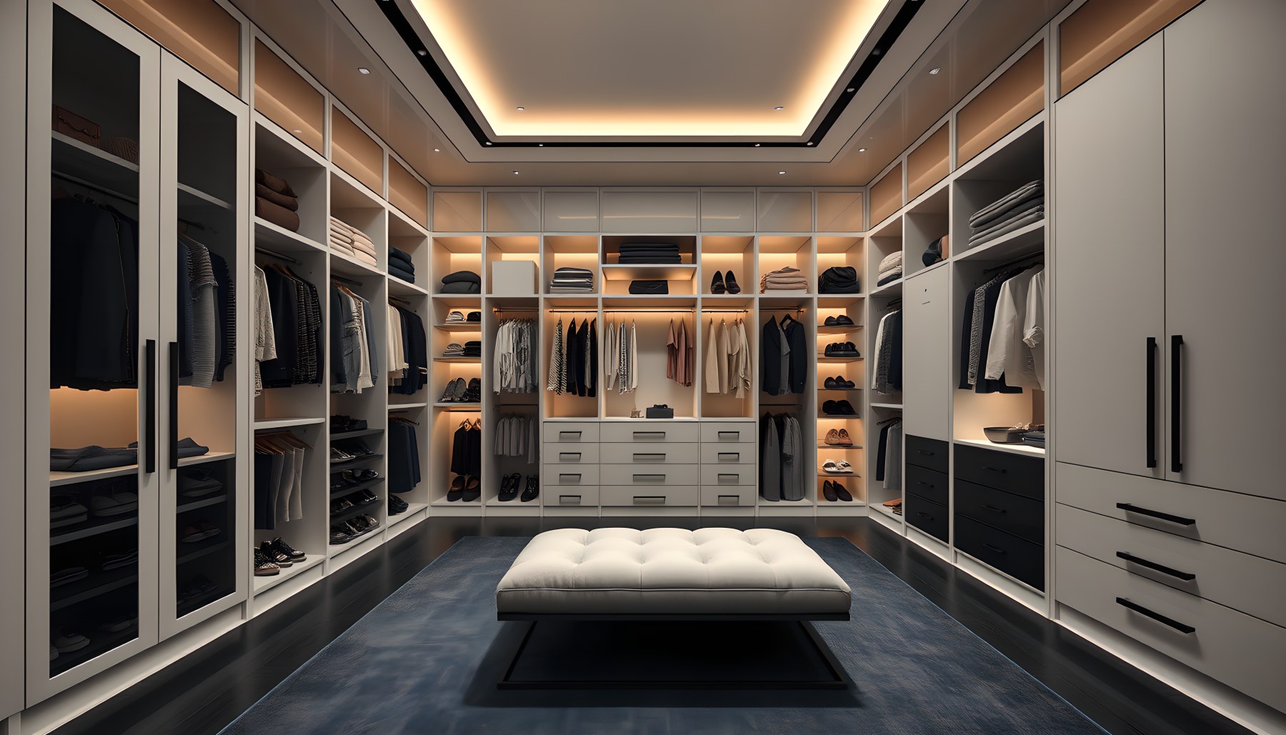
The walk-in closet is immediately recognizable through extensive wardrobe storage on multiple walls. Hanging garments, shelves, drawers, shoes, and accessories fill the cabinetry, preventing the room from reading as an empty dressing salon. Glass-fronted sections and open bays make the inventory visible, while warm integrated lighting gives the clothing and cabinetry depth.
A long upholstered bench occupies the center rather than an oversized island, leaving clear circulation around the perimeter storage. This is a useful choice because the primary function remains dressing and access to clothing. The floor is darker and softer than in the main social areas, and the ceiling cove uses warm light to create a contained atmosphere. Tall cabinetry makes full use of the room height without relying on decorative wall treatments.
The palette continues the penthouse's darker private-room language. Dark or smoked glass, walnut-toned surfaces, pale drawers, and warm lighting provide contrast while keeping the visual focus on the wardrobe contents. The closet therefore acts as a transition between bedroom and bathroom functions: more enclosed than the bedroom, but more detailed and storage-driven.
From a planning perspective, the scene emphasizes the importance of usable aisle width and visible organization. Luxury here is expressed through capacity, clarity, and integrated storage rather than through a lounge-like arrangement. The room feels purpose-built, which strengthens the private suite as a coherent sequence.
Guest Suite: A Secondary Bedroom With Its Own Skyline Moment
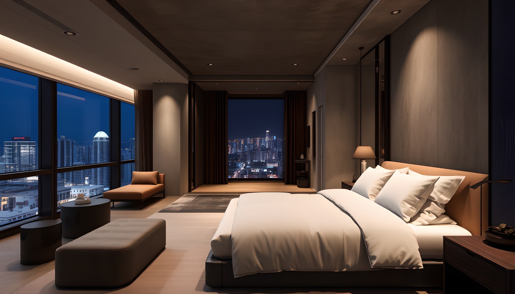
The guest suite is deliberately more compact and restrained than the primary bedroom. One bed dominates the composition, placed along a darker wall and oriented toward a corner of panoramic glazing. Pale bedding and a light rug contrast with the darker ceiling and wall surfaces, creating a quiet, cocooned sleeping zone. A narrow bench or upholstered element at the foot of the bed adds function without turning the room into a lounge.
At the far end, a small chair and side table sit near the glass, creating a limited sitting area that takes advantage of the city view. The room is shown at night, and warm bedside or wall lighting provides most of the interior illumination. This combination of low light and extensive glazing gives the suite a more intimate character than the bright public rooms.
The design hierarchy is clear. The guest suite shares the same broad material vocabulary—dark framing, pale textiles, warm light, skyline glazing—but uses less space and fewer secondary elements than the primary suite. That differentiation is important in a large residence because not every bedroom should feel equally ceremonial.
Circulation remains simple: the bed has readable space around it, the seating stays at the perimeter, and the window wall remains visually open. The scene therefore communicates hospitality through calm proportion rather than excess, offering guests a strong connection to the city while maintaining a distinct secondary role within the penthouse.
Primary Bathroom: Bathing Framed by Glass and Pale Stone
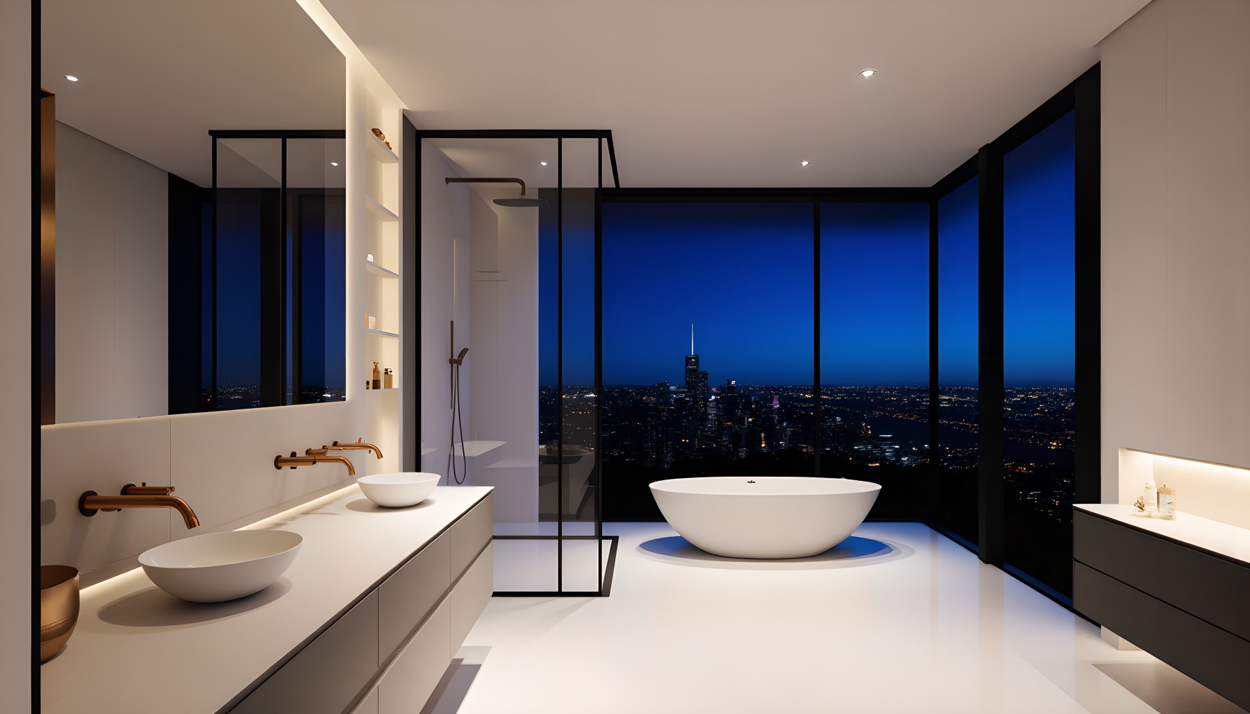
The primary bathroom returns to the bright, reflective side of the penthouse palette. A long double-basin vanity runs along the left, its pale counter and integrated storage creating a clear dry grooming zone. Near the panoramic corner glazing, a freestanding tub becomes the principal bathing element, positioned to take advantage of the skyline without obstructing circulation. A transparent shower enclosure sits between these zones, preserving sightlines through the room.
The surfaces are predominantly pale and smooth, with dark window frames and a darker vanity or storage element on the right providing contrast. Recessed lighting is sparse, allowing the luminous floor and walls to carry much of the brightness. The blue-hour city outside adds a cool color field against the warm-neutral interior.
The bathroom is successful as a scene because its functions remain legible. Vanity, tub, and shower each occupy a distinct position rather than blending into a generic spa environment. The circulation path through the center is clear, and the glazing acts as a perimeter condition rather than a decorative backdrop.
In a real penthouse, privacy, glare, plumbing distribution, waterproofing, condensation, and façade exposure would all require careful coordination. The image does not establish those systems. As design inspiration, it demonstrates how a luxury bathroom can remain architecturally quiet while still using a panoramic view as part of the bathing experience.
Gym: Training Equipment Along a Panoramic Glass Wall
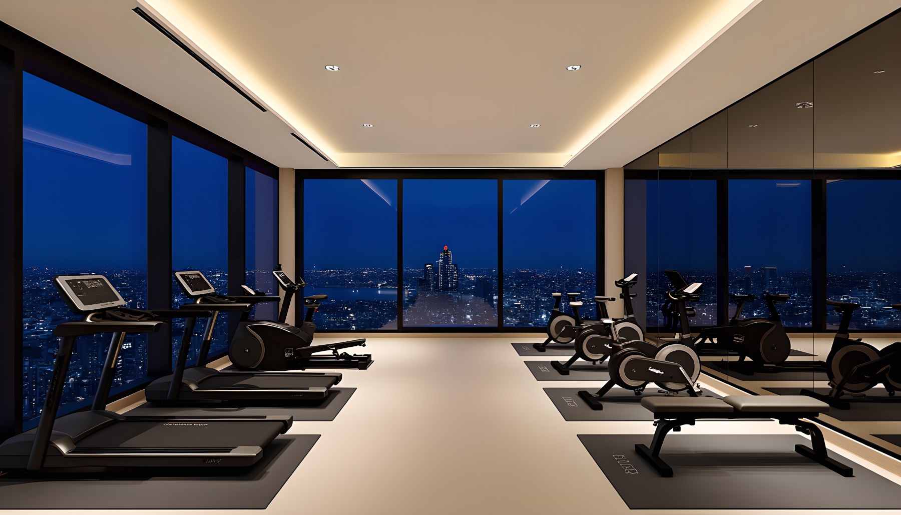
The gym is one of the most functional spaces in the tour. Treadmills occupy one side, while stationary bikes and strength or free-weight equipment are arranged on the other. The distribution creates multiple training categories and leaves a broad central zone for movement. Extensive corner glazing wraps the perimeter, turning the skyline into the visual background for exercise.
The material palette is deliberately reduced. Pale flooring and ceiling surfaces keep the room bright, while black equipment and window frames provide the strongest contrast. Concealed ceiling light traces the room edge and helps maintain an even atmosphere after dark. Unlike the spa, there are few soft materials or decorative elements; the equipment itself provides the visual complexity.
This room also shows how the penthouse's panoramic glazing can serve different programs. In the living room it supports social spectacle; in the bedroom it creates a private horizon; here it gives the exercise space openness and visual distance. The arrangement avoids placing large lounge furniture in the room, preserving its clear training identity.
A real residential gym would need attention to resilient flooring, equipment loads, vibration transfer, ventilation, acoustic isolation, and adequate clearance around machines. Those technical requirements are not visible in the concept. The architectural idea is nonetheless clear: a high-rise gym can feel luxurious through space, view, and disciplined equipment planning rather than through decorative excess.
Wellness Spa: Warm Timber, Treatment, and Thermal Relaxation
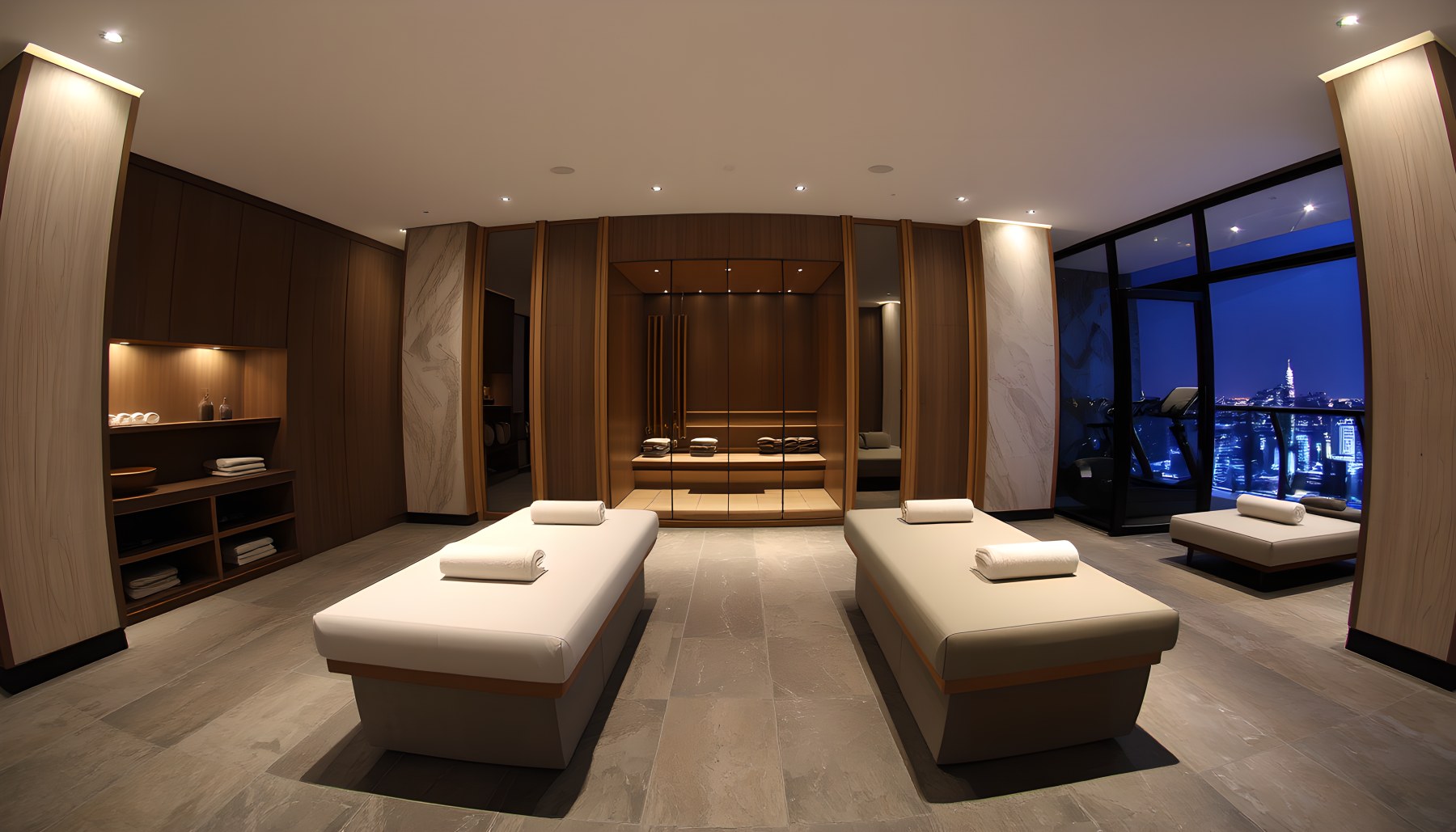
The wellness spa is intentionally different from the gym. It is quieter, warmer, and more inward-looking, organized around treatment and relaxation rather than movement. Two long upholstered treatment or relaxation surfaces occupy the foreground with folded towels placed at their ends. At the rear, a timber-lined sauna or heat-therapy enclosure becomes a strong architectural focal point. Built-in cabinetry and shelves along the side walls support the treatment function without adding freestanding clutter.
The floor appears stone or stone-like, while the walls alternate between warm timber and neutral mineral surfaces. Lighting is soft and integrated, concentrated along ceiling edges and within cabinetry. A corner of glazing keeps the skyline present, but it is less visually dominant than in the gym. This makes the spa feel protected even though it remains part of the same penthouse.
The room's proportion is also more intimate. Furniture is low, circulation is clear, and there are no large entertainment objects. This supports a restorative atmosphere and distinguishes the wellness program from both exercise and social leisure.
For a real home spa, humidity control, waterproofing, drainage, sauna ventilation, heat-resistant materials, and service access would be essential. The image does not verify those systems. What it communicates well is programmatic clarity: the room is devoted to treatment, heat, towels, and quiet recovery. That specificity allows the wellness suite to feel architectural rather than decorative.
Home Theater: One Screen, One Viewing Axis, Controlled Darkness
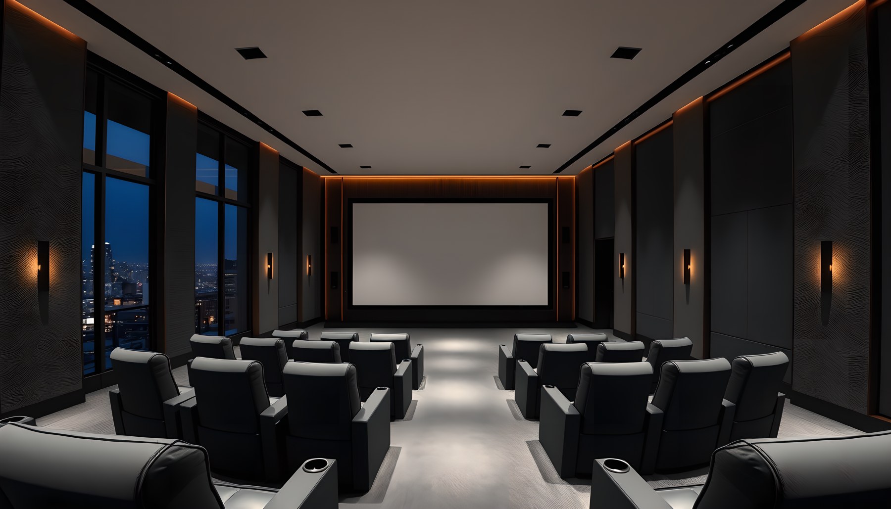
The home theater is the darkest and most acoustically focused room in the tour. A single large screen occupies the far wall, establishing one unmistakable viewing direction. Multiple rows of dark upholstered cinema chairs face it in an orderly arrangement, with clear aisles between seating groups. This straightforward geometry is important because the room's function depends on sightlines rather than on panoramic views.
Dark wall panels and a dark floor absorb visual attention, while restrained wall sconces and a narrow warm ceiling line provide enough illumination to reveal the architecture without competing with the screen. The ceiling is comparatively plain, which keeps the room from becoming visually busy. Glazing visible along one side appears darkened by the nighttime condition, but the interior remains centered on the cinema experience.
The scene is notably free of secondary bar counters, game tables, or lounge furniture. That discipline distinguishes it from the entertainment room that follows. The theater is for watching; the entertainment room is for active social play. Keeping those programs separate gives each more credibility.
In a real project, acoustic isolation, speaker placement, projection or display technology, ventilation noise, tier heights, and emergency egress would require detailed design. Those systems are not shown. As an architectural concept, the scene succeeds by using darkness, alignment, and controlled lighting to make one function dominant.
Entertainment Room: Billiards at the Center of Social Play
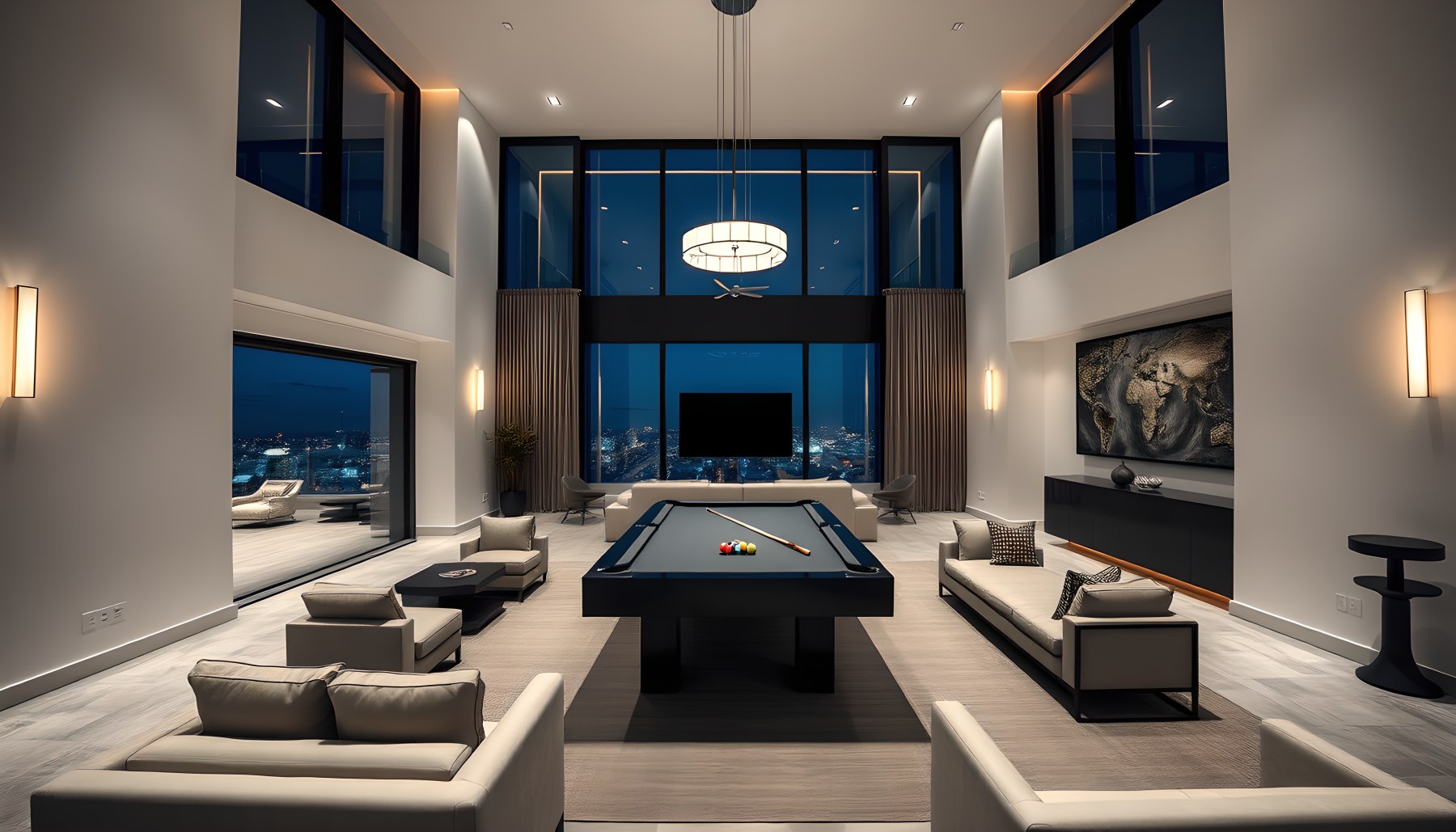
The entertainment room reopens the architecture after the dark compression of the theater. A billiards table sits squarely at the center beneath a large circular pendant, making the game function immediately legible. Low lounge seating is arranged along both sides, allowing spectators and players to share the room without crowding the playing clearance around the table.
The room is tall and bright relative to the theater, with pale wall surfaces, large windows, and warm vertical lighting. A fireplace and artwork appear along the side walls, but they remain secondary to the billiards table. At the far end, glazing brings the skyline into view and extends the room visually beyond its enclosure.
This is one of the clearest examples of how the penthouse differentiates forms of entertainment. The bar is organized around serving and display. The theater is organized around seated viewing. The entertainment room is organized around an interactive game. Because each room has a single dominant activity, the residence avoids the generic multipurpose 'amenity room' effect.
The central table also gives the architecture a strong proportional anchor. Its rectangular geometry relates to the room axis, while the circular pendant introduces contrast overhead. The surrounding seating remains low and peripheral, preserving movement around the table. The scene therefore balances activity, social seating, and architectural form without allowing decorative elements to overwhelm the purpose of the space.
Outdoor Living Room: A Sheltered Room at the Edge of the City
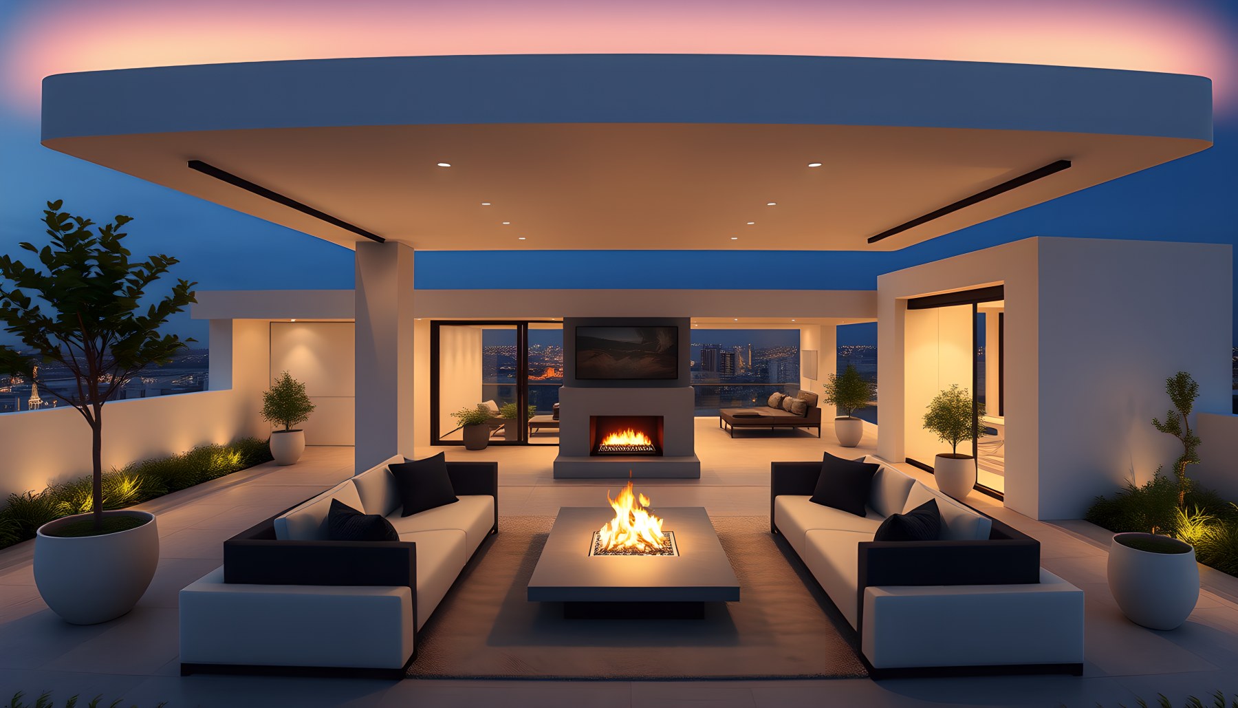
The outdoor living room is more than an open terrace. A broad overhead canopy defines the ceiling, making the seating area feel protected and spatially complete. Dark outdoor sofas and armchairs form a symmetrical arrangement around a central fire feature, while a second fireplace is integrated into the wall behind. The residence opens directly onto the space through large glazed doors, reinforcing continuity between interior and exterior living.
Pale walls and flooring keep the terrace luminous at dusk, while warm concealed light traces the edge of the canopy. Large planters and small trees soften the architectural perimeter without blocking the view. The seating remains concentrated beneath the roof rather than scattered across the terrace, which strengthens the sense of an outdoor room.
This scene also demonstrates how shelter changes the experience of height. The balcony later in the tour is more exposed, but here the deep roof provides a strong overhead plane that reduces the psychological openness of the high-rise edge. Fire adds another layer of comfort and creates a social focal point after sunset.
In a real penthouse, wind exposure, combustible clearances, drainage, waterproofing, structural loading, and outdoor furniture anchoring would be significant concerns. The concept image does not establish those details. Architecturally, however, it makes a persuasive distinction between simply having exterior area and creating a genuinely inhabitable elevated living room.
Balcony: A Compact Elevated Threshold to the Skyline
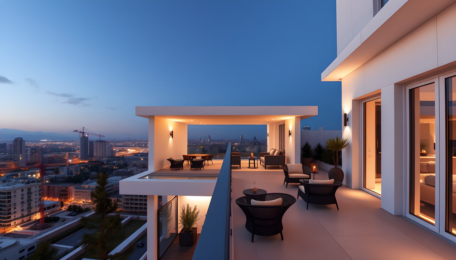
The final scene presents a smaller and more exposed outdoor condition than the preceding living room. The balcony is visibly attached to the residence, with a clear floor edge, protective parapet or railing, and direct access from interior glazing. A compact arrangement of dark chairs and small tables occupies the terrace without crowding it, preserving open circulation and long views.
A projecting roof or canopy provides some shelter over part of the balcony, while other areas remain more open to the sky. Warm architectural lighting from the residence gives the edge a soft glow against the blue evening atmosphere. Planters are used selectively, allowing the cityscape to remain the principal exterior feature. The view includes varied urban buildings and a broad horizon rather than a named or identifiable location.
As the closing scene of the tour, the balcony distills the penthouse concept to its simplest relationship: interior, threshold, edge, and skyline. There is less furniture, less program, and less enclosure than in the outdoor living room. That restraint gives the space the character of a private lookout rather than another social room.
Any real high-rise balcony would require site-specific wind analysis, guard design, waterproofing, drainage, door thresholds, and careful treatment of loose furnishings. The image should be read as conceptual inspiration. Its architectural value lies in showing how even a modest exterior platform can feel deliberate when its seating, shelter, and view are kept in balance.
The Penthouse as a Horizontal Sequence Rather Than a Vertical House
The most important planning idea in Skyline Crown Penthouse is its single-level character. Large luxury houses often generate hierarchy by stacking public, private, and service functions on different floors. A penthouse has a different problem: many programs must coexist across one elevated plate. This increases the importance of horizontal thresholds, visual axes, acoustic separation, and transitions in material and lighting.
The supplied scenes suggest several distinct zones. Arrival and principal social spaces are bright, outward-looking, and organized around strong skyline views. Work, collecting, and entertaining occupy more tailored environments where cabinetry, display, or equipment becomes dominant. The private suite relies on darker surfaces and softer lighting. Wellness rooms split into an active glazed gym and a more protected spa. Exterior spaces then extend the sequence beyond the curtain wall.
This kind of zoning can be effective because it lets atmosphere signal function. A person moving from pale marble social rooms into darker walnut millwork understands that the program is changing before encountering a closed door. Gallery-like passages can link zones while also supporting art. Glazing can mark public perimeter rooms, while more solid internal walls can support storage, acoustics, and privacy.
The challenge in a real floor plate would be invisible infrastructure. Kitchens, bathrooms, spa rooms, fireplaces, mechanical equipment, audiovisual systems, and service circulation all require substantial technical distribution. A successful plan would need to coordinate those systems without disrupting the clean visual language suggested by the images. The conceptual sequence is valuable because it provides a spatial hierarchy to which those technical systems could be subordinated.
Material Continuity Without Monotony
A luxury residence with seventeen distinct scenes risks looking like a collection of separate showrooms. The concept avoids that by repeating a small family of materials while changing their proportion and brightness from room to room. Pale marble and light mineral finishes dominate the kitchen, bathroom, living room, and circulation zones. Walnut and dark cabinetry become more prominent in the office, bar, spa, bedroom, and closet. Smoked glass appears where transparency needs to feel more private or display-oriented. Black metal consistently frames windows and selected furniture. Brass-toned light introduces controlled warmth.
The result is continuity without literal repetition. The kitchen and theater could not be more different in atmosphere, yet both use strong dark-to-light contrast and clean geometric edges. The office and walk-in closet share the language of integrated dark storage, but one is organized around a desk and the other around clothing. The bar uses the warmest and most visibly decorative lighting, while the gallery remains restrained so the artwork can dominate.
This illustrates a broader design principle: material identity is strongest when each material has a recurring role. Stone can provide luminosity and permanence. Timber can provide warmth and storage. Dark metal can sharpen transitions. Glass can alternate between transparent openness and smoked enclosure. Metallic accents can mark moments of hospitality or emphasis.
In real construction, such consistency would depend on careful detailing across many trades. Veining alignment, cabinet reveals, metal finishes, glass tint, lighting temperature, and junctions between materials would all need coordination. The conceptual images cannot verify that level of resolution, but they provide a coherent hierarchy for it.
Blue-Hour Architecture and the Role of Artificial Light
Many of the scenes are intentionally shown at blue hour or night. This is more than a cinematic choice; it defines the penthouse's visual identity. The city outside becomes a cool field of blue, black, and scattered white light. The interiors respond with warm concealed lighting, fire, illuminated shelving, wall washing, and focused pendants. The contrast creates depth and makes the glazed perimeter legible after sunset.
Different rooms use this strategy differently. In the foyer, a warm ceiling cove frames the arrival sequence. In the dining room, a decorative pendant gives the table a central glow. The office uses illuminated shelves to create a dark, concentrated workspace. The bar turns its bottle display into a warm luminous wall. The gallery relies on perimeter and artwork lighting. Bedrooms reduce overall brightness, while the theater almost eliminates ambient light except where needed for orientation. The outdoor living room uses fire and canopy lighting to make the terrace feel protected.
This range is useful because it prevents a single lighting formula from being applied everywhere. The consistent color contrast remains, but the distribution of light responds to use. Social rooms can be brighter and more layered. Private rooms can be softer. Display spaces can focus light on objects. Entertainment rooms can preserve darkness.
A real residence would need controls, dimming, glare management, fixture maintenance, and coordination with daylight. The concept also does not establish whether all scenes occur at the same time or from the same orientation. What it does show convincingly is that evening lighting can be treated as an architectural material, shaping ceilings, walls, storage, and thresholds rather than appearing as an afterthought.
Specialized Rooms and the Value of Programmatic Clarity
The breadth of the program is one of the penthouse's most distinctive features, but the scenes remain understandable because each specialized room is organized around one dominant activity. The office revolves around the desk. The bar revolves around the counter and bottle display. The gallery revolves around art and circulation. The closet revolves around wardrobe inventory. The gym revolves around training equipment. The spa revolves around treatment and heat therapy. The theater revolves around one screen. The entertainment room revolves around billiards.
This clarity matters because luxury interiors can easily become visually elaborate while losing functional definition. A room filled with fireplaces, lounges, bars, artwork, and games may photograph dramatically but provide little spatial hierarchy. By contrast, a specialized room becomes stronger when secondary elements support the main use rather than compete with it.
The design also benefits from pairing complementary programs instead of merging them. The gym and spa belong to the same wellness category but require different environments. The theater and entertainment room both support leisure but produce different social behavior. The bar can serve gatherings without becoming the primary focus of the entertainment room. The closet belongs to the primary suite but remains a storage-driven room rather than an extra lounge.
In a real project, some owners might prefer more flexible rooms, and specialized programs can increase area and operational complexity. The concept deliberately chooses specificity. As an architectural study, that decision creates a richer tour and demonstrates how room identity can emerge from planning, furniture, equipment, light, and material working together.
Balancing Exposure and Refuge at High Elevation
A penthouse is inherently exposed. Large areas of glazing, distant views, and outdoor terraces can create extraordinary spatial openness, but domestic comfort also depends on refuge. The supplied images repeatedly balance those two conditions.
The living room is highly exposed to the skyline, yet fireplaces, rugs, and inward-facing sofas create a protected social island. The primary bedroom places the bed within darker framing despite extensive glass. The office uses dark millwork to give visual enclosure beside the city. The spa reduces the dominance of glazing through timber and treatment furniture. The outdoor living room uses a deep canopy to create shelter at the edge of the tower, while the balcony accepts a more open and exposed character.
This balance is especially important in high-rise design because the exterior can feel psychologically distant from the ground. People need architectural cues that establish edge, safety, and enclosure. Solid wall returns, ceilings, deep thresholds, dark frames, rugs, fireplaces, and furniture groupings can all provide those cues without eliminating the view.
Real high-rise terraces would also need to manage wind, sun, drainage, thermal bridging, and guard design. Exterior fire features would require site-specific code and safety review. None of those systems can be assumed from the images. The conceptual lesson is more fundamental: panoramic openness is most compelling when it is paired with places of protection. A residence should allow occupants to approach the skyline without making every room feel exposed to it.
The Skyline as a Repeated Architectural Material
Across the full tour, the skyline behaves almost like another material. It is cool blue in the kitchen, a warm sunset horizon in the dining room, a field of night lights in the bedroom, a panoramic backdrop in the gym, and an open atmosphere around the exterior rooms. Because it changes in color and intensity, it gives the otherwise restrained interior palette additional variation.
The architecture repeatedly frames the view rather than presenting it identically. Some rooms use broad uninterrupted glass. Others introduce columns, wall returns, curtains, cabinetry, or corner conditions. The art gallery largely turns inward. The theater suppresses the exterior almost entirely. This selective use of view is important because constant panorama can become visually exhausting. Rooms gain character when the skyline appears with different degrees of emphasis.
Furniture placement also mediates the view. Dining chairs face across the table rather than all facing outward. Office users sit within a work composition rather than directly at the glass. Bedroom seating occupies corners near the perimeter while the bed remains central. Gym equipment is arranged parallel to the view, allowing movement and outlook to coexist.
This strategy suggests a broader principle for luxury high-rise interiors: the view should be choreographed. It can provide orientation, mood, and a sense of place, but it should not replace architecture. Skyline Crown Penthouse is most convincing when the city supports the room's purpose rather than becoming the room's only idea.
Skyline Crown Penthouse works as a complete architectural tour because its seventeen scenes are not simply a list of amenities. They build a sequence of changing conditions around a consistent urban idea. Arrival is formal and reflective. The living room expands into monumental volume. Kitchen and dining become more precise. Office, bar, and gallery introduce work, hospitality, and collecting. The private suite becomes quieter and more enclosed. Wellness separates active training from restorative treatment. Entertainment separates cinema from interactive play. Exterior rooms finally move the experience beyond the glass.
Across those changes, the material and lighting language remains recognizable. Pale marble and mineral surfaces reflect light. Walnut and dark cabinetry add warmth and storage. Smoked glass and black metal create depth. Brass-toned accents provide selective richness. Fire and concealed lighting establish a warm interior register against the cooler city outside. The skyline appears repeatedly but never in exactly the same role.
The strongest design lesson is one of hierarchy. Large luxury residences benefit when each room has a clear purpose, each threshold marks a change in atmosphere, and repeated materials are allowed to behave differently according to function. A penthouse does not need constant visual excess to feel exceptional. It can achieve richness through precision: one strong table in the dining room, one coherent island in the kitchen, one focused work zone in the office, one viewing axis in the theater, one game at the center of the entertainment room.
This remains an AI-generated conceptual architectural study. It does not represent a real property listing, a known address, a verified built residence, or a project attributed to a real architect or client. The imagery also cannot establish the structural, mechanical, fire-safety, acoustic, envelope, or waterproofing solutions that a real high-rise home would require. Those would need site-specific professional design and review.
As conceptual inspiration, however, Skyline Crown Penthouse presents a disciplined vision of metropolitan luxury. It treats the city as a perimeter of changing light, uses a restrained material system to unify a complex program, and balances panoramic exposure with rooms of increasing privacy and focus. The result is a residence imagined not as one continuous spectacle, but as a carefully edited sequence of urban experiences.
View the complete property profile.
AI disclosure: This architecture is an AI-generated conceptual design presented for inspiration, not a real property listing or claimed built project.