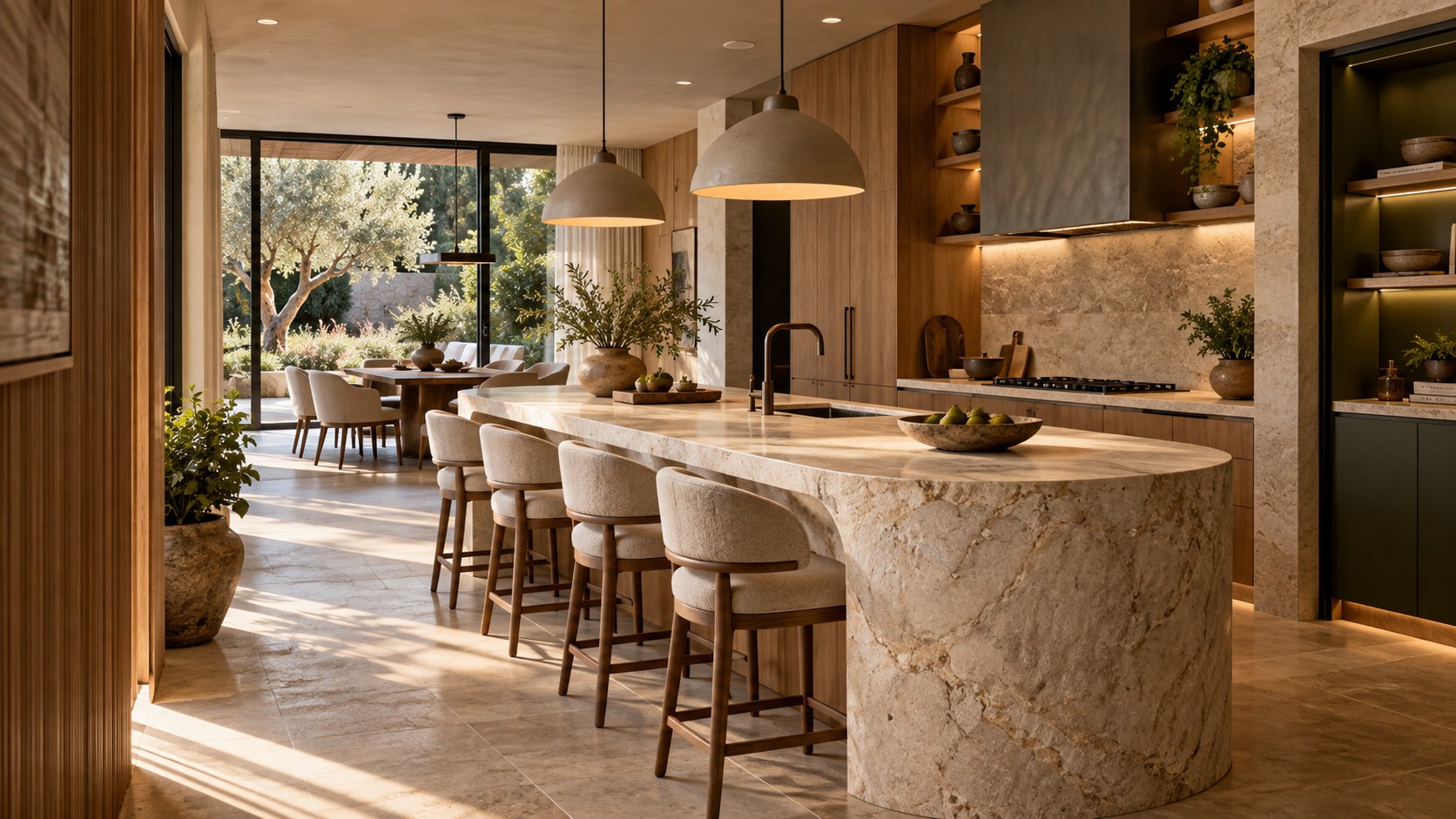
Four organic-modern kitchen concepts reveal how pale oak, blackened steel, green marble, and terracotta can transform a shared spatial idea. Beyond their distinct atmospheres, the comparison explores working islands, material hierarchy, circulation, lighting, detailing, and the decisions that make a kitchen inviting long after its first impression.
The organic-modern kitchen is often introduced through mood: warm timber, stone with expressive movement, soft furniture, and the sense that domestic life has been allowed to become less formal. Yet a kitchen is an unusually unforgiving place to design through atmosphere alone. It is a working room with demanding relationships between preparation, storage, cooking, cleaning, movement, and social occupation. Materials are touched repeatedly, lighting must help people see what they are doing, and surfaces must remain convincing after the original immaculate scene becomes an everyday environment. The most satisfying version of organic modernism does not simply borrow the textures of nature. It gives those textures a clear place within an architectural system.
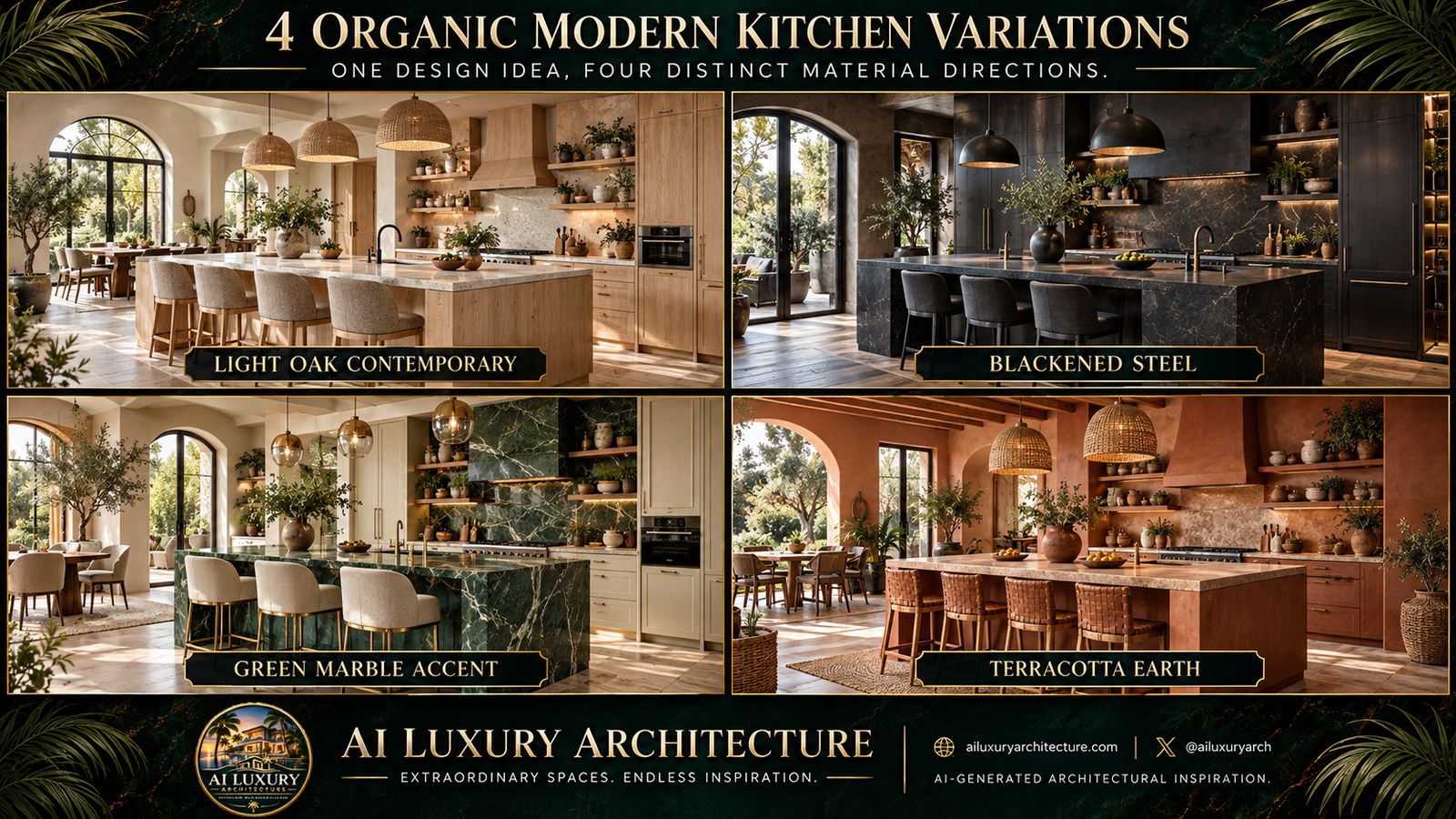
Four conceptual kitchens illustrate how dramatically the same broad design intention can change through material direction. One is bright with pale oak cabinetry, soft upholstered stools, light stone, and woven pendants. Another concentrates visual weight in dark cabinetry, charcoal stone, blackened metal, and pendant shades. A third makes deep green veined stone the central architectural event, balanced by cream cabinetry and warm metallic accents. The fourth turns toward clay-colored cabinetry, warm plaster-like surfaces, woven fibers, and a more earthy, relaxed atmosphere. These are four distinct AI-generated interpretations, not documented alternatives for a particular built residence. Their value is comparative: each raises different questions about scale, glare, touch, intimacy, and the degree of visual activity a kitchen can sustain.
What connects the scenes is more important than any individual finish. All position a substantial working island at the meeting point of practical activity and social life. Each uses a perimeter of cabinetry and cooking surfaces as a working backdrop. Seating at the island acknowledges conversation as part of contemporary kitchen use. Daylight, planted elements, and adjacent dining space prevent the kitchen from becoming an isolated technical box. Those common relationships provide a productive way to examine choice. What happens when light wood gives the entire room a shared tone? How does an almost black material field change its apparent boundaries? When should a richly veined stone be allowed to dominate? What does an earthy palette ask of lighting and maintenance?
The following study considers those questions as architectural decisions rather than as a ranking of fashionable looks. It follows material character through cabinetry, islands, windows, ceilings, work zones, the dining edge, and the small transitions where a beautiful image must become a plausible room. The goal is not to choose a universally superior kitchen, but to understand how a consistent program can accommodate several distinct identities without losing spatial clarity or everyday usefulness.
The Common Framework: Designing the Kitchen Before Choosing Its Mood
A material palette gains authority when the underlying plan has a reason for being the way it is. The four conceptual kitchens share recognizable ingredients: a large island, a full-height cabinet zone, a cooking wall with integrated or closely related storage, pendant lighting, bar seating, and an opening toward another inhabited space. The arrangement offers an important lesson even where the exact details differ from image to image. A kitchen’s architectural order must be legible before its textures become interesting. Otherwise attractive cabinetry is simply placed around a collection of appliances, while the person using the room must negotiate the leftover distances.
The island is the most prominent object in all four scenes, but its job is not merely to provide a photogenic block of stone or wood. It establishes a second line of work parallel to the perimeter. Depending on the specific arrangement, it may contain a sink, support preparation, accommodate casual eating, or give guests a place to gather without entering the active cooking zone. These functions do not always fit comfortably within one surface. An island crowded with a sink, hob, stools, and decorative objects can look generous while leaving very little clear worktop. Architectural planning begins by allocating actual activities to areas of the surface, then deciding which part should become a social face. The visual mass of the island follows those decisions.
The distance between island and perimeter deserves the same attention as the island itself. Cooking, dishwashing, and storage require doors and drawers to open, people to turn, and sometimes more than one person to move through the kitchen. If the circulation is too narrow, the dominant central feature becomes an obstacle. If it is excessively broad, routine movement grows cumbersome and the working relationship between counters weakens. The right dimensions depend on equipment, door swings, accessibility needs, and the intended number of users; no persuasive image can determine them by appearance alone. What it can reveal is whether the island feels aligned, whether its ends permit a natural route, and whether the perimeter forms an intelligible background rather than an uncoordinated wall.
A successful kitchen also differentiates two kinds of movement. One belongs to the people preparing food: moving between storage, cleaning, preparation, and cooking. The other belongs to family members and guests passing between entry, dining, and living spaces. These paths may touch, especially around a sociable island, but they need not cross at every point. Stools positioned on the outward-facing side of an island can let guests remain present without occupying the working aisle. A dining zone beyond the island extends the social sequence while giving the kitchen a clear limit. In the lighter and greener variations, the adjacent dining furniture and generous arched openings underline this idea of continuity without complete functional overlap.
Organic modernism becomes meaningful at this level because it avoids a false opposition between softness and discipline. Rounded pottery, woven shades, natural textures, and planted objects can make a kitchen feel welcoming, but the essential structure of the room still depends on straight, durable working surfaces and predictable movement. Warmth comes from allowing the functional order to support relaxed life. A kitchen is not successful simply because it resembles a furnished living room. It succeeds when the skills of spatial planning make cooking, informal conversation, and adjoining domestic activities compatible.
This underlying framework also protects a design from rapid aesthetic fatigue. A cabinet finish can change, and a preferred stone may eventually be replaced. The relationship between a comfortable working aisle, a useful island, sufficient storage, and a connected dining room can remain valuable much longer. Material decisions are consequential, but they are best understood as interpretations of an architectural plan that is already capable of serving its occupants.
Light Oak Contemporary: Warmth Through Lightness and Repetition
The light-oak interpretation is the clearest demonstration of how a kitchen can feel generous without relying on large gestures of contrast. Pale oak cabinet fronts and island faces carry a warm, continuous grain across the working elements. Light stone rests above them rather than competing with them. Soft grey-beige upholstered stools and woven pendant shades extend the tonal family; small dark fittings provide precise interruptions. The image’s arched openings and adjacent dining corner bring daylight and planting into the composition. The atmosphere appears gentle, but its architectural force lies in the controlled relationship between these many low-contrast surfaces.
Pale timber can be an effective organizing material because it has texture without necessarily introducing a strong color block. When used continuously on lower cabinets and the island, it connects surfaces that otherwise belong to different functions. The island stops looking like a freestanding monument and begins to read as an extension of the perimeter’s construction language. Yet continuity requires editing. If the grain changes direction unpredictably between tall doors, drawers, side panels, and the island, the eye encounters many small disagreements. A deliberately chosen rhythm of vertical or horizontal grain can give cabinetry an architectural scale, especially across long fronts. Individual knots and natural variation remain welcome within a wider system that appears considered.
The material also changes the perceived proportion of a room. Light cabinet faces tend to reveal themselves without carrying the same visual weight as dark panels, particularly in scenes where the worktop and walls are similar in value. In a large kitchen this can preserve a sense of openness; in a compact kitchen it can keep essential storage from appearing too oppressive. But the danger is visual flattening. Pale timber, pale stone, cream plaster, beige seating, and woven lights can become an undifferentiated field if every surface is equally bright. Shadow and depth are needed. Recessed shelves, small under-cabinet gaps, door reveals, and localized dark fixtures can clarify which surfaces are forward, which are recessive, and where a hand reaches to open a cabinet.
The woven pendants are important in this variation because their texture belongs at the scale of human experience. They lower the perceived ceiling over the island and create a small domestic territory within a bright volume. Their presence should not be confused with adequate task lighting. A pendant that casts a decorative pattern may produce attractive atmosphere while leaving the preparation surface unevenly illuminated. The practical design can allow these fixtures to establish intimacy, supplementing them with controlled under-cabinet sources where knives, washing, and food preparation occur. The result is a lighting hierarchy rather than an insistence that every fixture be both functional and decorative.
The pale palette makes craftsmanship unusually visible. Misaligned drawer reveals, uneven door spacing, abrupt timber-to-stone junctions, and thick appliance frames can disrupt a calm field precisely because there is less strong color to divert attention. One should examine how the island worktop meets its end panels, whether the top has a believable thickness, and where a protective edge is necessary. Timber near splash-prone locations requires deliberate detailing; the visual warmth of wood cannot substitute for appropriate surface protection and maintenance. A good kitchen allows the material to be tactile without requiring users to treat it as fragile furniture.
This variation suggests that organic modernism need not be heavily sculptural. Its richness can come from the small differences between oak grain, stone movement, woven fiber, ceramic vessels, and planted leaves. When each family remains subordinate to the plan, the kitchen feels warm without turning rustic and contemporary without turning sterile. Its discipline is one of proportion and repetition. The most valuable lesson is not to select pale oak for every kitchen, but to notice how much architectural calm can emerge when a modest number of materials repeat with care.
Blackened Steel: Composing Depth Without Sacrificing Domestic Comfort
The dark interpretation changes the same essential kitchen program into a study of concentration and shadow. Cabinetry appears deep charcoal or black; the island reads as a substantial dark stone volume; pendant shades, seating, and metal detailing occupy closely related tones. Fine veining in the stone, reflective highlights, greenery, and daylight from an arched glazed opening prevent the composition from becoming a featureless silhouette. Compared with the light-oak interpretation, this room feels enclosed and deliberately focused. Its appeal is not that darkness is more sophisticated, but that controlled contrast can make an everyday workspace feel architecturally precise.
Dark kitchens are often treated as a photographic effect: decrease brightness, increase contrast, and allow dramatic pendant lights to become the principal subject. That approach can produce compelling images but uncomfortable rooms. A practical dark kitchen must still reveal counter edges, open drawers, handholds, ingredients, and objects in use. The architectural challenge is to distribute enough light for clear work without illuminating every surface into visual noise. Task lighting under shelves or wall cabinets can make the preparation wall legible. Ambient light can establish a comfortable background level, while pendants help define the island. These layers should be designed from the actual activities taking place, not merely from a desire to show glossy stone catching light.
The dark island becomes visually heavy because its front and top belong to a closely related material family. This can be useful in a generous room: the island anchors the composition and gives the eye a center amid glazing and circulation. Yet perceived mass should be balanced against its actual dimensions. A thick stone waterfall edge may feel appropriate in one room and monumental in another. A dark end panel can be visually lightened through a recessed plinth, a change in texture, or a carefully placed shadow line, but such details must remain plausible. An island cannot appear to hover without a convincing support system, and a continuous stone wrap should accommodate practical access and the realities of fabrication.
Blackened metal is particularly effective at the scale of edges and joints. It can outline glazing, sharpen a shelf bracket, articulate a handle, or provide a quiet connection between timber and stone. Used on every surface, however, it may cause distinct objects to collapse into one dark field. The most refined treatment gives it a limited responsibility. The cabinetry establishes broad planes; the stone makes the island and backsplash substantial; metal describes where those planes meet or where a person interacts with them. This hierarchy allows the eye to understand the kitchen’s construction rather than simply reading the room as dark.
Daylight is not optional to the dark scheme’s success. The glazed opening toward greenery introduces a distinct exterior brightness and establishes depth beyond the cabinet wall. It gives occupants visual relief and allows the material field to change across the day. At night, that relationship reverses: the interior becomes luminous against dark glass, and reflections may obscure the garden. Low, localized light near the facade and carefully illuminated exterior elements can preserve a sense of depth, though the room should not rely on constant theatrical garden lighting to feel complete. Dark rooms benefit from maintaining an intelligible relationship to the wider house, including its dining and circulation zones.
The most persuasive lesson of the blackened-steel direction is that a kitchen can be visually intense while its organization remains calm. Contrast is best concentrated at the boundaries between tasks, materials, and volumes. Darkness makes clear proportions and purposeful illumination more important, not less. When those relationships are sound, the result becomes an intimate architectural counterpoint to the broad brightness of contemporary living spaces.
Green Marble Accent: Letting One Material Carry the Visual Emphasis
The green-stone interpretation introduces color as a concentrated architectural event. Deep green veining appears on the principal island and the cooking-wall surface, while creamy cabinetry, lighter stools, warm brass-toned pendants, and botanical details create a softer supporting field. Unlike the light-oak kitchen, which distributes visual interest through gentle texture, or the dark kitchen, which gathers it through tonal mass, this version places most of its dramatic character in the stone itself. The result provides a useful lesson in restraint: an expressive material becomes more convincing when the rest of the room is composed to receive it.
Strongly colored natural-looking stone can change how a kitchen is read from an adjacent room. The island becomes a recognizable element even at a distance, and the backsplash creates an echo that relates the island to the working wall. Those two surfaces establish a visual conversation across the working aisle. The effect works best when the material's presence follows meaningful architectural roles. A large island front is naturally visible to guests, while the range wall has a clear position within the cook's field of activity. The same stone used as tiny disconnected strips on many other surfaces would dilute that connection by turning a singular gesture into a repeated decorative motif.
Stone pattern requires an unusual form of design attention because it is never simply a uniform color. Veining can be dense, fine, directional, or irregular. At the scale of a large island, the pattern changes the apparent length and mass of the object. A dramatic vein that turns around a corner may become a focal event, but a careless discontinuity can break the illusion of coherent material depth. Where bookmatching or deliberate vein alignment is desired, it should arise from the chosen slabs and fabrication possibilities rather than an image of impossible perfection. Natural variation is an asset if it is understood as part of the composition. The goal is to make the stone feel selected and placed, not digitally repeated.
The cream cabinetry is a critical partner. By holding the back wall in a quieter light tone, it allows the green to retain its depth without making the whole room dark. Warm brass fixtures bring a second, finer register of color. Their function should be precise: perhaps identifying pendants, handles, or selected fittings. Too much polished metal would compete with the stone, especially where it reflects concentrated highlights. A muted or brushed quality often supports the organic direction more quietly, but the correct choice depends on the overall reflectance and the amount of natural light. The important point is that brass operates as punctuation rather than another continuous surface.
This palette raises a subtle issue of spatial hierarchy. From the living or dining area, one may see both the green island and the large green range wall. If both are equally active, the room can become visually crowded. Their relative importance can be tuned through scale, light, and material extent. Perhaps the island remains the principal expressive block, while the backsplash is narrower or more shaded. Alternatively, a calm island top could sit below a more concentrated wall plane. The approved concept depicts both in the saturated family, which makes the discipline of their relationship essential. An architectural scheme should be reviewed from multiple viewpoints, not only from the carefully staged perspective that reveals all the best surfaces at once.
The green-marble direction shows how luxury can be achieved through concentration rather than abundance. One powerful material family, repeated in architecturally meaningful places and supported by quieter cabinetry and seating, can give the kitchen a lasting identity. Its success rests on editing the surrounding surfaces with the same attention devoted to selecting the stone.
Terracotta Earth: Tactility, Warmth, and the Architecture of Everyday Use
The terracotta interpretation shifts the kitchen toward an enveloping warmth. Clay-colored cabinetry and plaster-like wall surfaces share a family of burnt orange, rose, and earthy brown tones. Warm timber, woven pendants, tactile stools, pottery, and natural-fiber details deepen that atmosphere. The scene includes arched openings and an adjoining dining area, but its sense of place comes less from the outline of those arches than from the way the surfaces absorb and return light. It feels domestic, textured, and relaxed. The architectural challenge is to preserve that generous atmosphere without allowing an accumulation of warm objects to obscure the kitchen’s working purpose.
A terracotta palette can be applied in several different ways, each carrying distinct consequences. Clay color on cabinet fronts reads differently from plaster-like color on the walls; a glazed ceramic surface is unlike a matte mineral finish; a stone island in a warm hue has a different mass from a timber one. The concept uses related tones across cabinetry and adjacent surfaces, but a credible proposal would distinguish the materials by function and tactile character. The working countertop should be suited to repeated use, while a wall might carry a softer, more absorbent texture. The contrast between a durable horizontal surface and a more expressive vertical plane can produce richness even when their colors are close.
This direction is especially revealing about light. A warm room under morning sun may glow, but a palette built entirely around warmth can become heavy when natural light is limited. Balanced daylight, areas of pale surface, and a few darker accents help retain depth. At night, overly amber illumination can turn the various clays, woods, and woven fibers into one orange field. Lighting can remain warm while preserving enough tonal distinction for work surfaces, handles, and seated occupants to be clearly seen. The pendants pictured in the concept contribute tactile scale; they are not a substitute for dedicated illumination at the range, sink, and preparation zone.
The arched openings evoke an informal dialogue between a contemporary working kitchen and a broader lineage of Mediterranean-influenced interiors. They provide curved forms against predominantly rectilinear cabinets and counters. But arches are powerful spatial devices and should not be added as decorative labels without relation to the plan. An opening can frame the dining area, focus a view of planting, or offer enough wall thickness to make a passage feel sheltered. Its geometry should suit the structure and the spaces on both sides. A beautifully proportioned arch can be more effective than repeating arches at every doorway solely to establish a style.
There is a useful difference between an earthy kitchen and a kitchen that appears artificially aged. The former uses the natural variation of materials, a nuanced palette, and honest textures to create depth. The latter may depend on distressed finishes, decorative artifacts, and visual nostalgia unrelated to the actual building. In a refined residential setting, a small number of well-proportioned clay-toned surfaces can provide warmth while contemporary fittings, integrated equipment, and precise storage maintain clarity. An island with a clean profile beside textured plaster may speak more convincingly than a room filled with deliberately antique-looking objects.
Terracotta Earth therefore offers something different from the other three directions. It demonstrates how material temperature and texture can make a hard-working contemporary kitchen feel settled and familiar. Its strongest qualities are not decorative abundance but tactile contrast, moderated light, and a sense that the kitchen belongs to a larger domestic life. It works when the room is comfortable to inhabit after the photographic moment ends.
Islands, Work Zones, and the Social Geometry of an Open Kitchen
The four material directions vary dramatically, yet the island remains their shared spatial instrument. This repetition is useful because the island is where contemporary kitchens most often try to reconcile incompatible demands. It must be a clear and durable work surface, a possible place for water or heat, an area for storage, a bar for informal conversation, and a visual object seen from adjacent rooms. These responsibilities can reinforce one another, but they cannot simply be stacked without design decisions. The island must be organized in plan and section before the elegance of its cladding can be judged.
Consider the side of the island facing the working wall. It belongs primarily to preparation and circulation. The location of a sink or other equipment changes how that side operates, and it affects the location of drawers, refuse storage, cleaning supplies, and clear counter space. On the opposing side, stools create a social perimeter. These two faces should not be equally loaded with activity. Someone chopping, rinsing, or plating needs space and light; a guest needs somewhere to place a glass without occupying that work surface. An overhang may offer legroom, but its thickness and support need to be plausible, and it should not make the whole island appear precarious. A working surface is a carefully arranged field, not an uninterrupted photograph of stone.
Seat count should emerge from credible width. Rendered images sometimes place many chairs along an island because repetition looks harmonious. In use, each person needs room to sit, turn, and move their arms, while circulation behind the chairs must continue. End seats can be useful, but they affect the cross-route between kitchen, dining, and living space. The conceptual scenes show three or four stools depending on the interpretation; the broader lesson is to resist treating the number as a luxury metric. Fewer well-spaced seats can make the kitchen more hospitable than a crowded row that obstructs passage and interferes with work.
The perimeter is equally consequential. Tall cabinetry provides a strong architectural backdrop and an opportunity to conceal storage and equipment, but it also concentrates door swings and access requirements. A long wall of cabinetry can feel calm when its modules align, yet a door arrangement that forces one appliance to open into the path of another may be operationally poor. The cooking wall should be composed around actual use: sufficient landing space near heat, accessible utensils, appropriate extraction, and a workable relationship to the island. A dramatic range wall can anchor the room, but an attractive backsplash does not solve insufficient preparation area.
Integration with dining should feel intentional. A dining area visible beyond the kitchen can provide a destination and prevent the island from becoming the only place to gather. The route between them should support serving food, clearing dishes, and moving around seated occupants. A generous arched opening in the lighter or earthy interpretation can frame that relationship. In a darker scheme, a glazed opening and contrasting floor can signal a different zone without constructing a barrier. The important point is that the dining area needs its own spatial identity. When every seat faces the island, the larger room can resemble a showroom with no hierarchy beyond the central feature.
Storage planning is often where aesthetic ambition meets ordinary life most directly. Minimalist cabinetry suggests empty counters, but a household still needs to accommodate cookware, small appliances, dishes, food, and the objects that accumulate during use. Integrated storage can preserve visual calm, provided it is genuinely usable. Deep drawers may offer different access from tall cupboards; shelves can make frequently used items convenient, but open display increases visual activity and cleaning. The scenes use open shelving as a quiet layer of ceramics and planting. In practice, such shelves are most successful when treated as a small supplement to functional closed storage rather than as the primary solution.
The organic-modern ambition adds one further dimension. Softened corners, woven textures, planted details, and natural stone can humanize a kitchen, but they should not obscure the clarity of its practical geometry. Architectural softness is most persuasive when it emerges from a comfortable plan. When the island proportions, operational zones, storage, and circulation are resolved, even a very dark or strongly colored material direction can feel welcoming. Material character then enriches daily life rather than trying to compensate for its frustrations.
Light, Texture, and the Threshold Between Kitchen and Landscape
Across the four concepts, daylight and planted views prevent the kitchens from becoming self-contained material compositions. The bright oak version brings the garden close through its generous arched windows. The Blackened Steel version relies on exterior brightness to create depth against dark cabinetry. The green-stone kitchen uses the garden as a color echo, while the terracotta palette finds an important counterpart in open air and soft sun. These relationships are not merely scenic. Daylight and landscape help establish how a person reads proportions, sees material texture, and moves between kitchen and dining space.
Natural light changes the apparent color of nearly every material in the room. Pale oak can become golden in low sun and more neutral beneath a cloudy sky. Blackened metal may appear flatter when strongly backlit, while dark stone reveals its variation under controlled side light. Green marble-like surfaces can shift toward cooler or warmer tones depending on nearby walls and glazing. Clay finishes can become intense under direct warm light and muted in shadow. For this reason, a palette should not be selected by looking only at samples under showroom illumination. In a built design, one would study the materials where they will be seen at different times, testing their relationships rather than assuming a single photographic color is permanent.
The position of glazing matters as much as its size. A long island placed parallel to a window can receive beautiful oblique light along the worktop, but excessive glare or strong reflections may make the surface uncomfortable to use. A window behind a preparation sink can connect work to the garden, but access for cleaning and the location of splash-prone surfaces affect the detail. A large arched opening creates an expressive silhouette, yet its framing and wall thickness need to be credible, and its orientation may call for additional solar control. Daylight should be invited as an architectural partner without being allowed to override visual comfort.
Artificial lighting should follow the hierarchy already present in the materials. A task light aimed at the worktop must reveal edges and ingredients reliably. Under-cabinet or shelf lighting can provide this function without making pendants excessively bright. Pendant fixtures above an island can give human scale and accent, but they should be chosen for how they illuminate actual occupied areas, not merely how their silhouettes repeat. Cabinet interiors can receive discrete light where helpful, although continuous display illumination can make a kitchen look like a retail environment. The most refined approach assigns each source a responsibility and leaves some surfaces quieter than others.
Reflectivity deserves special examination. Polished or lightly reflective stone, glazed tile, dark metal, and glass can multiply point sources and create hotspots across the room. In the green variation, highly veined stone already attracts attention; uncontrolled highlights would add a competing visual layer. In the dark variation, a strong pendant reflection might become more visible than the worktop itself. The lighter and terracotta rooms have different risks: excessive even illumination can flatten their nuanced textures. Honed and brushed surfaces, shielded fixtures, and a deliberate balance of light and shadow can help preserve material depth. Darkness should not be eliminated simply because the room contains expensive finishes.
Landscape also influences the perception of enclosure. An organic-modern kitchen can feel deeply connected to nature without having plants physically invade the room. A framed tree or shaded terrace beyond the dining area can establish a calm relationship between architecture and the site. A view across a planted courtyard may offer privacy as well as daylight. The window’s position determines which parts of the landscape are seen from standing and seated heights. Designing those sightlines deliberately gives the outside a role in daily experience rather than treating it as a scenic backdrop added at the end.
The essential lesson is that organic modernism is not a claim that natural materials automatically create a connection to nature. The connection is constructed through view, daylight, orientation, scale, and the way surfaces respond to changing conditions. When those elements are planned with care, pale oak can glow softly, dark stone can have depth, green marble can feel related to planting, and terracotta can achieve warmth without excess. The atmosphere becomes architectural because it changes intelligibly with the day.
Detail, Durability, and the Long Life of a Material Direction
An image can make a kitchen feel complete at the moment it is first encountered. Architecture must anticipate the hours and years that follow. Handles will be touched, drawers opened, counters cleaned, chairs moved, and appliances repaired. Natural textures will vary with light and use. A kitchen cannot remain permanently free of utensils or the traces of meals. The long-term value of a material direction therefore depends on whether it remains convincing once ordinary domestic activity enters the composition. Durable refinement begins at the junction between the conceptual effect and the physical detail.
A carefully designed island illustrates this tension. Stone fronts may be visually continuous with a top, but their corners need believable thickness and support. Cabinet doors and drawers behind an apparently uninterrupted face still require access. Plinths need protection from shoes and cleaning equipment. If a heavy-looking island is visually lifted through a recessed base, that recess should be considered in relation to its stability, cleaning, and the surrounding floor. Light oak, dark stone, green marble, and terracotta-colored fronts each create different impressions, but every one relies on a precise and maintainable construction logic.
Worktop finish is both an atmospheric and operational choice. Highly polished surfaces reflect light and can visually enrich a room, yet reflections can obscure minor objects, reveal marks, or multiply bright fixtures. A honed surface may appear quieter, but its maintenance expectations vary by material. Some natural stones are sensitive to particular substances, while engineered and ceramic-like alternatives have their own fabrication and edge constraints. The visual language of an image cannot establish the physical properties of a slab. An architectural proposal should distinguish appearance from verified material behavior, especially where food preparation, heat, splashes, and daily cleaning overlap.
Cabinetry has similar obligations. The light-oak direction relies on coherent grain, but that grain may occur on veneers, solid components, or other manufactured assemblies with different detailing needs. The blackened direction depends on a consistent dark finish, which can reveal contact or edge damage differently from pale timber. Cream cabinetry beside green stone is deliberately quiet, so poorly aligned doors may become more visible. Clay-colored surfaces can create warmth, but their exact finish determines their response to abrasion and cleaning. In each case, a strong concept requires a practical specification rather than assuming the photograph establishes the necessary technical information.
Wet and heat-adjacent conditions demand intentional transitions. A timber front near a sink should not be treated as though water exposure is irrelevant. A richly veined backsplash behind a cooking zone must be paired with suitable detailing at appliance and counter junctions. Open shelves above preparation surfaces accumulate dust and cooking residue according to their position. Lighting channels, cabinetry reveals, and recessed hardware should remain accessible for cleaning where needed. One can make these components visually quiet, but denying their presence does not produce better architecture. It produces a room whose apparent elegance may be difficult to preserve.
Material aging can become a form of character rather than a sign of failure when it is anticipated. Oak may change in tone; stone can acquire subtle marks; metal finishes respond to touch; woven fibers and upholstery may soften through use. The question is whether these changes remain compatible with the intended room. A kitchen that only appears convincing under immaculate photographic conditions places a demanding burden on its occupants. A kitchen with calm proportions, durable working surfaces, and a coherent material language can feel richer as it becomes inhabited. This is a more meaningful standard of luxury than visual perfection.
The four palettes also reveal that choice should consider the wider residence. A dark, concentrated kitchen may serve as a compelling counterweight within a pale open-plan living space. A light-oak kitchen can create continuity with warm timber floors and a modest ceiling. Green stone may become the singular material event that connects kitchen and dining, while the terracotta version might extend the warmth of surrounding plaster and garden-facing rooms. The kitchen should not be treated as a collectible image installed in isolation. Its material logic can strengthen the sequence of spaces before and after it.
What makes these conceptual variations useful is the visibility of their tradeoffs. Light oak offers brightness but requires careful control of flatness and detailing. Blackened steel provides intimacy and precision but demands an especially thoughtful lighting strategy. Green marble creates a powerful center but depends on restraint around it. Terracotta brings tactile warmth but must avoid decorative saturation and difficult-to-maintain textures in working zones. None is inherently more authentic, timeless, or luxurious. Each becomes convincing when the design gives its materials a justified architectural role and acknowledges the rhythms of everyday use.
An organic-modern kitchen is not defined by one color, one stone, or a prescribed collection of handmade-looking objects. The four conceptual directions make that clear. Pale oak creates a spacious and quietly textured room; dark metal and charcoal stone make the island feel concentrated and architectural; green veining provides an expressive center; clay tones and natural fibers encourage an earthy sense of domestic warmth. Each interpretation can be sophisticated because each can support a coherent relationship between material, light, furniture, and the people who use the room.
The comparison also exposes a common mistake in design decisions: choosing an atmosphere before understanding the space that must sustain it. An attractive island still needs sensible working surfaces and circulation around its occupied stools. An expressive cooking wall still needs storage and accessible cleaning. Warm pendants still need appropriate task lighting nearby. Windows and planting should frame actual patterns of life, not simply fill the background of an image. Good kitchen design is the discipline of making those practical relationships feel natural rather than intrusive.
Material richness becomes durable when the plan gives it room to operate. A dramatic stone deserves quieter neighbors. Timber benefits from thoughtful grain direction and convincing joins. Woven textures contribute human scale where their use remains practical. Shadows, view, and changes of daylight are as important as the finishes themselves. The aim is not to combine every attractive direction into one room. It is to choose a clear hierarchy and develop it consistently through cabinetry, thresholds, lighting, storage, and the dining edge.
These images represent AI-generated architectural inspiration rather than a documented building or completed kitchen. Their value lies in allowing several material propositions to be examined side by side without mistaking appearance for proof of construction or performance. A successful interpretation would be the one that suits its spatial context, supports its intended routines, and remains welcoming beyond the initial impression. Organic modernism reaches its fullest expression when natural character and practical precision belong to the same architectural thought.
Related Visual Inspiration
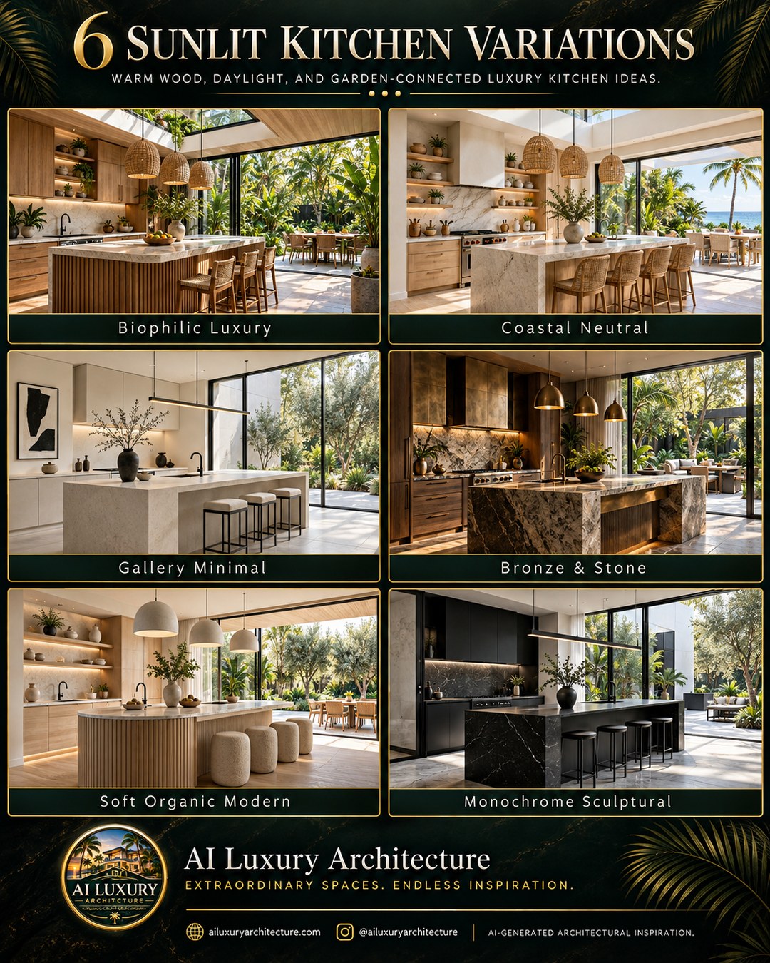
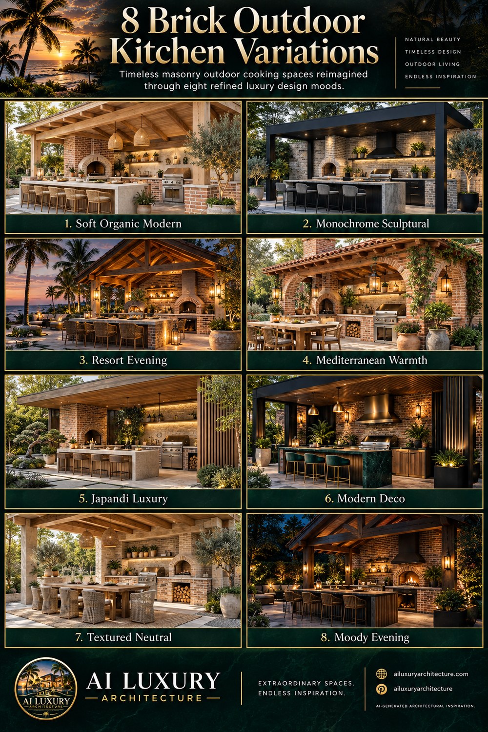
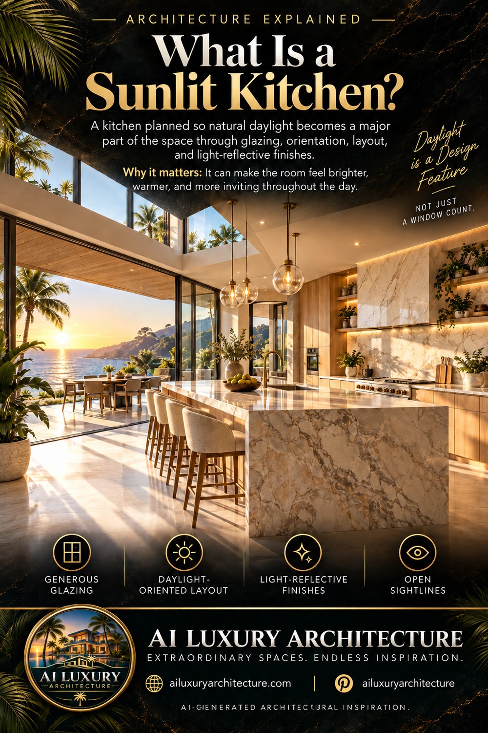
Additional AI-generated architectural studies connected to the ideas explored in this article.
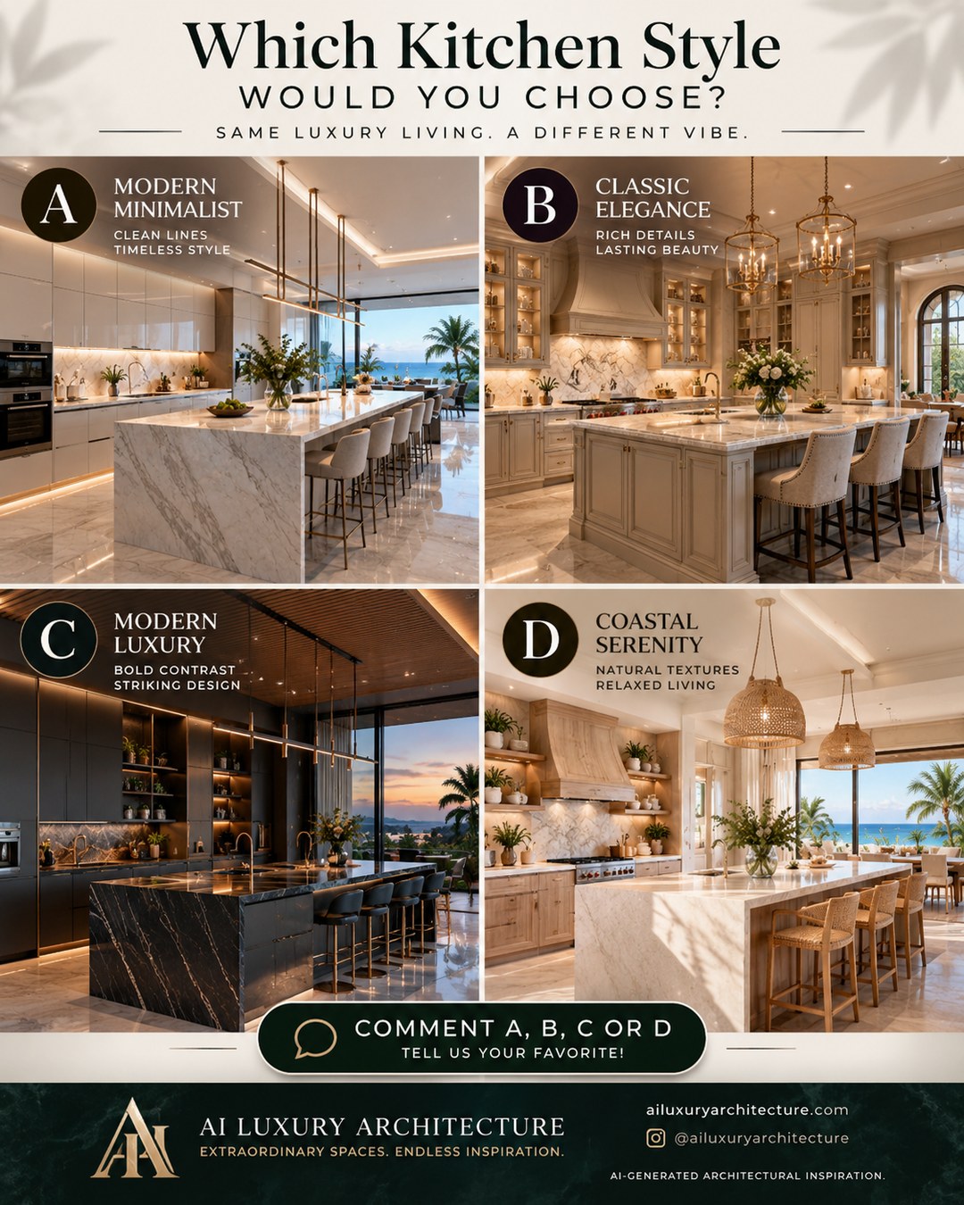
WOULD YOU CHOOSE?
AI disclosure: This article explores AI-generated architectural inspiration and conceptual design ideas. It does not describe a claimed real-world property, client, architect, or built project.