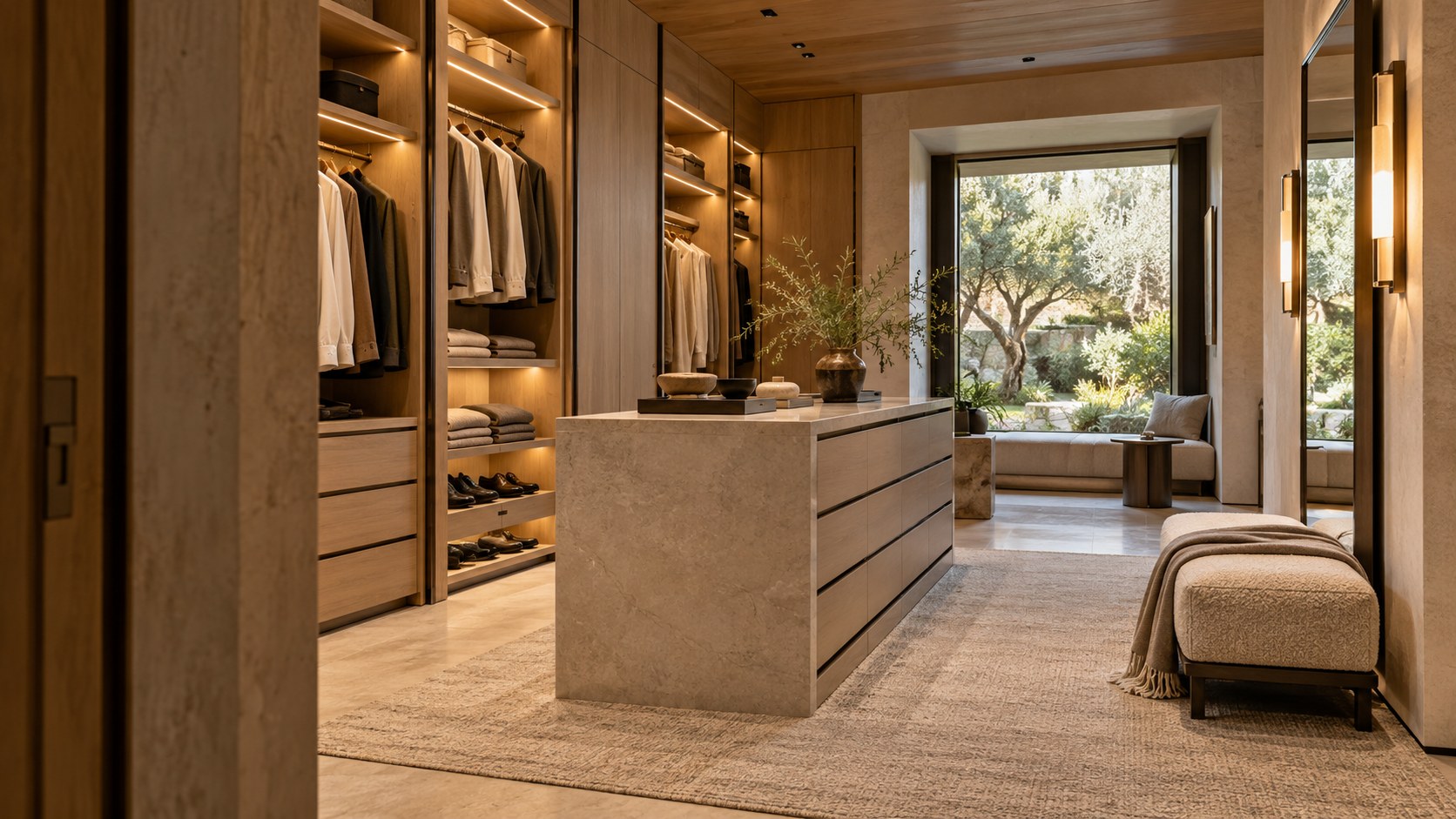
Eight imagined walk-in closet interiors reveal how spatial planning, lighting, storage, and material character can transform the same room type. From textured neutrals and light oak to blackened steel, green marble, terracotta warmth, and a sociable dressing suite, the most lasting luxury comes from clarity of use.
A walk-in closet can be one of the most revealing rooms in a residence. Its contents are personal, but its architectural obligations are highly public in the sense that they involve recognizable principles: circulation, proportion, visibility, lighting, material continuity, and the difference between a pleasing perspective and a place that works every morning. A generous dressing room can create a quiet interval between sleeping and the rest of the day. It can also become an inconvenient corridor lined with expensive cabinets if its arrangement begins with display rather than movement.
Eight imagined closet variations offer a useful way to test this distinction. Textured Neutral, Moody Evening, Light Oak Contemporary, Blackened Steel, Green Marble Accent, Terracotta Earth, Linen & Limestone, and Entertaining Ready share the idea of carefully ordered wardrobe storage around a central furnishing. Yet their characters change substantially through palette, reflectance, material weight, and the social expectations implied by furniture and accessories. Some make the stored clothing the central visual subject; others turn the island or the evening atmosphere into the dominant presence. Those differences are not merely matters of taste. They suggest different relationships between occupation and display.
The concepts are AI-generated architectural inspiration, not representations of completed residences. Their value lies in the questions they make visible. How much space does an island require when drawers must open? What does a dark glazed cabinet do to the perception of its contents? When does beautiful stone cease to be a useful work surface? Can a bright room remain comfortable at night? What should be visible from the adjacent bedroom, and what should remain deliberately private? A lasting dressing room answers these questions through an integrated design, not through a succession of decorative purchases.

The Dressing Room as a Sequence of Daily Movements
A walk-in closet may be described by its cabinetry, but it is experienced as a sequence. One enters, locates garments, opens storage, compares options, retrieves accessories, dresses, checks the result, returns objects, and leaves. The architecture should make those actions intelligible without requiring the occupant to weave repeatedly around a central feature. The images of the eight variations demonstrate the appeal of a clear central island flanked by organized wardrobe runs. Their frontal viewpoints make the storage read almost as a room-sized composition. What a photograph cannot establish, however, is whether the margins between those elements remain comfortable when someone is actually using them.
The route into the room establishes its character before the wardrobe comes into view. A direct opening from a bedroom can make the closet feel like a natural extension of a private suite. An offset entry can prevent its contents from being visible immediately from the bed or a nearby hall. A passage shared with a bathroom or laundry space offers practical convenience, but it also increases the number of movements passing through the dressing zone. None of these arrangements is universally better. The relevant question is whether the room is a destination for dressing or a shortcut through other functions. If circulation cuts through the center while another person is using drawers or sitting at a bench, the spatial experience quickly loses its composure.
The central island is a useful illustration of this problem. In most of the concepts, it acts as a horizontal counterweight to tall cabinetry. It offers a place for smaller objects, a sense of symmetry, and a furniture-scale element in a room otherwise dominated by vertical storage. Its footprint is only the beginning of the calculation. Drawers may open on more than one side; a person retrieving a tray requires space to bend and step backward; a second person may need to pass; and a stool or bench adds its own operating area. A narrow strip of visible floor can be aesthetically clean in a picture while becoming unusable as soon as drawers extend into it.
A useful planning method is to draw the closet in several occupied states. Consider one person selecting clothes on a quiet morning, two people preparing to leave simultaneously, and someone bringing in folded laundry or an oversized suitcase. In each situation, opening doors and drawers should not stop all other movement. The island might become shorter, shift toward a wall, or disappear altogether if circulation is more valuable than display. A wall-side counter or a generously planned peninsula can perform many of the same tasks without dividing a modest room into two narrow corridors. The island is not an entitlement attached to the word luxury; it is one possible response to a particular room.
The body also provides an important scale check. High shelves can store infrequently used items but should not be presented as daily access without a realistic means of retrieval. Hanging spaces must account for differing garment lengths, while shelves intended for folded pieces need enough depth to avoid becoming cluttered shadow boxes. Mirrors require positions from which a person can step back and see an entire outfit. A seat needs clearance for sitting and rising; a frequently used drawer should not open directly across the place where someone stands before a mirror. These observations belong to architecture because they influence the location of fixed partitions, electrical points, lighting, and cabinetry.
Sightlines deserve the same attention as dimensions. A symmetrical view down an island toward a framed opening, evident in several of the lighter concepts, can make a closet feel especially composed. Yet a long straight view into an exposed wardrobe may also communicate visual busyness from the adjoining bedroom. An architect might rotate the entry, use a shallow return wall, or alternate open shelves with closed storage to give the room a calmer threshold. The purpose is not to conceal every garment but to choose where collection and display begin. A dressing room should never feel like its contents are confronting the occupant all at once.
Privacy and companionship can coexist. One person may prefer a quiet, solitary routine; another household may treat the dressing room as a shared area in which two people talk while preparing for an occasion. The plan can support either without making the whole room public. A comfortable central path, a genuinely usable bench, and discreet storage for everyday clutter can give the room a social dimension while keeping the primary work of dressing clear. This distinction prepares the ground for evaluating the eight styles: their atmosphere matters only when the underlying sequence works.
Textured Neutral and Moody Evening: Two Ways to Shape Attention
Textured Neutral and Moody Evening sit at opposite ends of the brightness spectrum, yet both use controlled contrast to make the closet feel deliberate. In the first concept, cream and taupe cabinetry, pale central furniture, upholstered seating, and warm integrated shelf light form a continuous field. The visual interest comes from small differences in tone and surface. Clothing can stand out gently against the joinery, while a pale rug and restrained decorative objects soften the rigidity of repeated cabinet bays. The design does not depend on one spectacular material. Its effect is cumulative, built through consistency and touch.
That apparent ease requires surprising precision. A light-toned room can become visually flat if cabinetry, stone, flooring, upholstery, and walls share almost identical reflectance. Subtle variations in texture become the primary source of depth: a matte plaster-like surface beside a smoother cabinet door, softly woven upholstery near a honed countertop, or a warmer timber detail against neutral stone. Concealed lighting can help define the shelving without making every niche a bright stripe. The architect is composing a family of related surfaces, not filling the room with objects that happen to be beige. Seams, handles, edge profiles, and the scale of storage modules become more noticeable when there is little color contrast to distract from them.
Textured Neutral also invites a question about use over time. Pale seating and rugs can make the closet feel almost residential rather than retail, but they sit near shoes, accessories, laundry, and frequently handled garments. Upholstery needs to be appropriate for that pattern of contact. A pale rug might make the room visually softer but can complicate cleaning where luggage wheels or outdoor footwear regularly pass. A useful design may confine the most tactile fabrics to seating and a protected central zone while giving the most active paths a durable, easily cleaned floor. Restraint is stronger when it remains comfortable under actual use.
Moody Evening creates a different experience. Dark cabinetry, reflective black surfaces, warm brass-like accents, and localized illumination suggest a closet in which selected objects emerge from shadow. The image uses dark glazing and strategically lit storage as instruments of focus. Rather than making the entire room equally bright, it constructs a sequence of luminous shelves, a central island, and darker intervals between them. This can feel cinematic because the eye is guided rather than offered full, uniform visibility. It is also a more demanding approach for a room where accurate color and fast selection are everyday needs.
A dark interior can confuse visibility with drama. If a deep black cabinet reflects the person standing in front of it more clearly than the garments behind the glass, the transparency becomes less useful. Glossy horizontal surfaces may create bright repetitions of the same luminaire. Jewelry and dark clothing can disappear unless localized task light is carefully controlled. The appropriate response is not simply to increase the brightness of every strip. A layered lighting strategy may combine clear, neutral task illumination during dressing with lower, warmer ambient levels for evening. The dark cabinetry can retain its depth while an occupant can still distinguish navy from black and inspect fabric condition.
These two variations also suggest different emotional rhythms. Textured Neutral welcomes the occupant with an evenly legible space and a soft visual background. Moody Evening makes entering the room an atmospheric event, perhaps especially appealing when the dressing suite is connected to a warmly lit bedroom. But mood should be adjustable. A person preparing in early daylight needs clarity; someone choosing an evening outfit may prefer a calmer setting. The most considered architecture allows a convincing nighttime scene without forcing that scene on the room at every hour.
Light and darkness therefore represent planning decisions as much as design styles. In a very bright room, soft materials and changes of sheen create sufficient definition; in a dark one, orientation and useful task lighting must be made explicit. Both approaches succeed when they respect the stored collection, the body in motion, and the fact that the room must be lived in rather than admired from one camera position. The choice between them is less about deciding which photograph looks richer than about deciding what sort of daily attention the space should encourage.
Light Oak Contemporary and Linen & Limestone: The Architecture of Lightness
Light Oak Contemporary and Linen & Limestone appear similarly airy at first glance, yet their material narratives are different. The light-oak concept relies on repeated pale timber joinery, a softly colored central island, minimal dark hardware, and a garden-facing opening. It suggests contemporary clarity through visible wood grain and simple cabinet rhythm. Linen & Limestone moves further toward mineral softness, combining cream-colored storage, pale stone on the island, bleached wood, and upholstered pieces whose texture registers as fabric rather than wood. One is primarily about the legibility of crafted cabinetry; the other is about the meeting of delicate, dry-feeling materials.
In Light Oak Contemporary, the cabinet module establishes scale. Repeated shelves, hanging bays, and drawers create a quiet architectural grid that gives a large amount of storage a single visual order. The island repeats the wood language without needing to imitate the tall cabinet walls exactly. That relationship is important because a closet made entirely from one pale timber finish can easily resemble a showroom of cabinetry instead of a room. A measured contrast in floor tone, wall finish, or upholstery allows the storage to remain coherent while acknowledging that different surfaces perform different tasks. The black details shown in the concept are effective precisely because they are sparse: a few thin lines can reveal boundaries without breaking the larger calm.
The visible garden connection in this variation introduces daylight and orientation. A dressing room with a window can feel less inward than one enclosed entirely by cabinetry. It provides information about weather and time, and it can prevent a long storage space from feeling like a tunnel. Yet daylight is not an unconditional benefit when fabrics are stored nearby. Direct sun through glazing can create glare, uncomfortable heat, and long-term exposure for sensitive contents. The architect may orient the opening, provide external shading, use appropriate glazing, or position storage so that direct sunlight does not repeatedly strike the same garments. The conceptual image establishes the pleasure of daylight; the design work lies in controlling its consequences.
Linen & Limestone uses a different kind of spatial generosity. The pale central island, soft ottoman, finely toned cabinetry, and decorative greenery create a feeling of quiet retreat. In the image, the near-monochrome room is shaped by diffused light and gently distinguishable surfaces. Such an approach asks the designer to think about where hardness is necessary and where softness can be introduced. Stone may be appropriate for a durable central surface, while upholstery supports sitting and a timber or painted cabinet can provide easier modification than solid stone construction. Treating every visible plane as limestone would be less useful and could burden the room with material weight the image does not disclose.
Natural stone, even when pale and understated, has implications for joints, edge protection, support, staining, and maintenance. A stone island should have believable thickness and structural backing. Its surface will be touched by metal objects, toiletries, garment accessories, and sometimes liquids. The design can preserve the sense of mineral calm with a carefully chosen finish and practical edge profile rather than an implausibly seamless monolith. Similarly, fabrics require a realistic understanding of cleaning. A linen-textured seat may soften a closet, but a well-designed cover or alternative high-performance textile may be more appropriate where the seat receives frequent use.
These lighter interpretations also raise the question of visual continuity with adjacent rooms. If a bedroom already uses warm oak, continuing the cabinetry language can make the dressing space feel architecturally related without matching every surface. If the suite contains pale stone in a bathroom, a restrained mineral detail in the closet can form a bridge between activities. Continuity should not erase necessary environmental differences. A dressing room should not simply borrow wet-room specifications, and a bathroom's brightness or humidity conditions should not be allowed to determine the protection of stored clothing.
The finest quality of both approaches is their lack of visual strain. Their palettes make it possible for garments, shoes, and occupants to become the changing color in the room rather than fighting a dominant decorative theme. They are also different forms of restraint. Light Oak Contemporary emphasizes measured joinery, precise lines, and daylight; Linen & Limestone emphasizes tactile moderation and mineral calm. The architectural test is whether each remains distinct when the decoration is removed and its daily functions are considered. When it does, lightness becomes a property of proportion and material relationship rather than simply a high exposure setting in a photograph.
Blackened Steel and Green Marble Accent: Weight, Contrast, and Display
Blackened Steel and Green Marble Accent both give a dressing room a strong architectural focal point. The first uses dark framed cabinetry, graphite textiles, linear lighting, and a central island in deep tonal contrast. The second combines a prominent green stone island with warm brass-toned details, cream storage, and botanical color echoes. They are distinct but related attempts to create drama through material concentration. One emphasizes a controlled linear framework; the other invests visual energy in the stone's color and veining.
The Blackened Steel image makes the cabinet framing important. Vertical and horizontal dark lines divide the clothing collection into legible compartments. When glass doors are introduced, this framing can suggest precision and protection while allowing the contents to remain visible. Such a design may suit an occupant who values a carefully ordered collection and enjoys the disciplined rhythm of repeated display bays. But the apparent precision must respond to objects of differing sizes. Hanging clothing, boxes, shoes, and folded garments do not share one ideal module. A successful system includes adjustable components and thoughtful storage types behind a unified outer framework, rather than forcing every possession into identical showcases.
Dark finishes are not automatically low-maintenance. Reflective surfaces may show fingerprints, water spots, and airborne dust. Blackened metal or metal-look components need appropriate protection at points of repeated contact, and the connection of frames to glass or backing panels must be credible. A visually delicate frame also cannot be assumed to support heavy storage without a plausible fixing system. Dark stone islands require equal care: an elegant thin edge may depend on hidden support, while a deep glossy surface can introduce glare from downlights. The key is to distinguish material expression from structural fantasy. The image offers a disciplined atmosphere, not a construction detail.
Green Marble Accent produces its presence differently. The rich green island stands amid relatively pale shelves, giving the room a strong central mass. Brass-like accents and greenery repeat tones already present in the stone, allowing color to link the island to surrounding details. This is visually compelling because contrast is concentrated instead of dispersed everywhere. A deep stone need not coat every wall to establish identity. It can act as a single significant surface around which calmer cabinetry organizes the collection. This is a useful strategy in luxury interiors more generally: one expressive material is often more persuasive than a collection of competing statements.
A stone surface with pronounced veining must be composed at its actual scale. The size and direction of pattern across the island can affect how its edges and faces are perceived. Material thickness, bookmatching decisions, corner joints, and end returns influence whether it looks crafted or artificially continuous. In conceptual images, veining may flow around a sharp corner with implausible ease. A realistic design would consider available slab dimensions, the desired alignment, appropriate substrates, and joints that accommodate fabrication. These constraints do not diminish the design. They turn the apparent luxury of the image into intelligible craft.
The green concept also raises the question of how a saturated material affects clothing display. Clothing contains many unpredictable colors and patterns. A strong backdrop can enrich a considered collection while making another collection appear visually restless. Cream storage bays can provide a calmer field immediately adjacent to the garments, leaving the green island to carry the room's identity. Blackened Steel has a similar dilemma in reverse: dark clothing may blend into dark cabinets, while a lighter liner or focused shelf illumination makes individual pieces easier to distinguish. Material choices should be tested with representative contents, not only with decorative accessories selected for a photograph.
These variations demonstrate that confidence in materials is not the same as material quantity. Both can be memorable with comparatively few gestures because their contrasts are clear. Their long-term success depends on the same quiet factors as the paler schemes: comfortable passage, accessible storage, lighting that supports choice, and surfaces that can withstand handling. A dressing room may feel like a tailored gallery, but it remains a place where people touch things every day. The strongest dramatic interiors accept that domestic requirement rather than concealing it behind theatrical illumination.
Terracotta Earth and Entertaining Ready: Two Meanings of Warmth
Terracotta Earth offers a different interpretation of luxury from the polished dark or pale mineral schemes. Warm clay, rust, wood, textured accessories, and amber lighting create a dressing space that feels enveloping rather than pristine. In the image, the cabinetry and central island share a family of earthy tones, while woven-looking textures and a compact upholstered seat provide human scale. The visual effect is produced less by contrast than by a consistent thermal impression: the colors suggest warmth even before the artificial light is considered.
This approach can be valuable in a dressing room because clothing storage is inherently intimate. Natural-looking timber, softened edges, and tactile surfaces encourage the space to read as part of domestic life rather than as a retail display. Yet warmth does not require every surface to be brown or rust-colored. Variation in grain, absorbency, sheen, and depth helps prevent a continuous earth palette from becoming visually dense. Light-toned clothing benefits from enough separation against the cabinet backdrop, and accessories need identifiable locations rather than disappearing into a continuous field of decorative baskets and shelves.
The choice of woven materials or open baskets has practical consequences. They may be attractive for scarves or other soft items, but not every accessory benefits from dust exposure or a container whose contents are difficult to see. A wardrobe requires layers of accessibility. Daily garments should be easy to identify; delicate pieces may need enclosed, appropriately finished compartments; seasonal items can live higher or deeper in the storage system. The Terracotta Earth vocabulary can remain present in the visible surfaces while the interior storage is customized to what it actually contains. Craft is expressed in the fit between object and enclosure, not merely in the appearance of handmade texture.
Entertaining Ready shifts the idea of warmth from materials to social atmosphere. Its darker cabinetry, upholstered lounge chairs, flowers, glassware, and illuminated central feature suggest a dressing room prepared for conversation as well as selecting clothes. This is the most explicitly theatrical variation because its room is staged for hospitality. The appeal is understandable: a generous private suite may be used by a couple or a small group preparing for an evening, and a seat or convenient surface can turn the process from a solitary task into a shared pause. The image illustrates that possibility through furnishings rather than showing a specific event.
Such a concept requires particular architectural discretion. A dressing room is not normally a reception space, and opening it to guests can change expectations around privacy, valuables, and personal storage. It may be more appropriate to include a small sitting zone within the suite than to turn every storage aisle into a social passage. The arrangement should keep the direct route to hanging storage open and avoid placing refreshments where a spill could damage garments. A central island with glasses on top still needs usable space for folding, organizing, and retrieving accessories. Serving surfaces must not be allowed to displace the actual purposes of the room.
The storage island in the Entertaining Ready image appears more furniture-like because of its transparent lower display and the objects staged above it. That composition can lend the room a lounge atmosphere, but every function under the counter should be considered realistically. Glass-fronted storage can be attractive for carefully selected accessories yet may be awkward for items that change often or create visual clutter. Seating should permit comfortable conversation without turning toward a wall of personal possessions. A small lounge is most successful when it occupies a quiet edge, allowing the center to remain free for movement.
Terracotta Earth and Entertaining Ready thus represent two different relationships to comfort. One is tactile and individual, concentrating warmth in finishes and light. The other is social, using furniture and staging to make the closet feel more like an extension of a lounge. The lesson is not that one is appropriate and the other excessive. It is that the chosen degree of sociability should follow how the household actually dresses, stores, and shares space. A room that offers a comfortable place to sit is genuinely generous; a room that sacrifices wardrobe usability to imitate a hospitality suite may be extravagant without being useful.
Storage Geometry: Making Eight Styles Work With Real Collections
Behind the varied material palettes lies a common organizational task. Every concept presents tall walls of storage, repeated bays, a central island, and some form of seating. That consistency makes the comparison legible, but it also hides the most individualized part of a dressing room: the contents themselves. A person with many long garments needs a different arrangement from someone whose wardrobe is mostly folded pieces. Shoes, handbags, hats, jewelry, watches, luggage, and frequently used accessories all have distinct spatial requirements. Architectural order comes from accommodating those differences within a coherent cabinet system.
A useful storage plan begins with an inventory rather than an idealized wall elevation. How many items belong on hangers, and how long are they? Which garments must remain visible, and which should be protected from light? What needs to be reached every day? Which belongings are seasonal or rarely handled? What should be stored close to the entrance, and what can sit beyond the primary movement zone? The answers are not decorative preferences. They determine the relative proportions of drawers, shelves, hanging runs, higher compartments, mirrors, and open surfaces. Only after these relationships are understood should the cabinetry be dressed in oak, metal, stone, or another finish.
The vertical dimension is especially easy to misuse in an impressive image. Floor-to-ceiling cabinetry conveys richness and complete use of the wall, but the upper reaches may be inaccessible without additional arrangements. A credible design reserves high storage for appropriate contents and makes retrieval safe and manageable. At the lower level, deep drawers can support folded clothes or accessories, but a drawer's apparent depth should correspond to what it holds. Shallow objects can become lost in oversized compartments; tall items cannot be solved by a beautiful but shallow shelf. Internal organization should remain adjustable as the collection changes.
Open storage offers immediate visibility, which is central to the visual appeal of most eight variations. The repeated vertical shelves and hanging bays make garments part of the room's composition. Yet openness also increases dust exposure and the visual impact of disorder. Closed doors provide protection and a calmer background but add operating envelopes and can introduce reflections. A blended strategy may serve best: open shelves where visibility is useful, closed compartments where visual quiet or protection matters, and a carefully chosen glass display where selected objects deserve special attention. The style of the room can then be expressed through the rhythm of these storage types rather than demanding one treatment everywhere.
An island can become a concentrated storage device for small belongings. It is well suited to shallow trays, organized drawers, a temporary place for folded garments, and a surface on which to compare options. But deep or excessive islands may waste the center of the room, while accessible wall storage can be more efficient. The architect should coordinate drawer fronts and door swings with circulation, particularly where another user may be accessing the opposite wall. A central furniture object is only successful if the remaining aisles work both visually and operationally.
Mirrors also influence the storage layout. A large mirror cannot function properly if the only place to stand is immediately beside an open drawer. Its position should provide a useful viewing distance and a lighting environment that does not produce distracting silhouettes or distort colors. Full-length viewing may require a wall area that could otherwise carry shelves. Treating that area as a deliberate architectural reservation rather than a lost opportunity leads to a better room. An adjacent seat for putting on shoes can likewise shape the disposition of lower storage and provide a different kind of useful floor area.
These questions reveal why the same basic architecture can support several visual styles without becoming generic. A sound room has a legible circulation loop, storage that responds to actual belongings, a clear place for mirrors, and sufficient light for selection. Once those commitments are established, finishes can transform the atmosphere. The Textured Neutral scheme can make the cabinetry almost disappear; Blackened Steel can sharpen its rhythm; Terracotta Earth can warm it; Green Marble Accent can emphasize its central island. But the invisible logic beneath these images should remain robust. The finest wardrobe is not the one with the greatest number of illuminated shelves; it is the one in which every frequently used item has a sensible place and moving through the room feels effortless.
Lighting, Daylight, and the Difference Between Atmosphere and Visibility
Lighting is perhaps the most consequential variable across the eight concepts. The Moody Evening and Blackened Steel rooms derive much of their identity from illuminated dark storage. Textured Neutral and Linen & Limestone rely on broadly diffused brightness. Light Oak Contemporary uses a visible window to establish daylight and an airy orientation. Green Marble Accent and Terracotta Earth employ warm highlights to enhance the color and texture of their materials. Entertaining Ready layers display lighting with the atmosphere of a small lounge. These are distinct compositions, but a dressing room must do more than look persuasive under one exposure setting.
The primary task is visual discrimination. A user needs to see clothing color, pattern, fabric condition, and small accessories clearly. Light placed only along the top edge of cabinetry may make the shelving glow while leaving hanging garments inadequately illuminated. Backlighting can produce attractive silhouettes without revealing the front surfaces of clothing. The most useful schemes bring controlled light onto the objects being selected while managing reflections from glass and polished counters. A combination of indirect ambient illumination, localized wardrobe lighting, and mirror-area lighting can support both function and atmosphere without requiring a uniformly bright ceiling.
Mirror lighting deserves its own consideration because it affects how garments and skin tones are perceived. A strong downlight centered above the head can create severe facial shadows, while lights directly reflected in the mirror may produce glare. Soft vertical or balanced lateral illumination is often more comfortable for inspecting an outfit. The exact approach depends on wall geometry and the relationship between the mirror and nearby windows. The goal is to see a coherent image rather than a face and garment divided into bright and dark patches. In a premium dressing room, this ordinary functional quality is a central part of luxury.
Control is equally important. Different activities require different scenes: selecting clothing in daylight, putting away laundry, preparing in the evening, and passing through the space during the night. A flexible scheme may allow storage and mirror lighting to become brighter independently while ambient light remains moderate. At night, a gentle path of illumination can support safe movement without flooding the adjoining bedroom with light. The dramatic dark concepts become more credible when they can switch from their cinematic appearance to a clear working mode. The bright concepts become more comfortable when they can reduce their overall luminance without losing orientation.
Materials complicate this task. Glossy black stone can multiply points of light; glazed cabinet doors can reflect the room rather than reveal the garments; pale stone can appear glaring when overlit; warm metals can create bright decorative accents that compete with the clothing. Rather than adding more luminaires whenever visibility becomes difficult, a designer can reconsider their angles, shielding, placement, and the sheen of adjacent surfaces. The relationship between light source and material is architectural. A rough texture can benefit from soft grazing light, while a mirror or polished surface usually asks for more careful reflection control.
Daylight adds a further layer. It can make the closet feel connected to the seasons and reduce its dependence on electric light, as suggested by the brighter oak and linen variations. But a dressing room contains materials that can be affected by repeated sun exposure, and a large glass opening can undermine privacy. Appropriate shading, glazing placement, and controlled views need to be considered alongside the pleasure of looking out. A window at the end of a long room can anchor the spatial axis without exposing every storage bay to direct sun. A smaller borrowed-light opening can sometimes provide orientation while preserving more wall for storage.
The most important lesson is that lighting should not be treated as a detachable mood. It changes how one reads cabinet dimensions, stone texture, timber grain, personal possessions, and the occupant's appearance. A carefully designed scene brings those readings into agreement. The room can be luminous and quiet, dark and legible, or warmly intimate without becoming visually confusing. Across the eight variations, light is the element that most clearly demonstrates why an architectural interior is a sequence of lived conditions rather than a single finished photograph.
From Concept to Lasting Interior: Detail, Maintenance, and Choice
Conceptual imagery has a special talent for making complex rooms appear immediately complete. Cabinet fronts align perfectly, stone seems uninterrupted, lighting emits a consistent glow, and accessories sit in carefully chosen arrangements. These qualities can clarify a design idea, but they are not proof of a workable assembly. An architectural evaluation has to ask how the room would be constructed, serviced, cleaned, and adapted, even when the subject is an AI-generated concept rather than a proposed built project. This inquiry does not replace imagination; it gives the image meaningful constraints.
Cabinetry should be understood as a collection of assemblies. Tall vertical elements need stable backing, credible fixation, and joints that accommodate the materials being used. Hinged doors require full opening clearance, sliding doors require space for tracks and overlapping panels, and drawers need mechanisms accessible for adjustment or replacement. Integrated lighting requires wiring routes, appropriate cooling or specification, and accessible components. A closet with every shelf brightly illuminated may look immaculate but can be difficult to maintain if equipment is concealed behind permanent finishes. The strongest solutions make serviceability part of the joinery design without letting access panels dominate the composition.
Environmental conditions matter because clothing is stored for extended periods. A dressing room adjacent to a bathroom may experience different moisture conditions from a room connected only to a bedroom. Ventilation and humidity management must be coordinated to discourage persistent dampness or stale air, while direct heating or light exposure should not damage sensitive materials. This is particularly relevant to rich timber finishes, upholstered seats, leather goods, and collections kept behind glazed fronts. The design should avoid making claims of protection based solely on a cabinet's appearance. Real performance depends on enclosure, airflow, material selection, and how the room is used.
Material aging and maintenance should inform the selection of finishes. Black glass and dark metal can show dust and hand marks; pale rugs and upholstered seats can show everyday soil; stone can require appropriate care and protection; warm timber can change in tone with exposure. These qualities need not disqualify a material. They simply have to be accepted as part of the desired experience. A finish that looks exceptional in a pristine render might be less successful for an occupant who prefers low-maintenance routines. Conversely, someone who enjoys caring for a tailored collection may welcome the maintenance involved in a more intricate cabinet system.
Adaptability is another form of luxury that photographs rarely depict. Wardrobes evolve as clothing habits, accessibility needs, and household composition change. Fixed shelves for one precise display can become frustrating when objects no longer fit. Adjustable hanging heights, flexible internal fittings, durable and replaceable components, and generous paths support change without sacrificing the room's identity. A bench can remain useful long after the decorative accessories around it are replaced. A well-proportioned mirror wall continues to make sense even if cabinetry finishes are refreshed. The lasting design decisions are those that remain helpful beyond the moment of initial presentation.
The choice among eight styles should therefore proceed from life toward appearance. Begin with the character of the adjoining suite, the amount and type of storage required, the desired privacy, and the pattern of use. Test the room with occupants and operating drawers, not only with an empty photograph. Decide how much daylight is helpful and how evening lighting should change. Then ask which material narrative best supports the resulting architecture. A pale oak wardrobe may feel natural beside a light timber bedroom; a darker room may establish a calm contrast to a brighter suite; a green stone focal piece may enliven an otherwise restrained interior. These possibilities are productive when they are responses to context rather than imported labels.
A further test is to remove the styling that makes each variation immediately recognizable. Take away flowers, staged trays, carefully arranged garments, and decorative lighting accents. What remains of the spatial idea? If the room still offers understandable access, well-scaled cabinetry, comfortable viewing, and a deliberate balance of storage and free floor, its architecture is likely sound. If it collapses into an awkward arrangement around an oversized island, the image was relying too heavily on ornament. The future featured composition can use this same principle by presenting one coherent room from an oblique entrance viewpoint rather than replicating a grid of alternatives.
The eight concepts are most useful when read together as a design laboratory. Their differences expose the effects of shade, texture, hue, reflectance, cabinet rhythm, and social expectation on a largely similar room type. None is a universal answer. Their value is in making priorities visible so that a residential dressing room can become more closely fitted to its occupants. Luxury emerges when beautiful materials, calm organization, practical light, and daily movement agree without strain.
A luxury walk-in closet is not defined by the quantity of cabinetry or the expense of its central island. It is defined by how thoughtfully space makes an everyday activity feel clear, comfortable, and personal. The eight AI-generated variations demonstrate how far atmosphere can shift without changing the fundamental typology: pale surfaces can soften storage, dark finishes can lend precision, stone can establish a focal point, and warm materials can make a private room feel welcoming. Even the most social variation still depends on the basic dignity of useful circulation and organized belongings.
The central architectural task is to hold these visual possibilities against more durable questions. Can two people pass while a drawer is open? Is a garment easy to find in the actual lighting? Does the chosen surface tolerate contact and age gracefully? Is the room comfortable at different times of day, and can it adapt to a changing collection? Those considerations do not narrow the imagination. They make a compelling image worth translating into a lasting design idea.
These are conceptual architectural studies, not documented built spaces. Their greatest contribution is to suggest that refinement arises not from choosing the most dramatic palette, but from designing the relationships among light, material, storage, movement, and human use with enough care that the result feels natural.
Related Visual Inspiration
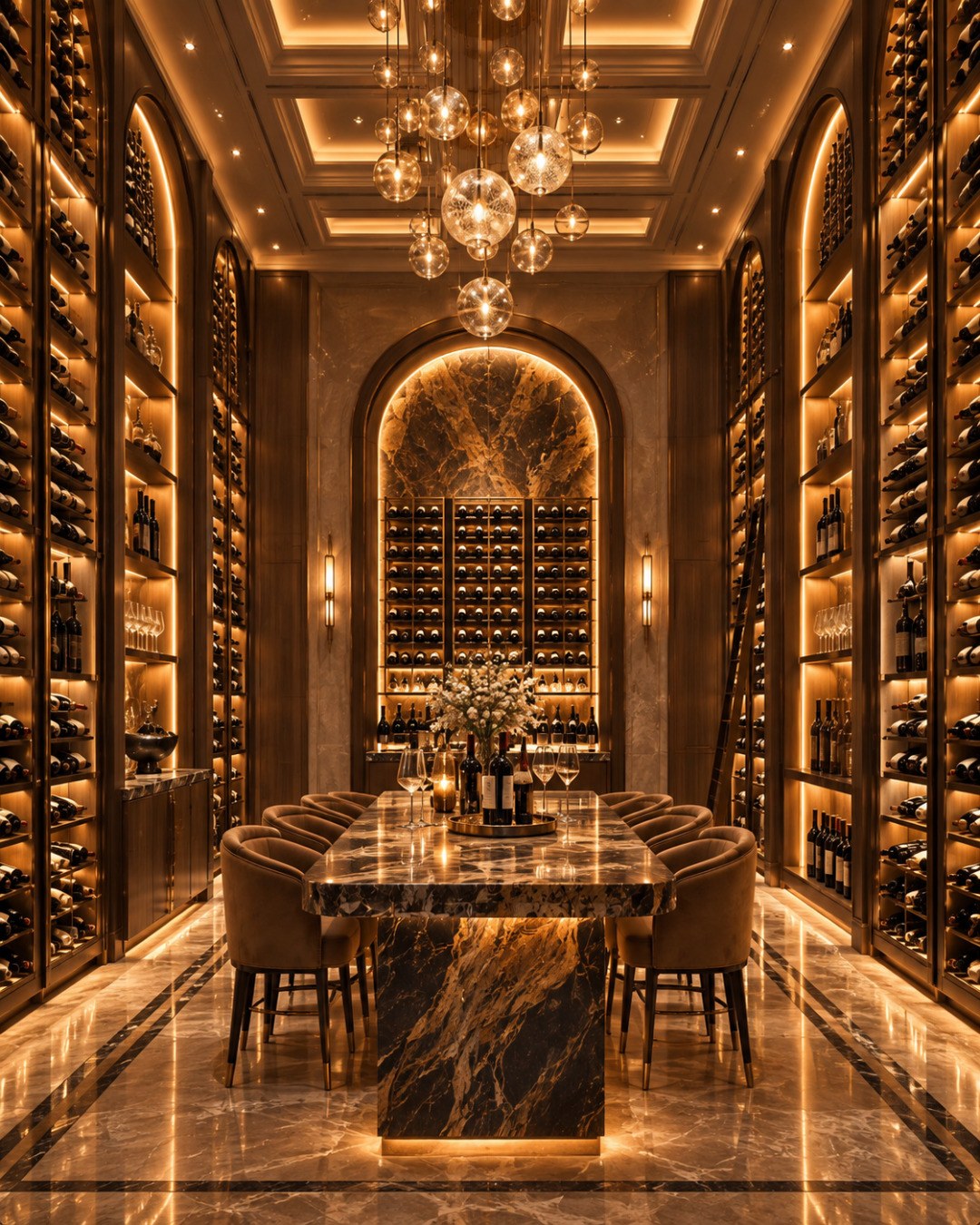
Additional AI-generated architectural studies connected to the ideas explored in this article.



AI disclosure: This article explores AI-generated architectural inspiration and conceptual design ideas. It does not describe a claimed real-world property, client, architect, or built project.