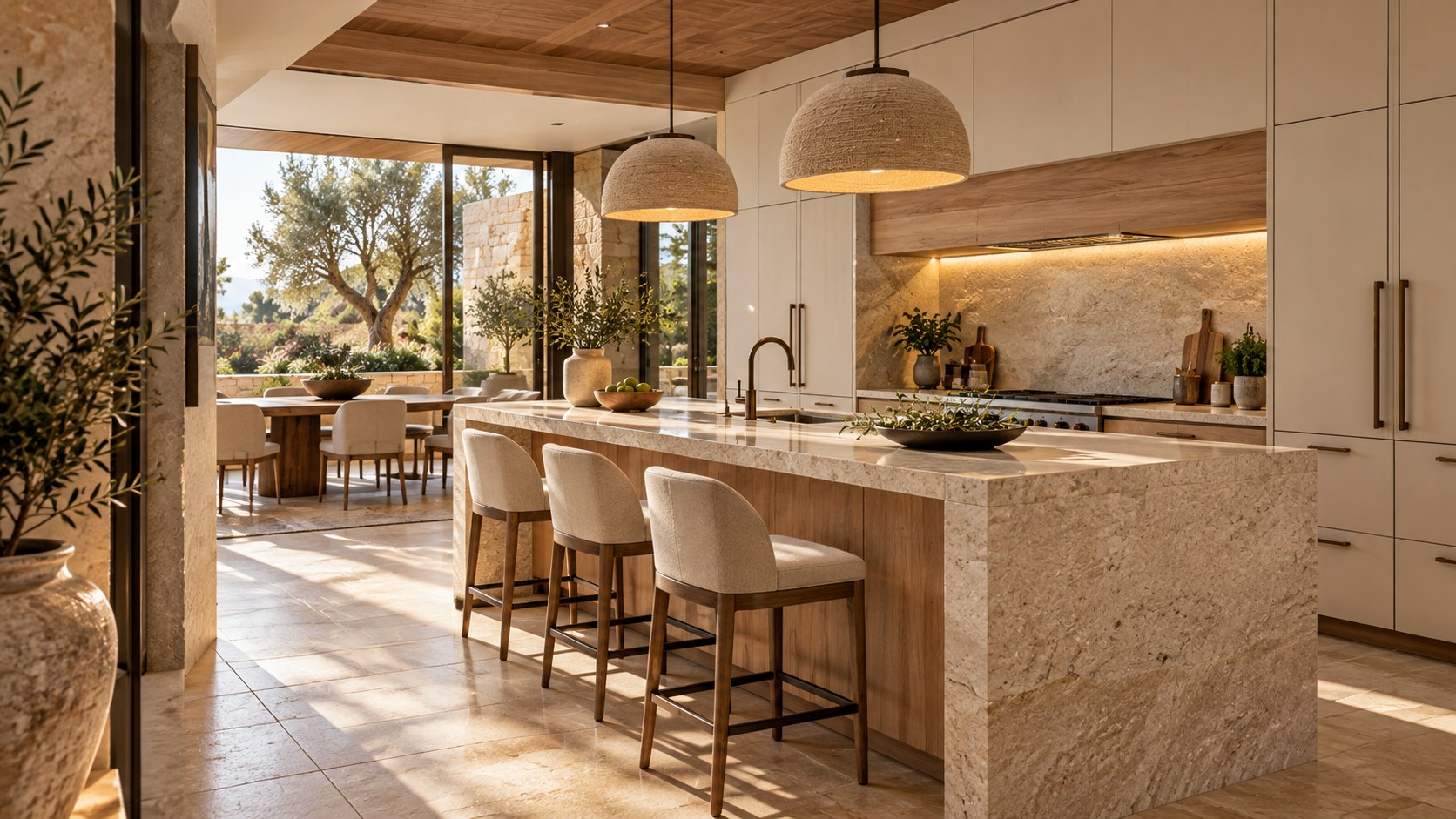
Four imagined luxury kitchens reveal how minimalist stone, classical cabinetry, dark modern contrast, and coastal natural texture change the character of the same domestic space. Beyond appearance, thoughtful island planning, task lighting, material junctions, storage, and circulation determine whether each architectural direction remains compelling in everyday life.
A kitchen makes an unusually revealing test of architectural intention. It is a room of heat, water, storage, movement, and regular cleaning, yet in many luxury homes it is also a social landmark visible from the principal living and dining spaces. A powerful island, an elegant cabinet wall, or an opening to a distant view can organize an entire interior. The difficulty is that those visible gestures must continue to work when someone is preparing dinner, opening drawers, carrying dishes, or talking with guests. The most persuasive kitchen is not simply the one that photographs well; it is the one whose proportions and material decisions make everyday life feel natural.
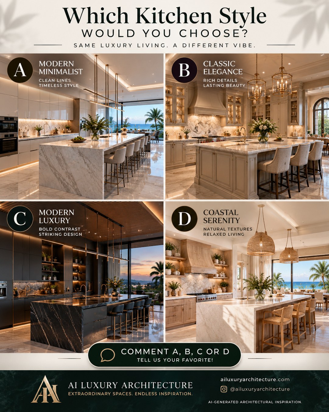
Four imagined directions demonstrate how widely the atmosphere can change while the broad domestic program remains recognizable. Modern Minimalist uses pale cabinetry, dramatic light stone, and disciplined lines to make the island seem almost continuous with the architecture. Classic Elegance layers framed cabinetry, an emphatic cooking hood, lantern-like lighting, and warm detailing into a more formal composition. Modern Luxury turns toward charcoal surfaces, richly veined dark stone, controlled highlights, and a deeper evening mood. Coastal Serenity uses pale timber, woven pendants, soft stone, and the brightness of an ocean-oriented outlook to suggest informality without abandoning precision.
These are conceptual AI-generated interiors, not photographs documenting completed homes, tested assemblies, or named design commissions. Their value is comparative. Because the subject remains a luxury kitchen, the changes in cabinet rhythm, surface reflectance, furniture character, and lighting become easier to examine. The following study asks what each language contributes, where its risks lie, and how a coherent architectural plan can make any of the four approaches more than a decorative costume.
One Domestic Program, Four Ways to Give It Architectural Order
The four concepts share a recognizable hierarchy. Each gives the island a central position, sets a working perimeter behind it, provides a row of social seating, and keeps an opening to a larger living environment. This repeated arrangement makes the differences in appearance unusually legible. The pale island in the minimalist room nearly merges with the bright floor; the paneled island in the classical room has the weight of a crafted cabinet; the dark stone island in the modern-luxury room reads like an intentional block; the coastal island is a relaxed counterpoint to lighter timber and a view. Those impressions begin with material, but their usefulness depends on the same spatial questions.
An island is a piece of working infrastructure before it is an object of visual theater. It must allow hands to prepare food, provide clear places to set down dishes, and remain accessible from the storage and cooking zones. Its ends must also permit movement between the kitchen and surrounding rooms. A long island can create admirable order when it establishes a coherent line through the space, yet it can also force unnecessarily long routes if an occupant must travel around its full length to reach a refrigerator or dining table. The right proportion cannot be read from an image alone. It emerges from the location of doors, drawers, equipment, and people.
The perimeter cabinet wall is just as important, although a beautiful island tends to eclipse it. Full-height storage can visually anchor a room and conceal everyday supplies, but it can also compress the kitchen if placed too close to the island. A cooking wall with a prominent hood establishes a second focal point, which must be kept in a productive relationship with the first. In the classical concept, the large hood and fitted display cabinets are part of the room's architectural identity. In the other versions, quieter cabinet faces and horizontal light emphasize continuity. Neither strategy excuses doors that collide, inaccessible corner storage, or insufficient clear work surfaces beside the cooking area.
The presence of upholstered stools also transforms the island into a boundary between working and social life. Guests can remain part of the room while the cook operates along the opposite side. This arrangement succeeds only if stool positions respect legroom, movement behind seated people, and places where a guest might set a drink without entering the preparation zone. A repeated row of seats looks orderly in a rendering, but their count should follow real occupancy. A generous kitchen can feel strangely inhospitable if too many stools crowd the principal circulation route or turn every gathering into an audience watching the cook.
An adjacent view or dining space gives the room another layer of orientation. In the coastal and pale modern concepts, the eye continues toward daylight and a terrace or garden-facing opening. In the darker concept, the bright exterior becomes a framed release from the inward intensity of stone and metal. In the traditional interpretation, the arched opening and glazed edge establish a more formal progression between rooms. These openings should be considered from both sides. A framed view can enrich the kitchen, but the kitchen itself also becomes a background seen from dining, and its prominent surfaces must remain coherent from that longer distance.
Architecture brings the practical zones into one composition through plan, elevation, and section. Plan tests the routes between preparation, cleaning, cooking, and serving. Elevation tests cabinet modules, shelf rhythm, door sizes, and the relationship between hood and island. Section tests countertop heights, ceiling transitions, pendant positions, extraction space, and lighting concealment. The photograph-like image contains hints of all three, yet proves none. Treating the concept as a starting proposition rather than a finished specification protects the ambition of the design while making its unresolved conditions visible.
The enduring lesson is that the same spatial order can support contrasting material voices. Minimalism asks the architecture to recede into broad quiet planes; classicism emphasizes carefully arranged parts; dark modern luxury makes a few major elements command attention; coastal serenity relaxes the visual boundaries through touch and daylight. A good plan is not indifferent to these choices, but it should be robust enough that appearance does not substitute for use. When clear circulation, storage, working surfaces, and social territories are genuinely resolved, a palette can do what it does best: change the emotional reading of a sound architectural room.
Modern Minimalist: Light Stone, Clean Lines, and the Hidden Work of Restraint
The Modern Minimalist option is built around a luminous continuity of pale surfaces. Glossy white or ivory cabinet fronts form a largely uninterrupted working wall, while a light veined stone island projects a strong horizontal form into the room. Slender warm-metal pendants suspend above it, adding a precise rhythm without the volume of decorative chandeliers. An outward view toward sky and water extends the sense of openness. The overall impression is effortless, but that is exactly why the design requires discipline. With relatively few visible interruptions, every uneven seam or badly located appliance becomes more noticeable.
Minimalist cabinetry depends on proportions more than on an absence of ornament. A very long run of doors can appear calm when its modules follow an intelligible order, but arbitrary widths cause a supposedly continuous surface to become a collection of competing rectangles. The relationship between full-height doors, base drawers, and integrated appliances needs to be planned as an elevation. A refrigerator or oven bank can be incorporated without dominating the wall if its working position and panel dimensions are considered early. Concealment should never make access awkward: a beautifully uninterrupted frontage loses its quality if ordinary storage requires difficult reaches or hidden operating clearances.
The white and pale-stone palette also makes reflective behavior central to the experience. Bright floors, a polished island, and glossy cabinet fronts can multiply sunlight from the sea-facing opening. At certain hours, their combined brightness might be invigorating; at others, the counter becomes uncomfortable to look across. Choosing a honed or otherwise controlled surface finish in selected areas can preserve luminosity without turning the room into a hall of highlights. The issue is not whether a kitchen must be matte or polished. It is how each surface interacts with the viewing positions of a standing cook, a seated guest, and someone entering from the darker room beyond.
A stone waterfall island is a particularly strong visual gesture. Its side panel allows the material to be understood as a continuous volume rather than simply a thin worktop supported by joinery. In a real project, that appearance must be reconciled with panel thickness, joint alignment, corner vulnerability, support, and the location of drawers or cabinets. Stone pattern may wrap convincingly around an edge, but exact veining continuity depends on material selection and fabrication. The best version is not the most digitally flawless seam; it is the one whose construction can be understood and whose corners can survive ordinary contact with stools, bags, and cleaning equipment.
The pendant lights in this direction operate almost like a line drawing. Their fine metal frames and repeated suspension points give the island a human-scaled rhythm within a large bright space. Yet an attractive linear fixture does not guarantee useful illumination across food preparation. If its light is aimed mainly downward or produces sharp reflections on polished stone, it can leave certain work positions less comfortable than the photograph suggests. Under-cabinet lighting, discreet ceiling sources, and softer evening ambient light can share the work. The ceiling should reserve space for those layers without becoming visually congested by a grid of fittings.
Minimalism is often assumed to make a room easier to maintain because fewer things are visible. That is only partly true. Integrated handle profiles can collect residue; pale glossy cabinetry may reveal fingerprints under oblique light; stone joints and narrow reveals require careful cleaning; and open counters depend on generous closed storage. A minimalist kitchen must plan where the toaster, utensils, small appliances, recycling, and occasional clutter actually belong. The purpose of concealment is to offer the occupants choice over visual order, not to pretend that daily tools have disappeared from domestic life.
In the source concept, the distant sea and planted edge soften what might otherwise become a very controlled, almost institutional palette. That relationship is transferable even to a home without a coastal setting. A measured opening toward a planted courtyard, an understated warm timber panel, or fabric-covered stools can prevent the stone and white lacquer from feeling remote. The principle is not to add a long list of organic accessories. It is to introduce a few elements whose texture, shadow, and scale remind the occupant that the kitchen is inhabited.
Modern Minimalist succeeds when its apparent simplicity is earned through proportion, access, and light. If cabinet lines are purposeful, the island is sized around real use, and reflections remain controlled, the absence of ornament allows material thickness and daylight to become the architecture's principal subjects. If those conditions are ignored, clean lines merely expose unresolved details. Restraint is not the deletion of complexity but its thoughtful organization behind a calm visible surface.
Classic Elegance: Cabinetry, Ornament, and the Architecture of Continuity
Classic Elegance makes a different promise. Instead of presenting the kitchen as a set of nearly seamless volumes, it reveals an ordered collection of recognizable crafted parts. Warm cream cabinetry has framed fronts, the principal cooking hood is a shaped architectural feature, glazed display niches create depth, and lantern-like pendant fixtures bring a decorative vertical dimension over the island. Light stone and softly upholstered stools moderate the formal language. This is not simply a more ornamented version of the minimalist scheme. It is a different way of establishing hierarchy, in which repeated components and carefully chosen points of emphasis give the kitchen its sense of completeness.
The key question is how the room's individual pieces relate to one another. Classical detailing becomes persuasive when a major cabinet wall has a recognizable base, middle, and upper termination. Tall doors, smaller drawers, cornice lines, and shelf openings should not be assembled as independent decorations. Their dimensions must form a shared rhythm, with intentional adjustments around appliances and corners. If a range hood occupies the central bay, the surrounding joinery can acknowledge its importance through proportion and symmetry without requiring every service or window position to obey a rigid formal axis. Credible elegance is not absolute symmetry at any cost; it is the impression that exceptions have been handled deliberately.
The hood is especially consequential because it transforms a technical requirement into a strong visual landmark. In the conceptual image, its sculpted form rises between fitted storage and creates a clear destination behind the island. A developed design would need to make room for the actual extraction route, heat-related clearances, access for cleaning, and the geometry of the cooking equipment below. The visible hood surround should not be confused with the mechanical system behind it. Its apparent depth has to accommodate something real. A richly detailed mantel shape that looks convincing in an illustration could prove frustrating if it blocks cabinet access or occupies space needed for proper service.
The display shelving on either side creates another scale of experience. A large cabinet elevation viewed from the dining room may read as one composition, while close up it offers smaller compartments for glassware, ceramics, and carefully selected objects. Light within those niches can bring warm depth to pale cabinetry, provided it does not transform every shelf into a bright showcase. There is a practical distinction between pieces stored for frequent use and objects displayed primarily for pleasure. Deep cupboards, drawers, and accessible pantry storage should perform the substantial work; open and glazed shelving can then add character without having to accommodate all the messier activities of cooking.
Ornamental metalwork is most effective when it remains part of an organized material family. The lantern-like chandeliers, door pulls, and possible cabinet accents in the concept can share warm brass or bronze character without needing identical shine. If every metallic detail is polished and prominent, the room risks losing the warmth of its cream surfaces beneath a field of repeated reflections. Brushed or patinated finishes can give the hand a different quality and bring out the silhouettes of the fixtures more softly. The question is whether light fixtures should serve as the main jewelry of the room, or whether they are supporting the hood and cabinetry as more permanent architectural focal points.
The upholstered island seating introduces a subtle tension between domestic comfort and everyday practicality. Pale fabric, tailored backs, and decorative edge detailing can make the social side of the kitchen feel almost like a dining room. Those seats still need sufficient spacing, room to pull away from the counter, and upholstery appropriate to the expected use. Their visual richness cannot compensate for inadequate legroom or inaccessible floor cleaning. In a house that entertains often, the stools may be occupied for long conversations; in a busy family kitchen, simpler surfaces may make sense. The architectural design should be able to support either reality without losing its overall order.
A classic kitchen also has to negotiate the adjoining architecture. An arched opening or a traditional window rhythm may make the decorative cabinet language feel appropriate, but it should not be treated as a requirement to replicate period forms throughout the house. Contemporary stone floors, discreet equipment, or a restrained adjacent living area can provide a productive contrast. The strongest historical references are spatial and proportional: wall thickness, cabinetry integrated into recesses, carefully scaled openings, and a palpable sense of enclosure. Copying moldings without the underlying logic of a substantial wall and resolved threshold often produces a superficial effect.
Classic Elegance is therefore a study in coherence rather than an argument for more detail. Each profile, panel, lighting fixture, and niche should have a recognizable role within a larger composition. Its longevity depends partly on how easily those parts can be cleaned, repaired, and adapted when equipment changes. The most convincing interpretation has the grace of crafted furniture alongside the convenience of a thoroughly contemporary kitchen. It can feel enduring not because its decorative vocabulary is guaranteed to remain fashionable, but because its relationships of scale, rhythm, and use have been thought through carefully.
Modern Luxury: Dark Stone, Layered Depth, and the Discipline of Contrast
The Modern Luxury option gathers attention through darkness and contrast. Charcoal cabinet walls, a richly veined dark island, deep metal accents, and a timber-lined or strongly articulated ceiling create an enclosed foreground. The ocean-facing opening at the far end becomes a bright counterpoint, especially in the imagined evening light. Where the minimalist kitchen seems to extend outward, this version seems to hold the occupants within a deliberately composed interior. Its sense of drama comes from the relationship between a few powerful surfaces, not merely from the presence of expensive-looking black materials.
A dark stone island has exceptional visual authority in a bright open-plan home. It can become the room's main anchor even when viewed from an adjacent living area, and its veining brings movement into an otherwise controlled tonal field. Yet its prominence creates obligations. The pattern must be composed across the top, visible ends, and any waterfall returns so that the surfaces read as belonging to one physical object. Strong veins should not be duplicated unnaturally like printed wallpaper, and a vast monolithic appearance should not conceal implausible slab thickness or an impossible opening for storage. A beautiful piece of stone is still supported by a built structure with joints and access requirements.
The dark perimeter gives the eye another challenge. Appliances, worktop edges, handles, and stored objects can become difficult to distinguish when most adjacent surfaces share a similar value. A sophisticated dark kitchen responds with layered light rather than simply increasing overall brightness. Task illumination can be concentrated where preparation occurs. Softer ambient sources can establish spatial orientation. Glazed shelves or recesses can be revealed selectively, while the island pendants provide a comfortable point of interest above seated faces. The hierarchy should allow some surfaces to remain genuinely quiet. If every shelf, toe kick, wall, and cabinet is given a glowing outline, the effect becomes theatrical and loses the restraint that made the room compelling.
The timber ceiling in the concept is important because it prevents the dark scheme from becoming purely mineral and metallic. Warm grain running across the room establishes another scale and a sense of shelter. But a heavily articulated ceiling must relate to the height of the space and the real structure above. Deep slats, recessed lighting, ventilation outlets, and acoustic treatment all require physical space. A continuous dark plane can help gather the kitchen visually, while an excessively busy grid may compete with the veined island below. The ceiling works best as a supporting element that gives the dark materials a warmer, more human frame.
The apparent polish of a black kitchen introduces an especially demanding reflection problem. Dark glossy stone can act like a mirror when illuminated by linear pendants or bright openings. A blackened-metal backsplash may reveal repeated points of light, fingerprints, and cooking residue more visibly than expected. Rich veining that looks luminous under photography lighting may become visually confusing when reflections fall directly across the work area. Material samples should be evaluated under both daylight and artificial sources, with the observer at real standing and seated positions. Matte, honed, satin, and polished finishes can produce quite different results even when their color is almost identical.
Connection to the outside matters as much as illumination within. The contrast between a dark interior and an open seaward view can be beautiful near sunset, but after nightfall exterior glazing may reflect the bright kitchen back into itself. Occupants may feel less connected to the view and more exposed to observers outside. Shading and privacy controls should be integrated into the frame or ceiling design from the outset, along with enough lighting flexibility to create a relaxed evening condition. A dramatic photograph captures one moment; a successful dark kitchen accommodates mornings, cooking hours, entertaining, and the quiet period after everyone has left the table.
The relationship between black surfaces and lighter furnishings deserves similar restraint. Upholstered stools with warm neutral seats can soften the island, while small brass-toned details provide recognizable hand contact points. Too many contrasting materials, however, might make the room resemble a luxury retail interior. One dominant dark stone, one quiet cabinet finish, one measured timber expression, and a limited metal family often create enough richness. A planted edge or soft textile can introduce life without becoming a separate decorative theme. The kitchen should invite touch and conversation, not force its occupants to behave as though they are moving through an exhibition.
Modern Luxury is strongest when contrast expresses actual spatial order. The dark island marks the social and working center, the cabinet wall contains storage, the ceiling lends shelter, and the exterior aperture establishes a destination beyond. If the design can also preserve comfortable task light, practical maintenance, and relaxed movement, its drama becomes architectural rather than cosmetic. Luxury in this direction is the ability to remain calm even when the material language is intense.
Coastal Serenity: Natural Texture, Soft Boundaries, and the View
Coastal Serenity appears to draw its character from the meeting of pale timber, softly veined stone, woven pendants, and a broad view of the sea. Light oak cabinetry and natural-fiber seating bring warmth into the foreground; the pale island and cream walls keep the room luminous. Unlike the pristine minimalism of the first option, this version welcomes gentle texture and slightly more relaxed furnishing. Its atmosphere depends on a careful balance. Too much rustic detail would make the kitchen feel like themed coastal decor; too much visual refinement would erase the tactile ease that distinguishes it from the minimalist direction.
The kitchen's openness to the exterior is its clearest organizing feature. A framed view can give the cook a sense of orientation and make the adjoining dining space feel connected to weather and season. But coastal light also introduces practical environmental questions. A broad bright horizon may create glare on pale counters, and direct sun can alter the appearance of oak, textiles, and woven shades over time. The design should consider the actual orientation of the glazing, opportunities for exterior shade, appropriate window treatments, and the position of work surfaces relative to bright openings. A lovely clear-day view is not the same as comfortable daylight throughout the year.
Pale timber helps bridge the interior and any sheltered exterior terrace. Cabinet grain gives the walls a subtle vertical or horizontal rhythm and introduces warmth without creating a dark visual block. Yet the same material requires care around heat, splashes, and repeated hand contact. The appearance of solid oak in an image could be achieved through different constructions with different maintenance and dimensional behavior; the photograph cannot establish which was intended. A credible architectural scheme would specify an assembly suitable for the exposure and design junctions that protect vulnerable edges. Choosing a natural finish should mean welcoming the material's character, not ignoring its real limitations.
The woven pendant shades have a particularly useful spatial role. Their broader volume and visible texture lower the apparent scale of the ceiling over the island, helping a generous kitchen feel domestic. Depending on construction, however, a woven shade can create uneven patterns of light and may gather dust near cooking activity. It should therefore be treated primarily as part of the atmospheric layer, with reliable task lighting provided separately where necessary. Its placement must avoid obstructing sightlines or hovering uncomfortably near seated heads. A pair of pendants can give rhythm, but their spacing should follow island work positions rather than an arbitrary requirement for perfect decorative symmetry.
Coastal interiors also benefit from different kinds of enclosure. A huge glass wall can make a kitchen feel almost outdoors, but a room with no quiet wall surface may lose storage, privacy, or a sense of protection. The concept retains substantial cabinetry and an identifiable cooking zone rather than dissolving everything into glazing. That balance is essential. A garden-facing breakfast area, a framed aperture toward the sea, and a more sheltered service wall can coexist within one plan. Circulation should allow someone to move between the kitchen, dining table, and terrace without making the island's working aisle a public shortcut.
The palette invites tactile materials without making every element compete. A pale stone island can remain the substantial central feature; warm wood may form the cabinetry; woven upholstery and pendants provide limited texture; plants bring a little living contrast. If seashell forms, rope details, distressed boards, blue accessories, and nautical ornaments are accumulated together, the result quickly becomes narrative decoration rather than architecture. A calmer response would let the changing color of sea and sky perform most of the expressive work. The interior remains a stable foreground that receives those changing conditions.
There is also a distinction between an interior inspired by the coast and one actually exposed to coastal weather. A photograph of blue water does not establish salt, wind, moisture, or temperature conditions, and an imaginary residence should not be given a false address. If a real project were situated near the shore, the durability of exterior hardware, glazing components, terrace materials, and adjacent timber would need site-specific review. Interior daylight, ventilation, and possible humidity conditions would likewise matter. The lesson is not to prescribe an unspecified coastal construction system, but to understand that atmosphere and exposure have different architectural responsibilities.
The appeal of Coastal Serenity lies in ordinary pleasure: preparing food while daylight changes across pale wood, sitting comfortably at the island, and moving naturally toward a dining area that feels open to the landscape. Its visual softness succeeds when supported by a clear cabinet plan, controlled light, and materials capable of repeated use. Of the four directions, it perhaps most plainly demonstrates how architecture can feel informal without being accidental. Ease is carefully planned, even when the finished room does not advertise that effort.
The Working Island: Circulation, Storage, and Everyday Hospitality
An elegant island can dominate the first impression of a kitchen, but its real test occurs on a busy evening. Someone is working at the sink, another person reaches for serving dishes, guests are seated along the social side, and a tray must travel toward the dining table. All four conceptual rooms use the island as a central landmark; that consistency makes it possible to compare how the same activity could unfold in four different atmospheres. No finish can rescue an island that makes these ordinary movements uncomfortable. Planning must give the counter's working and social faces separate responsibilities while allowing them to remain part of one room.
The active side generally benefits from an understandable relationship among cleaning, preparation, cooking, and food storage. That does not mean every kitchen must obey a universal diagram or one prescribed sequence. A large residence may contain a secondary pantry, a separate cleaning zone, or several cooks working simultaneously. What matters is that movement should not require constant doubling back or crossing the busiest social path. A preparation area needs sufficient uninterrupted surface, the range needs practical nearby landing space, and cleaning tasks need reachable storage. The particular dimensions depend on appliances, users, access requirements, and how the household actually cooks.
The other side of the island accommodates sitting, conversation, and the transition to dining. A row of upholstered or woven stools makes this interface legible in all four images, yet the social edge can become congested if seat positions are chosen for appearance. People need space to get on and off a stool without pushing into passing circulation; seated legs should not interfere with drawers or doors. Guests often place phones, dishes, or drinks on the counter, so the separation between food preparation and the social edge should be considered. A small but comfortable number of seats may serve the room better than a continuous row spanning the entire length of the island.
Storage is the quiet architecture behind the scene. A display of perfectly clear counters may be achievable for a photograph, but a working kitchen must accommodate cookware, food, utensils, cleaning supplies, equipment, and the things that accumulate during real meals. Full-height cabinets and deep drawers have different advantages; open shelves can put frequently used objects within reach but also expose them to dust and cooking residue. The minimalist direction may benefit from discreet integrated storage, while the classical scheme can express functional cabinets through framed fronts. The darker and coastal directions can likewise conceal or reveal selected items without changing the fundamental need for accessible, well-organized capacity.
The kitchen-to-dining route is often underestimated in visual studies. If the dining room lies beyond the island, serving food and collecting dishes should feel easy. A passage that looks generous from the camera's position may narrow sharply when several stools are pulled back. A corner of the island may obstruct the natural desire line between the pantry and the table. A glass door toward the garden may be attractive but inconveniently positioned if opening it disrupts the main preparation aisle. The relationships should be checked in plan with furniture occupied and appliance doors open, rather than only with all surfaces clear and every chair neatly tucked away.
The floor and ceiling reinforce these everyday routes. A floor material may appear continuous across kitchen and dining, but the cooking area must tolerate spills and cleaning without becoming slippery or fragile. If surfaces change at a threshold, their transitions should be considered in relation to level, edge durability, and accessibility. Overhead, pendants can define the social edge of the island, while quieter task lighting supports the active work positions. The great variety of finishes in the four directions does not alter these practical needs. A classical lantern fixture and a slender modern pendant can each be beautiful while requiring separate attention to how the counter is actually illuminated.
A final planning question concerns flexibility. A kitchen designed for elaborate entertaining may later become the center of a smaller household, or vice versa. Storage content changes, devices are replaced, and seating habits evolve. Building one enormous uninterrupted feature island may be visually decisive but difficult to adapt. A carefully considered plan can retain its architectural identity while allowing cabinet interiors, lighting scenes, stools, and loose dining furniture to change. The most generous kitchen is one that admits real life without losing its hierarchy. It gives the cook working dignity and gives guests a comfortable place to participate without interrupting every task.
Light, Material Durability, and Choosing a Lasting Architectural Direction
The four design languages become most revealing when considered through time rather than as simultaneous still images. The minimalist kitchen may feel brilliantly open at midday but overly reflective under strong sun. The classical room may achieve delicate warmth in the evening while requiring careful control of its many display lights. The dark kitchen can feel intimate after sunset but needs thoughtful illumination for daytime work. The coastal room can glow with soft morning light and then rely on more localized sources as darkness arrives. None of these atmospheres is fixed. The appearance of the room changes continually as external conditions and patterns of use change.
Daylight must be coordinated with the material palette rather than treated as a universal benefit. Pale stone and cream cabinetry distribute light differently from charcoal joinery and black veined stone. Warm timber and woven shades introduce texture that becomes visible under oblique light; ornate classical door profiles cast fine shadows that can enrich the cabinet wall. The same strong exterior opening might create welcome depth in a dark kitchen and excessive glare in a polished white one. In design development, samples should be examined under varied lighting conditions, and the geometry of windows, ceiling planes, and shading should be studied from actual working and seated viewpoints.
Electric lighting is most convincing when each layer has a specific job. Task sources help a person judge food, utensils, and counter edges. Ambient sources allow the room to remain legible without turning it uniformly bright. Pendant lights establish the island as a social place; display lighting may reveal selected joinery and objects. Nighttime circulation may need quieter guidance than the primary worktop. The four conceptual rooms offer different fixture characters, but every one would benefit from adjustable scenes that support preparation, dining, cleaning, and late evening. Refinement comes from distributing responsibility among sources, not from showing every light switched on for the camera.
Reflective finishes make the question more demanding. A line of pendants repeated in a polished countertop can form a distracting band. Light reflected from a white floor may increase visual discomfort near a broad glazed facade. A brass lantern may multiply small points of brilliance across adjacent glass, and a dark metal panel can reveal bright hotspots that overwhelm its intended depth. Material finish, source shielding, beam direction, and the observer's position all matter. It is often more effective to let a few surfaces carry the illumination while others remain matte or subdued. The result feels architectural because the eye has somewhere to rest.
Durability is another form of long-term lighting control. Worn finishes reflect light differently from new ones; pale surfaces may show marks, dark cabinets can reveal dust or fingerprints, and high-contact metal may develop a change in tone. Natural timber can age unevenly according to sun exposure, while upholstery and woven textures require care. Stone suitability varies with type and treatment, especially around acidic spills, splashes, heat, and repeated cleaning. The conceptual image does not identify actual specifications, so it would be misleading to declare one option inherently more durable. A responsible design asks which finish belongs at each working location and how it will look after sustained use.
Details at edges and junctions make the long-term character credible. Stone needs a believable relation to its support, including joints where panels meet. Timber fronts require appropriate transitions around sinks and dishwashers. Cabinet lighting channels and service components should be accessible without destroying adjacent finishes. Cooking-wall surfaces need practical cleaning access, while decorative hoods and recessed shelves should not create unreachable residue traps. Equipment will eventually be repaired or replaced; the cabinet arrangement should permit that work without dismantling large portions of the room. Design sophistication is measured as much by these quiet allowances as by the elegance of the main perspective.
The final choice among styles should therefore begin with an intention rather than a collection of attractive ingredients. Modern Minimalist can be the right language for a bright home that wants disciplined visual continuity, provided the practical storage and glare issues are resolved. Classic Elegance can give a substantial residence a crafted sense of enclosure, provided the detailing forms an ordered family rather than ornamental excess. Modern Luxury can introduce a compelling dark anchor into a generous living area, provided its lighting and material reflectivity are handled with care. Coastal Serenity can make everyday cooking feel relaxed and connected to landscape, provided its natural materials and openings respond to actual use and exposure.
Combining these directions is possible, but synthesis should not mean accumulating every remarkable feature. A pale minimalist kitchen might welcome a warm timber recess or one woven pendant without becoming coastal-themed. A classic cabinet wall could sit beside a very restrained modern stone island if their proportions are compatible. A dark kitchen might use a single pale surface to improve visibility, while a coastal room could incorporate a more precise bronze detail to sharpen its otherwise soft material field. Begin with the principal architectural idea and let secondary choices support it. When a room has a clear hierarchy, its character can remain strong even as stools, small appliances, artwork, and household routines change.
Four conceptual kitchens can make a powerful comparison because they reveal that luxury is not a single visual formula. Pale stone and concealed joinery produce a sense of precision; framed cream cabinetry and decorative fixtures communicate craft; dark veined surfaces and warm timber concentrate attention; light oak and woven textures establish a more relaxed relationship with the landscape. Each language gives different emphasis to the island, perimeter, ceiling, and view. Yet all depend on the same less photogenic necessities: usable clearances, accessible storage, realistic material joints, appropriate light, durable work surfaces, and routes that allow household life to unfold naturally.
The most useful design decision is therefore not simply to select A, B, C, or D as an image. It is to identify the experience the kitchen should support, choose a clear material hierarchy, and develop the spatial relationships that make that experience possible. A room designed only for its first photograph may become demanding to occupy. A room designed for cooking, conversation, cleaning, and change can retain beauty precisely because its architecture accommodates use.
These imagined interiors remain AI-generated explorations rather than documented built projects or verified technical proposals. They offer four compelling starting points and a reminder that an enduring kitchen is judged over hours, seasons, and years, not only in the ideal light of a single moment. The strongest outcome is the one whose atmosphere grows from its plan, whose details support its materials, and whose generosity is felt every day.
Related Visual Inspiration
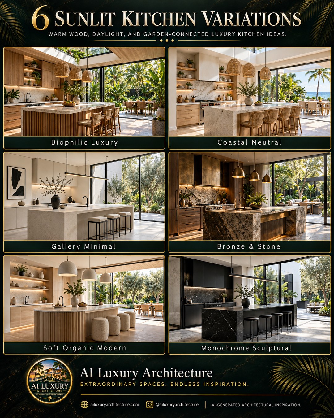
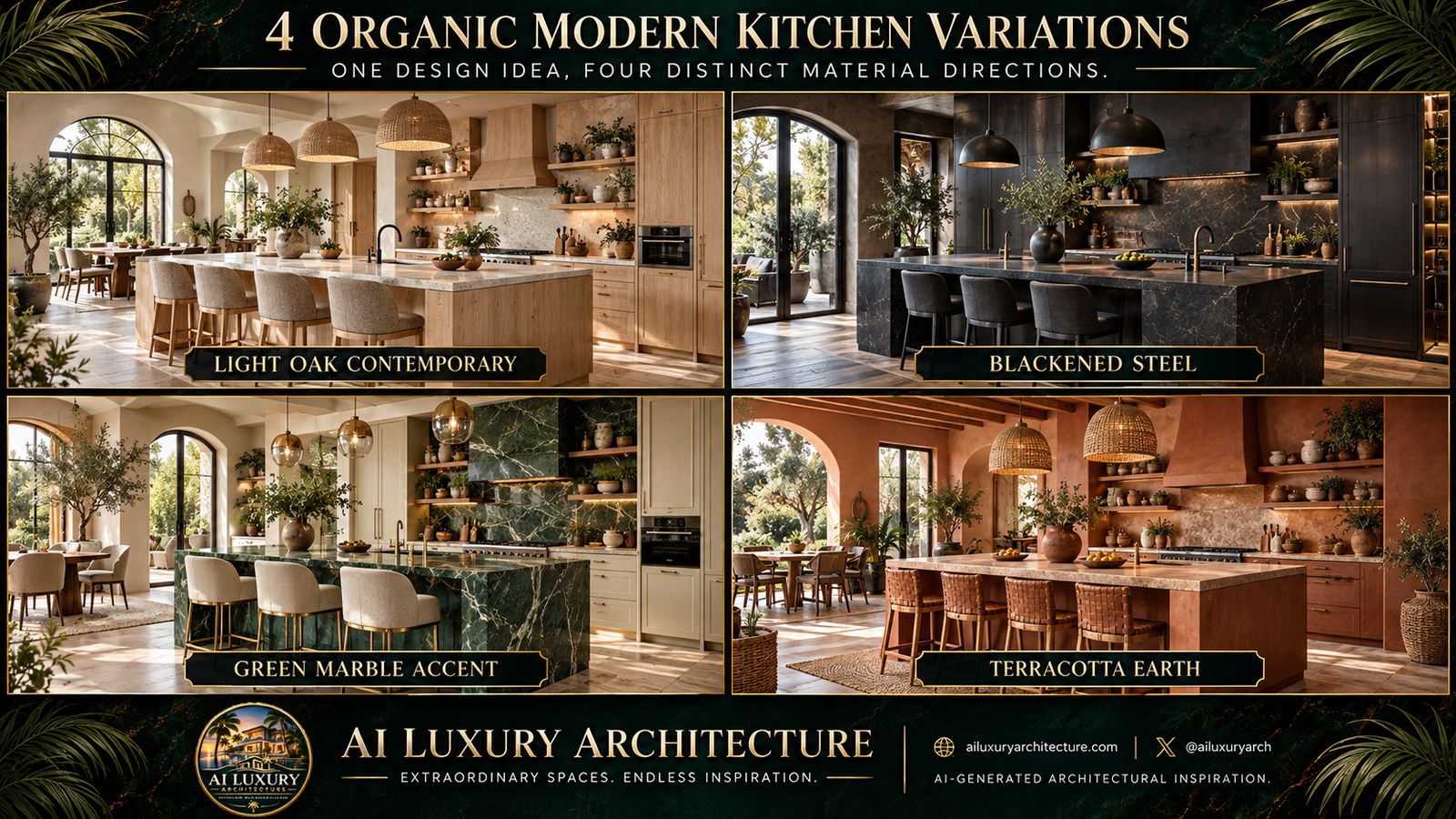
Additional AI-generated architectural studies connected to the ideas explored in this article.
AI disclosure: This article explores AI-generated architectural inspiration and conceptual design ideas. It does not describe a claimed real-world property, client, architect, or built project.