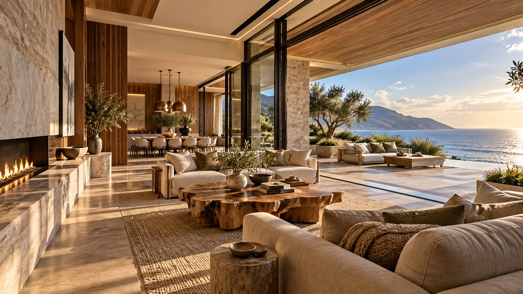
Eight AI-generated interpretations of one double-height oceanview great room reveal how stone, timber, planting, furniture, and lighting transform spatial character. This architectural study looks beyond visual mood to examine proportion, coastal glazing, circulation, comfort, material restraint, and the choices that make a dramatic living space genuinely habitable.
An ocean view can be so commanding that the architecture surrounding it seems destined to become a frame. In a great room, however, the frame is never neutral. The proportions of the space, the weight of its materials, the direction of furniture, the location of a dining table, and the quality of light all change how the horizon is experienced. A pale room can make the sea appear expansive and almost continuous with the interior. A darker one can turn the same view into a luminous picture beyond an intimate gathering place. Neither response is inherently better. Each establishes a different relationship between landscape and domestic life.
Consider a conceptual double-height living and dining space with a broad ocean-facing glass wall, upper-level edges, a fireplace zone, and room for several kinds of gathering. Eight distinct interpretations reveal how much architectural character can change without changing the essential premise. Warm Travertine emphasizes ivory stone and cream furnishings. Dark Walnut draws the interior inward through rich timber, charcoal seating, and low light. Biophilic Luxury layers planting into the edges of the volume. Coastal Neutral opens the palette with pale oak and sand-colored finishes. Gallery Minimal creates distance between a smaller number of objects. Bronze & Stone places weight and warmth around a substantial fireplace. Soft Organic Modern uses rounded furniture and tactile neutral fabrics. Monochrome Sculptural increases the force of silhouette through dark objects against lighter architectural planes.
These are AI-generated architectural studies, not photographs of eight constructed properties. Their value lies in comparison: they hold a recognizable spatial question relatively steady while changing the tools used to answer it. The variations should not be mistaken for complete technical proposals. They do, however, provide an unusually clear way to separate architecture from styling. A material that wraps a wall or organizes a fireplace changes the space differently from a loose cushion. A gallery ledge, glass opening, or stair affects circulation and structure differently from an accessory. A lighting mood can alter apparent proportions without changing them physically, yet it must eventually be reconciled with real fixtures and environmental conditions.
A useful reading therefore asks not which version looks most luxurious, but what kind of life each would support. How does the room behave at midday, when the glazing is brightest? What becomes the social center after sunset? Where can people move between dining and lounge seating without blocking one another? Which surfaces can age with dignity, and which need careful protection from intense light, salt-laden air, or repeated handling? What happens if a family wants conversation, quiet reading, and a meal in the same broad volume? The answer begins with the shared architecture and becomes more precise as each design direction is examined through proportion, material, circulation, atmosphere, and long-term use.
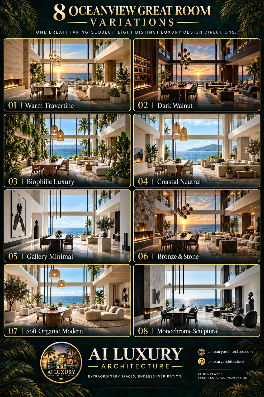
The Shared Framework: A Double-Height Room Facing the Sea
Before comparing palettes, it helps to understand the spatial system that makes the eight interpretations legible. Each image returns to a tall, ocean-oriented great-room premise: a major glazed opening carries the eye outward, an upper edge registers the second level, and the ground-floor living and dining functions occupy a continuous field. This is a recognizable architectural condition rather than a neutral showroom. The tall volume changes acoustic character, daylight distribution, furniture scale, and the relative importance of the horizon. The question is how to make it feel domestic rather than simply spectacular.
A double-height space can achieve generosity without using every available surface as a display. Height creates a long vertical interval between seated occupants and the ceiling, so the room needs intermediate points of reference. Gallery edges, hanging light fixtures, fireplaces, panel joints, and tall windows can help establish that scale. In the images, upper-level boundaries make the height readable instead of leaving the ceiling as an anonymous plane. Their visual position also tells us that the tall central room has a relationship with adjacent upper rooms. In a real scheme, whether that edge is a gallery, balcony, or enclosed room would affect privacy, sound transmission, guard design, and structural support. The visual idea needs a deliberate plan behind it.
The distant view does not remove the need for a foreground. A living room facing water becomes more convincing when the eye encounters several layers: seating, the floor or rug, the nearer edge of the glazing, perhaps a terrace or planted threshold, and finally the sea. If everything inside is arranged solely to point at the horizon, the room can lose social balance. A sofa line may maximize an outward view but make conversations awkward. Dining chairs may need some freedom to face one another rather than the glass. A low table or hearth can hold attention inward when weather or darkness changes the outside scene. Great-room planning is a negotiation between the landscape as destination and the room as place.
Scale also matters horizontally. The long glazed wall is visually dominant because it can collapse the boundary between interior and exterior. The remaining wall surfaces become more important, not less. A stone fireplace wall provides a solid counterweight to transparency; shelving or timber cladding can offer texture and storage; a plain gallery wall gives art and shadows room to register. The shared conceptual layout sets a useful problem: how much material character should the solid edges carry so that the room feels contained without denying the view? The eight directions offer different levels of emphasis at those edges.
In a credible residence, the opening would also require structural organization. Floor-to-ceiling glazing is not simply an empty slot: its spans, framing, wind resistance, thermal behavior, water management, and junctions with adjacent floor and roof assemblies all affect the architecture. Large panes may require subdivisions; frames and shading equipment occupy real depth. The visual studies are persuasive partly because major horizontal and vertical lines give the opening rhythm. Their discipline is more transferable than any particular impression of perfectly uninterrupted glass. The strongest design uses structure and glazing proportions to shape the view deliberately.
The orientation of dining relative to lounge seating is another defining choice. Where both zones share one room, the dining area benefits from a clear boundary without becoming disconnected. That boundary might be established through lighting, table proportion, furniture spacing, or a ceiling element rather than a solid partition. The source variations often retain a prominent dining group adjacent to softer lounge furniture, showing how one architecture can accommodate different postures and activity levels. The dining table has its own center of gravity, while the sofas create a lower, more expansive territory. A well-planned great room allows each to remain recognizable.
Finally, the repeated sunsets and bright daylight scenes should be read as tests of perceptual hierarchy, not evidence that the room will enjoy perfect light throughout every day. Light changes what reads first. During strong daylight, the seaward opening may overpower the furniture. At dusk, a fireplace, pendant, or shaded seating group can become a new focus. A sophisticated concept anticipates this sequence rather than insisting on one fixed photographic moment. With the shared framework understood, differences in timber, stone, planting, artwork, and furniture become far more meaningful: they do not create the architecture from nothing; they adjust how its established spaces are occupied and perceived.
Warm Travertine and Dark Walnut: Two Temperatures of Enclosure
Warm Travertine and Dark Walnut offer a particularly instructive contrast because both can use natural-looking materials and restrained furniture yet generate different emotional climates. The travertine direction opens the room visually with light mineral surfaces, cream seating, warm wood pieces, and subtle bronze details. The walnut direction darkens the major wall fields, introduces deeper joinery and shelving, pairs them with charcoal upholstery, and makes low-level warm lighting more influential. Their common setting exposes an important principle: perceived room size is not determined only by measured dimensions. Reflectance, texture, visual continuity, and the relative brightness of the horizon all change the apparent boundaries.
In the pale stone interpretation, the fireplace and surrounding wall can become an illuminated architectural mass rather than a dark recess. Ivory stone carries daylight sideways and establishes a relatively even tonal field for furniture. The image suggests a room whose principal objects can remain softly distinct from one another rather than strongly outlined. This does not mean that stone should blanket the entire interior. Repetition without hierarchy can wash out a room, making every surface equally important and reducing the eye's ability to find an anchor. A stronger application might reserve expressive travertine for one major wall, use quieter mineral finishes on secondary planes, and allow the view to provide the broadest visual change.
Travertine also carries physical characteristics that an image cannot certify. Natural stone varies in porosity, finish, veining, and susceptibility to staining or damage; a particular installation's suitability would depend on the chosen material and its treatment. In an occupied great room, the practical decisions include where stone may be touched, where spills occur, how slab or tile dimensions align with openings, and how a heavy-looking wall meets a floor. A carefully detailed plinth or joint can make the composition feel grounded. A large stone fireplace should have a plausible construction and heat-safe assembly rather than appearing to be a thin sheet without substance. The warmth of the image becomes architecture when it survives those questions.
Dark Walnut moves attention inward. The ocean remains visible through the tall glazing, but the saturated timber walls and deeper seating palette make the interior feel more enclosed, particularly as exterior light fades. Built-in shelves give the wall a secondary use and create smaller-scale points of interest. The image's lower, warmer lighting supports an evening-lounge atmosphere rather than the bright expansiveness of the pale scheme. Dark finishes can make a large room feel more intimate by reducing the apparent prominence of peripheral planes, but they also change the lighting problem: surfaces may need targeted illumination for reading, movement, and useful visibility within the shelving.
The scale and application of walnut matter. Deep timber paneling can appear rich in one composition and oppressive in another, especially where the wall occupies a large share of a double-height room. Rather than assuming that more timber produces more warmth, consider the rhythm of panels, the grain direction, the width of reveals, and the interruptions required for doors or cabinets. A wall that reads as a continuous material field from a distance might reveal carefully spaced joints at eye level. Cabinet doors and ventilation requirements should not create an accidental secondary pattern. The value of walnut lies not simply in its color but in the possibility of precise joinery and a tactile sense of enclosure.
These two interpretations also suggest different strategies for furniture and art. Against pale travertine, creamy upholstery may require contrast through silhouette, texture, or a darker table to keep the seating zone legible. In the walnut version, charcoal furniture can merge into the wall unless lighter rugs, individual seat shapes, or warm edge lighting create separation. Large artworks may be unnecessary if the material itself supplies texture; conversely, one selected object can help a timber wall feel less continuous. The best decisions come from comparing whole compositions, not choosing attractive finishes one by one.
The underlying tradeoff is between outward extension and inward concentration. Warm Travertine tends to amplify daylight and connect with the luminous coastal view. Dark Walnut makes the room feel more sheltered and gives firelight or lamps stronger authority after sunset. Neither is required to be exclusively bright or dark; a nuanced design can use a pale central living volume with a walnut-lined library edge, or a dark lounge anchored by a quieter stone floor. What should remain consistent is the distribution of attention. The material choices succeed when the room offers both a meaningful relationship to the sea and a coherent place to sit when the sea is no longer the primary event.
Biophilic Luxury and Coastal Neutral: Two Relationships With Landscape
Biophilic Luxury and Coastal Neutral both seek a closer connection with the surrounding landscape, yet they do so through different degrees of visual intensity. In the biophilic study, abundant curated greenery occupies the room's margins and appears near upper levels, lending the interior an organic density. Woven pendants, natural textures, and plants with varied forms reinforce the impression that the room and the tropical setting belong to one visual continuum. Coastal Neutral achieves a quieter correspondence through pale oak, ivory upholstery, sand tones, woven light shades, and restrained blue-green accents. The ocean is not duplicated by planting; it is allowed to remain the strongest color field beyond an airy interior.
The biophilic direction raises an important question about how a plant becomes spatial rather than decorative. A small pot on a console can add softness, but a group of substantial plants placed beside glazing or along the edge of a circulation zone changes how that area is perceived. Leaves partly veil the long view, provide near-field depth, and reduce the starkness of tall structural surfaces. At an upper gallery, planting can soften a hard horizontal line and offer a more layered connection between levels. Such effects are valuable precisely because the room is so tall and glass-dominant. The greenery supplies an intermediate scale between people and the larger architecture.
Yet vegetation must have a plausible place to live. Large plants require containers or planting beds, growing space, light suited to their species, access to water, and room for maintenance without forcing furniture into awkward arrangements. Indoor beds also raise questions about moisture control, drainage, structural loads, leaf debris, and the interfaces between soil and finished floors. None of these can be resolved by adding plants to a visualization. A disciplined plan would identify which plants are integral enough to justify built-in support and which should remain movable. It would also maintain clear pathways near glazing, stairs, and seating. Biophilic luxury is credible when the living landscape strengthens occupation rather than making the room difficult to use.
Coastal Neutral takes another route. By keeping the interior broadly pale and reducing visual density at the perimeter, it lets daylight and ocean color register more distinctly. Pale timber provides warmth without the inward pull of dark walnut. Woven materials bring a tactile counterpoint to the sharper glass and floor planes. Sand and ivory hues do not literally reproduce a beach; they create a restrained foreground against which water and sky can change naturally. This approach can feel spacious, but it risks becoming indistinct when sofa, rug, walls, and floor are too similar in tone. Carefully varied surface texture and a few deliberately darker edges are essential to making the space readable.
The two schemes also support different relationships to sunlight. A bright coastal room can become uncomfortable if reflections from pale floors and the sea combine with intense glazing exposure. A richly planted room may reduce glare in selected areas, but interior vegetation is not a substitute for a considered external shading strategy or glazing specification. Both need control of direct sun, potential heat gain, and privacy. Curtains or shades can be integrated without undermining the aesthetic if their tracks, pockets, and stacking zones are planned early. A room that is photographed with every shade open still needs a convincing condition for midday glare or an intensely bright afternoon.
Furniture geometry shapes the landscape relationship as much as finishes. In the biophilic interpretation, organic forms and textured upholstery can make seating feel embedded among planted edges; the visual risk is that a proliferation of leaf shapes, woven patterns, and objects competes with the horizon. Some zones need to remain quiet, with broad clear floor and unobstructed sightlines. In the coastal interpretation, a clean seating outline may emphasize openness, but too little spatial enclosure can leave people feeling on display in a very large room. A low sofa back, a rug, or a carefully placed console can give the social zone a stable internal boundary without interrupting the view.
The images offer two transferable design lessons. Biophilic Luxury relies on selective density: let plants create depth where they strengthen thresholds and human scale, then leave breathing room around primary activities. Coastal Neutral relies on selective emptiness: preserve bright visual fields while giving texture, shadow, and furnishings enough character to prevent the room from feeling anonymous. Both are forms of editing. A greater quantity of natural elements does not automatically mean a stronger connection to place, and an airy neutral palette does not automatically produce calm. The connection becomes convincing when the interior has a deliberate relationship to what can be seen, approached, touched, and maintained.
In conceptual coastal architecture, the most useful pairing may not be an absolute choice between these directions. A calm pale room can carry one generous planting zone beside a shaded terrace. A biophilic room can preserve a broad, nearly bare opening at the most important sea-facing axis. Such combinations work because the goal is not to imitate nature with decoration. It is to make the built environment capable of receiving landscape as light, depth, season, and movement. When that relationship is controlled, the ocean remains an active part of the room rather than a static photograph behind it.
Gallery Minimal and Monochrome Sculptural: The Discipline of Attention
Gallery Minimal and Monochrome Sculptural can appear similarly restrained because both reduce the dominance of warm color. Their architectural priorities, however, are not identical. Gallery Minimal limits furniture count, increases spacing, and allows monochrome art and carefully chosen objects to hold attention against crisp surfaces. Monochrome Sculptural works with a more forceful contrast of black, white, and stone, using pronounced furniture forms, vertical lighting, and dark decorative silhouettes to establish the room's character. One finds richness through intervals of emptiness; the other concentrates attention through strong shapes. Comparing them clarifies the difference between reducing objects and composing objects.
The gallery-like interpretation uses distance as a design material. When a sofa stands apart from a substantial artwork or sculptural chair, each item receives a small amount of visual territory. The eye can move from one object to another without negotiating many intermediate signals. In a double-height room, this separation can be particularly effective because large walls and tall openings provide generous background planes. The view becomes one element in a sequence rather than an incessant demand. A carefully positioned artwork may receive a clear wall, while the dining table retains its own legible zone. The apparent simplicity depends on the precision of those distances.
Distance is also a practical concern. A room with fewer objects can still function poorly if the seating is too far apart for conversation or if generous gaps are created at the expense of clear routes to the dining table. Gallery spacing should not be confused with isolating furniture. Sofas and chairs need to form a useful social relationship; tables must remain accessible; a rug should define a gathering field rather than a decorative island stranded in a large floor. In a credible plan, the negative space would be measured against actual walking routes, seating positions, and sightlines. The aim is not to make the room look unoccupied, but to let each activity happen without visual or physical interference.
A gallery approach also requires carefully considered light. Pale floors and walls can carry subtle variation from daylight, and monochrome artwork may need illumination that avoids reflections in adjacent glazing. The conceptual image suggests clean surfaces with individual sculptural accents, but the real lighting response would depend on surface reflectance, picture placement, and the room's changing exterior brightness. Flooding everything with equal light can destroy the hierarchy that makes the composition feel quiet. Selective illumination works better when it clarifies the art, a seating area, or an architectural edge while allowing other planes to remain less emphatic.
Monochrome Sculptural is more assertive. Black furniture and vertical elements stand sharply against light architectural surfaces; a dark chair can become a graphic form before it becomes a place to sit. The source interpretation uses sculptural seating and art as dominant accents within the same ocean-facing volume. This reveals a useful possibility: a room need not have a colorful palette to be expressive. Silhouette, height, curvature, and the relationship between solids and voids can create significant visual activity. It also reveals a risk. If every piece is designed as a visual statement, the result can become a showroom of competing sculptures despite having very few colors.
The control mechanism is hierarchy. One sculptural seating group could organize the foreground while vertical lighting remains quiet. A tall dark artwork could occupy a solid wall, leaving the furniture more understated. A striking dining table could be offset by simple chairs instead of another collection of extraordinary objects. The room should have a first, second, and third reading. The ocean view is already powerful, so the design must decide whether a dramatic interior object acts as counterpoint, frame, or distraction. Monochrome does not supply that answer by itself; careful composition does.
Material finish matters within a restricted palette. Black metal, charcoal textile, deep-stained timber, matte stone, and polished dark surfaces all read differently under light. Excessive gloss can multiply bright exterior reflections, making the room busier than the color range suggests. A quieter surface can reveal sculptural volume through shadow rather than shine. Likewise, a pale stone floor may need a softened finish and subtle tonal variation to avoid becoming a featureless reflective sheet. Monochrome luxury gains depth through controlled differences in texture and reflectance, not through color contrast alone.
The most revealing distinction between these two directions appears in everyday use. A gallery-like room asks whether important objects can retain their dignity when books, flowers, or guests arrive. A sculptural room asks whether statement furniture remains comfortable, movable where necessary, and proportionate to conversation. Both risk placing appearance ahead of inhabitation unless their generous visual order is supported by ergonomics and maintenance. Good luxury interiors allow life to enter without collapsing their composition.
Neither study should be taken as an instruction to remove personality. Gallery Minimal can welcome a carefully chosen collection, while Monochrome Sculptural can support warm textiles or an occasional natural material. Their shared achievement is a reminder that restraint is an active design process. Fewer objects may require more attention to their placement. Stronger silhouettes may require calmer backgrounds. In both cases, the final architecture succeeds when it gives the occupant the pleasure of a legible room rather than demanding constant admiration of its objects.
Bronze and Stone, Soft Organic Modern: Mass, Craft, and Touch
Bronze & Stone and Soft Organic Modern introduce another productive contrast: one gives the room a strong mineral anchor and finely controlled metallic detail, while the other softens the same broad volume through rounded upholstery, pale woods, woven lighting, and tactile neutral fabrics. Their shared coastal outlook helps separate two kinds of warmth. Stone and bronze create warmth through weight, patina, and reflected light. Soft organic furnishings create warmth through touch, curves, and the familiarity of natural textures. Both can look luxurious; neither necessarily provides comfort unless its material language is connected to scale and use.
The Bronze & Stone variation gives particular prominence to a natural-stone fireplace wall. In a glass-dominant great room, this mass is valuable because it asserts enclosure against the openness of the ocean-facing edge. The fireplace establishes an inward focus that can compete productively with the horizon. The image's darker pendants and bronze accents add precision and help define the dining territory. Their visual role is partly to relate a heavy stone wall to much lighter furniture and glazing. The scheme could become excessively imposing if every object echoed the same dense palette. The stronger approach is to let the hearth carry most of the material drama and keep other surfaces relatively quiet.
A stone fireplace is not simply a visual slab. Apparent mass needs to be reconciled with support, jointing, wall depth, the opening's proportions, and the technical requirements of the selected fire system. The photograph-like concept cannot demonstrate those details, so the responsible lesson lies in composition rather than a claim of technical performance. A plausible scheme would reserve space for the fireplace assembly, allow its finish to meet adjoining surfaces coherently, and provide appropriate access for maintenance. A stone surface can be expressive at long range, but its real quality also appears where it terminates near a floor, shelf, ceiling, or window.
Bronze-toned details work most convincingly when treated as a limited architectural vocabulary. Repetition might occur in pendant fittings, door handles, slim frame elements, and selected furniture legs. If every fixture uses a different metallic finish or reflective intensity, the visual logic breaks down. Aged bronze and dark brass can offer a restrained richness, but lighting and surface treatment influence whether the result feels warm or harsh. A carefully positioned pendant can make a dining table more intimate without overwhelming the view; an elaborate cluster that hangs into the principal sightline could become distracting. The design should decide whether the fixtures mark occupation or perform as independent sculpture.
Soft Organic Modern reduces apparent hard edges through rounded cream seating and a sculptural timber dining table. Curved sofa fronts, upholstered volumes, and tactile fabrics establish a welcoming low horizon within the taller architecture. Pale wood and woven pendant shades add a human-scaled grain beside the extensive glazing. The room may appear less formal because the furniture shapes invite different seating positions and suggest relaxed gathering. Yet the same fluid forms have planning consequences. A curved sofa can occupy a wider circulation footprint than an equivalent rectangular piece; a round table affects chair spacing and movement around it. Curves require as much careful dimensioning as straight lines.
Softness also needs architectural contrast. When everything is curved, pale, and textured, the room can become visually indistinct. A clear floor plane, strong glazing mullions, or a disciplined fireplace wall gives the softer furnishing layer a stable framework. In the source study, the tall central space and ocean view prevent the organic pieces from taking over the composition. A credible design would further distinguish the primary seating zone from the dining area through proportion and light, not a proliferation of rugs and accessories. One substantial wood table can be more expressive when surrounded by calm chairs and clear circulation.
The two directions suggest different relationships to maintenance. Stone may resist certain patterns of wear but requires appropriate selection and treatment; joints and exposed edges remain vulnerable. Bronze finishes may change character with touch, and whether that change is desirable depends on the intended surface. Textured upholstery can offer tactile depth but also gathers dust and may require careful cleaning. Woven fixtures need accessible positioning for maintenance, and handcrafted-looking elements should not conceal practical problems of durability. In luxury interiors, the appeal of touch must include the reality of repeated use.
There is a broader lesson about permanent and movable layers. Stone and built-in metal details tend to commit the architecture to a relatively fixed character. Sofas, rugs, and loose timber furniture can change as household needs evolve. Combining them well permits both identity and adaptability. A mineral hearth can remain the stable center while organic furniture is rearranged for different groups; a softer architectural palette can gain an anchor through one dark metal or stone element. The concepts are strongest when their differences become design resources rather than mutually exclusive styles.
Ultimately, the choice is not between strength and comfort. A commanding fireplace can frame an intimate conversation area; a gently curved lounge can inhabit a rigorously geometric building. Bronze & Stone reminds us that a room sometimes needs an element that feels permanent. Soft Organic Modern reminds us that the body experiences architecture through seat depth, fabric, touch, and movement. A sophisticated great room makes space for both. Its materials and furnishings should work together to support the scale of the architecture without forgetting the small human experiences that give a residence meaning.
Beyond the Panorama: Glazing, Climate, and the Coastal Threshold
A large ocean-facing great room gains much of its identity from glazing, yet the view should be understood as an environmental condition rather than a permanent decorative image. Daylight enters at different angles, the sky changes the color of interior surfaces, reflections intensify at some hours and recede at others, and the opening may expose occupants to solar heat, glare, wind-driven weather, or a sense of being watched. The eight variations demonstrate how a room's materials can react differently to the same imagined horizon. The underlying architectural challenge remains constant: provide a generous connection to the sea while retaining control over comfort, privacy, and the daily use of the interior.
The visible glass wall creates apparent continuity, but the actual threshold deserves careful attention. An exterior terrace, if included in a developed design, should not be made visually seamless by ignoring drainage, differential weather exposure, slip resistance, or the movement requirements of doors. A modest, well-coordinated transition can preserve a continuous architectural reading while acknowledging the real division between conditioned interior and exposed exterior. The floor finishes might be similar in tone but differ in texture and durability. Door tracks, drainage channels, structural mullions, and curtain pockets all need depth. Their presence is not inherently a design failure; the failure comes when they are discovered after the major composition has already been fixed.
The tall glazing also changes how furniture is arranged. In several conceptual versions, the horizon becomes the axial destination beyond dining and lounge seating. This is visually compelling, but it can encourage a plan with too many pieces facing outward. A useful living area should have an inward social center that survives on overcast days and after dark. A fireplace, low table, or arrangement of facing sofas can create that center. Dining occupants need clear chair clearance and access, even when someone pauses beside the glass to enjoy the view. A generous room can still be functionally narrow when furniture is concentrated along the most photogenic line of sight.
Glare is particularly relevant in the brighter Warm Travertine, Coastal Neutral, and Gallery Minimal directions. Pale stone and light upholstery help distribute daylight, but strongly reflective floors or wall finishes can multiply bright patches from the water outside. The Dark Walnut version presents a different challenge: the glazing may become a very bright opening surrounded by darker interior surfaces, increasing contrast during daylight. In either case, the palette must be tested under varied conditions. A sophisticated lighting and shading design treats surface reflectance, external conditions, and user adjustment as part of one system rather than assuming that a visually attractive afternoon image proves year-round comfort.
A well-resolved ceiling and upper gallery could help accommodate discreet shading systems, lighting, and necessary services, though the conceptual images do not establish which systems are present. The appropriate solution would depend on orientation and climate. Deep architectural reveals, external shading where feasible, and operable interior shades can each adjust the balance between visibility and protection. A tall window may require more than one control zone, especially when upper-level rooms relate differently to the sun than the floor below. The key is to let the architecture make room for these functions instead of adding a visible tangle of devices after the composition is complete.
The coastal setting also suggests questions about material exposure without allowing assumptions about an actual site. Salt air, humid conditions, intense sun, and wind can affect durability where relevant, particularly at exterior frames, hardware, finishes, and terrace edges. Not every oceanview residence experiences the same severity of exposure, so a real design would require location-specific review. Interior materials still need to accommodate daylight-related fading, condensation risks, and changing humidity where these are concerns. Natural-looking timber, stone, and metal should be selected for the intended conditions, not simply because the rendering places them beside water.
At night, the relationship reverses. When the exterior darkens, illuminated interiors can reflect strongly in the glass, reducing the view and exposing rooms to observers outside. A dark walnut interior with restrained lighting may feel enveloping; a bright gallery room may appear transparent and theatrical. Sheer curtains, more opaque shades, and differentiated evening light can let occupants decide whether the glazing operates as panorama, reflected plane, or private boundary. Great-room luxury includes that freedom to change the condition of the space. The image may celebrate uninterrupted visibility, but everyday life requires the choice not to be on display.
The most convincing oceanview architecture therefore preserves two simultaneous readings. From inside, the living room should maintain coherent proportions, comfortable circulation, and a clear social purpose when the view fades. Toward the exterior, the glazing should give daylight and landscape a generous presence without pretending that climate, structure, and privacy disappear. The materials of each variation can support that dual reading in different ways. None can replace the careful design of the threshold itself.
From Visual Variation to a Livable Architectural Decision
The eight interpretations are most useful when they become a structured comparison rather than a contest for the most dramatic image. Their shared great-room premise allows a designer or homeowner to ask what should remain stable and what can change. The tall ocean-facing volume, principal social areas, and broad view form the starting framework. The variable elements include the emphasis of stone or timber, lighting intensity, furniture silhouettes, planting density, decorative objects, and the relative weight given to interior versus landscape. Separating those layers prevents attractive styling decisions from concealing unresolved planning questions.
The first evaluation should concern use. How many people gather regularly, and what do they actually do together? A large dining table can be an architectural asset if it serves frequent meals and entertaining, but it may become an obstacle if the household prefers smaller groups and more space for reading. A broad sectional may be inviting for shared viewing, while separate chairs may make conversation more adaptable. In a double-height room, acoustic absorption and furniture layout matter because hard stone, glass, and tall ceilings can create a reflective environment. An excellent palette cannot compensate for uncomfortable sound or seats separated by impractical distances.
The second evaluation concerns spatial hierarchy. Which element should organize the first view on entering the room? In Warm Travertine or Bronze & Stone, a fireplace mass may act as an architectural anchor. In Gallery Minimal, a selected artwork and the broad opening may establish a quieter sequence. In Biophilic Luxury, a plant-lined edge may draw attention before the horizon. None of these effects is accidental. A convincing design assigns each major element a role and then reduces the prominence of secondary details. A room with a strong fireplace does not necessarily need a visually dominant pendant, a sculptural stair, an exceptional table, and an elaborate planting composition all competing at once.
The third evaluation asks how the room will change. The lighting appropriate for food preparation and dining differs from that for late-night conversation. Furniture may be rearranged as a household grows or as daily routines change. Plants mature, art collections evolve, and upholstery wears. A good great room has enough architectural identity to remain coherent through those changes without freezing its occupants into a staged composition. The fixed layers should be the ones that genuinely need permanence; the changeable ones should have freedom to respond to life.
Maintenance is an important part of this judgment. An oversized stone wall may be visually powerful but requires considered access to adjacent fixtures and services. A very pale sofa may invite different practical decisions from a charcoal one. Dense interior planting adds visual richness but also ongoing care. Dark joinery can give warmth and depth while showing dust or fingerprints under certain lighting. Sculptural furniture may be memorable but difficult to move or reupholster. The test is not whether any material is intrinsically easy or hard to maintain. It is whether its demands make sense for the household and whether the room can be cared for without repeatedly disturbing its architectural order.
Design development should also move between scales. Begin with a plan showing realistic furniture clearances, major paths, and sightlines. Study a section through the double-height area to understand the gallery edge, ceiling depth, pendants, and glazing. Develop elevations of the fireplace or joinery wall to test modules and joints. Then examine material samples under different light. The images offer compelling atmospheres, but they do not establish real dimensions, technical assemblies, or performance. Those questions belong to subsequent design work if an imagined idea is ever developed into a buildable proposal. This distinction protects the value of conceptual imagery by allowing it to inspire without pretending to certify.
A productive way to compare the options is to describe each in terms of its primary intention. Warm Travertine favors luminous mineral continuity. Dark Walnut favors sheltered evening intimacy. Biophilic Luxury favors layered living greenery. Coastal Neutral favors quiet brightness and softness. Gallery Minimal favors curated intervals and negative space. Bronze & Stone favors a strong material hearth. Soft Organic Modern favors touch and rounded social forms. Monochrome Sculptural favors silhouette and controlled contrast. These intentions are more useful than a simple ranking because they reveal the experience each scheme is trying to make possible.
A final choice might combine elements, but synthesis should not become accumulation. Selecting travertine, walnut, lush planting, bronze pendants, rounded sofas, monochrome artwork, and multiple sculptural objects simply because each looked appealing in its own version could erase the clarity that made the individual concepts successful. A stronger hybrid begins with a governing idea. A stone-led room might receive one walnut-lined recess and modest planting. A pale coastal room might use a dark sculptural chair as a single point of contrast. An intimate timber scheme might employ a restrained stone hearth as an anchor. The result should read as one architecture with selected accents, not eight directions competing for space.
What ultimately makes a great room luxurious is the relationship between generosity and control. The room should feel expansive without becoming exposed, detailed without becoming crowded, sophisticated without becoming fragile, and welcoming without losing visual discipline. The ocean view supplies extraordinary atmosphere, but the interior must provide a reason to remain there long after the first moment of looking outward. When material selection, furniture, light, circulation, and maintenance are considered together, variations become more than attractive alternatives. They become different, thoughtful ways of inhabiting the same architectural possibility.
A great room facing the ocean begins with a powerful temptation: treat the water, horizon, and sky as the entire design. The eight conceptual interpretations demonstrate why the interior deserves equal care. The same broad glazed opening can feel luminous beside travertine, intimate beside walnut, lush among greenery, relaxed in a coastal palette, composed with gallery-like spacing, grounded by stone and bronze, tactile through organic furnishings, or forceful through monochrome forms. Those differences are not merely cosmetic. They alter the room's hierarchy, the apparent weight of its boundaries, the role of the fireplace, and the way people experience light and one another.
The most transferable lesson is to make each move answer a spatial question. Material should articulate an edge or establish continuity. Lighting should support different activities and reveal depth. Plants should strengthen a threshold without obstructing life. Furniture should create comfortable gathering, not only a compelling silhouette. Glazing should frame the sea while allowing occupants to control exposure. Technical allowances and long-term care should be treated as dimensions of refinement, not hidden compromises.
These images are AI-generated architectural inspiration rather than documentation of built residences or verified design solutions. Their value is in showing how many distinct atmospheres one architectural premise can sustain. The best future design would not reproduce a card as a finished formula. It would take the underlying questions seriously, establish a clear hierarchy of space and use, and select materials that reinforce it. Oceanview luxury becomes lasting architecture when the room is as satisfying to occupy as the view is to admire.
Related Visual Inspiration
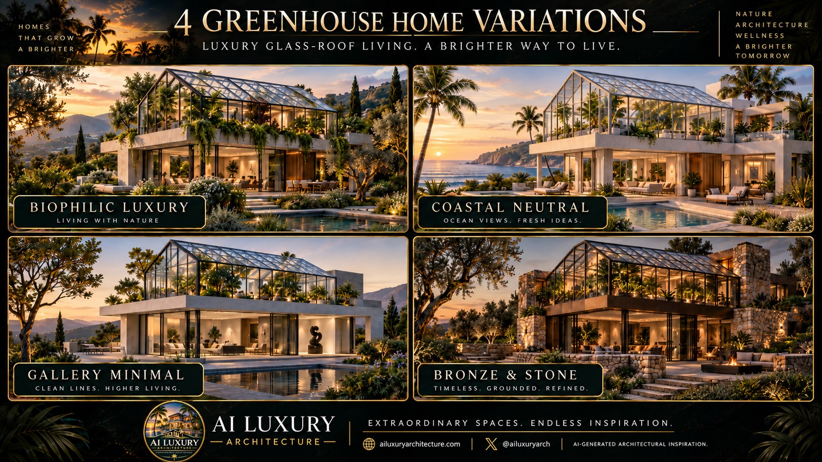
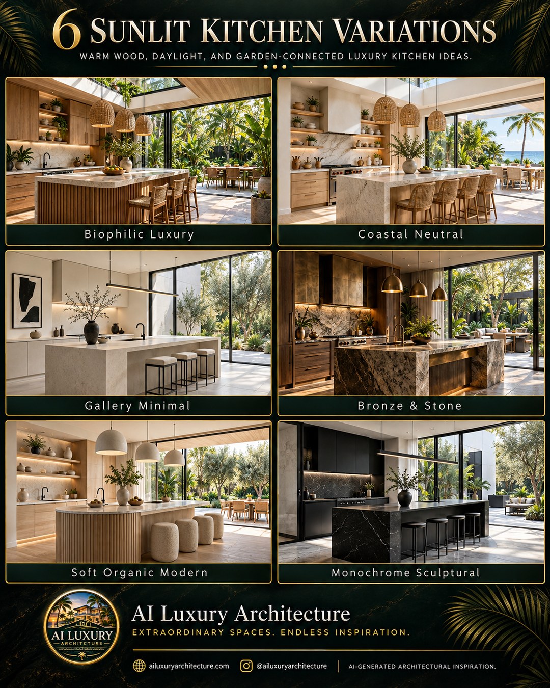
Additional AI-generated architectural studies connected to the ideas explored in this article.


AI disclosure: This article explores AI-generated architectural inspiration and conceptual design ideas. It does not describe a claimed real-world property, client, architect, or built project.