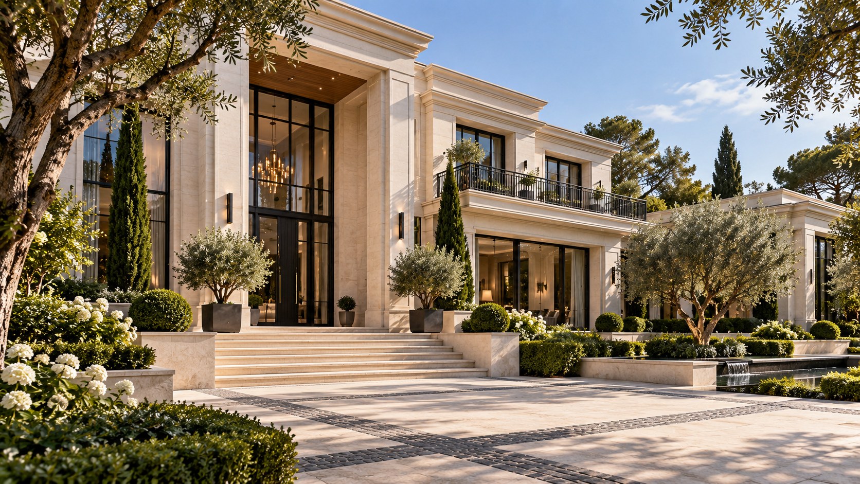
A grand mansion entrance becomes convincing when scale, stone, glazing, balconies, landscape, and lighting work as one composition. This design study examines how modern classical architecture can create ceremony and warmth without relying on excess, turning the approach to a luxury residence into a carefully staged spatial sequence.
A memorable mansion entrance is rarely created by one oversized door or one dramatic window. Its effect comes from a sequence of relationships: the proportion of the facade, the depth of the approach, the scale of steps, the rhythm of openings, the contrast between solid stone and glass, the placement of balconies, the framing of trees, and the way light makes those elements legible after sunset.
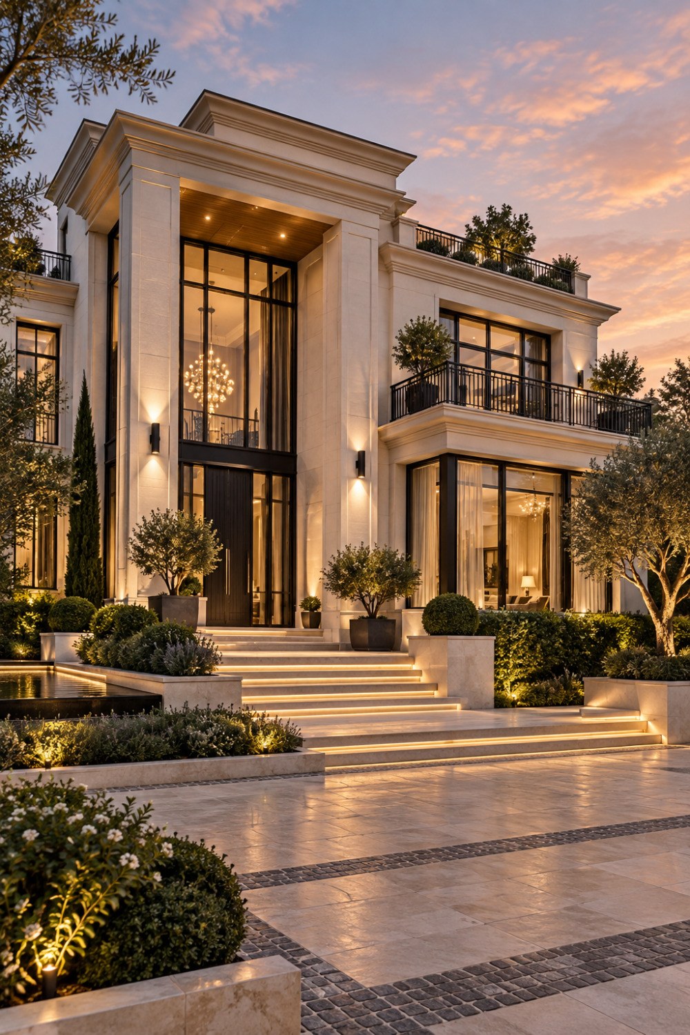
The approved AI-generated concept offers a strong starting point for that discussion. The image shows a modern classical residence at dusk with pale stone cladding, tall black-framed windows, a double-height entry volume, dark balcony railings, wide illuminated steps, layered planting, and warm architectural lighting. The composition is formal without being rigid. Its classical character comes through symmetry, vertical emphasis, cornice-like roof edges, substantial wall planes, and an entry sequence that is clearly more important than the surrounding openings. At the same time, the glass, slim dark frames, restrained detailing, and warm lighting keep the concept contemporary.
The architectural lesson is broader than the image itself. Modern classical residential design succeeds when old ideas about order, proportion, procession, and hierarchy are translated into contemporary construction rather than copied as historical decoration. A grand entrance should tell visitors where to go, make the scale of the house understandable, create a sense of shelter at the threshold, and establish the material and lighting language that continues through the rest of the home.
This article explores how those principles can be developed into a coherent luxury residence. The focus is not on reproducing one facade, but on understanding how proportion, vertical scale, glazing, stone, balconies, landscape, steps, and evening light can work together to make arrival feel ceremonial, comfortable, and architecturally credible.
Build the Facade Around a Clear Hierarchy
The most important quality of a grand entrance is hierarchy. Visitors should be able to understand the front of the house before they consciously analyze it. The entry should read as primary, the major living spaces as secondary, and smaller private or service openings as subordinate. When every window, balcony, and projection competes for attention, the facade may look expensive but it loses architectural clarity.
A modern classical composition can establish hierarchy through scale rather than ornament. The entry volume can rise higher than adjacent wings, project slightly forward, or be framed by deeper stone piers. A double-height glazed opening can make the threshold visible from a distance, while surrounding windows remain large enough to feel luxurious without challenging the entrance. The effect is strongest when these moves are coordinated with the overall width and height of the facade.
Vertical proportion matters because the human eye reads the entrance from the ground upward. Tall piers, elongated glazing, and a clear roof line can create a sense of upward movement that makes the center feel ceremonial. But height should remain connected to the actual interior volume. If a facade suggests a monumental hall but the space behind it is shallow or fragmented, the exterior expression becomes cosmetic. The most convincing architecture lets the exterior hierarchy correspond to the internal organization.
Classical architecture traditionally relied on ordered bays, aligned openings, base-middle-top relationships, and controlled symmetry. Contemporary design can use the same compositional discipline without reproducing historical columns or heavy ornament. Pale stone panels can establish the base and primary wall fields. Dark window frames can create precise vertical lines. Balconies can mark upper-level rooms while remaining subordinate to the center. The roof edge can complete the composition with a simple projecting cornice or deep parapet.
Hierarchy also depends on restraint. One strong entry volume is often more effective than several competing towers or porticos. If the central gesture is clear, surrounding elements can be quieter. This gives the facade a sense of confidence and allows material quality, depth, and lighting to become more important than decorative complexity.
Use Stone and Dark Metal to Create Weight, Precision, and Contrast
Material contrast is one of the most effective ways to modernize classical residential architecture. Pale stone gives the facade visual weight and permanence. Dark metal introduces precision. Glass adds depth and reflection. Together they create a composition that feels both grounded and contemporary.
Stone works particularly well at a grand entrance because it can define the primary structural-looking elements of the facade. Large vertical piers, deep reveals, stair walls, planters, and terrace edges can all be expressed in the same stone family. Repetition helps the building feel intentional, but the stone does not need to appear in identical ways everywhere. Smooth panels may suit the primary facade, while slightly more textured surfaces can be used at landscape walls or lower plinths.
Panel dimensions should reinforce the scale of the architecture. Very small stone modules can make a large mansion look visually busy, while oversized panels can appear unrealistic if joints, thickness, and fixing logic are ignored. The goal is to suggest a plausible cladding system with consistent joints, reasonable corner conditions, and enough depth around windows and doors to make the facade feel substantial.
Dark metal frames provide the counterpoint. Their thinness makes glazing feel precise and contemporary, while the dark color creates clear outlines against pale stone. The same family of dark metal can repeat in balcony railings, door hardware, lighting housings, and selected landscape details. This repetition gives the building a coherent visual language without requiring decorative matching.
The contrast also helps with scale. A tall black-framed window reads almost like a vertical incision in a stone wall. A dark railing makes a balcony edge feel lighter. A deep dark entry door can anchor the center of a pale facade. These effects are architectural because they depend on mass, edge, and proportion rather than surface pattern alone.
Material restraint is especially important in a large residence. Adding too many stones, metals, woods, and decorative colors can make the exterior feel fragmented. A limited palette allows shadow, landscape, glazing, and lighting to supply variation. Luxury emerges from the quality of relationships rather than the number of finishes.
Make the Double-Height Entrance a Real Spatial Experience
A double-height entry is most successful when it changes the experience of arrival, not merely the silhouette of the facade. From outside, the height can make the entrance unmistakable. From inside, it should create a clear moment of vertical release, daylight, and orientation.
The transition begins before the door. A visitor may move across a forecourt, approach a series of broad steps, pass between planted edges, and arrive beneath a more protected threshold. That sequence can compress and then release space. The exterior may feel open and expansive, while the doorway itself is more focused. Once inside, the taller volume opens upward and helps establish the main circulation routes.
Glazing can strengthen this effect by allowing the vertical space to be visible from the approach. A tall window above the door can reveal warm interior light, a suspended fixture, or the depth of the foyer without exposing every private area beyond. The challenge is balance. Too much transparency can make the entrance feel like a display case. Too little can make the double-height volume invisible from outside.
A large pendant or chandelier can provide scale within the void, but it should not be chosen only for size. Its position should relate to the entry axis, upper-level circulation, and sightlines from outside. The fixture can become part of the evening identity of the house, especially when seen through tall glazing, but it should remain integrated with the architecture rather than becoming the only focal point.
The proportions of the foyer should also remain believable. A very tall space needs enough width and depth to avoid feeling like a shaft. The staircase, gallery, or upper bridge should be placed so the height has a functional relationship to circulation. A double-height entrance can support orientation by making it easier to understand where the main living rooms, upper floor, or garden axis are located.
The strongest result is one in which the entrance feels ceremonial because it organizes movement, light, and scale. Monumentality becomes useful rather than decorative.
Design Steps, Forecourts, and Balconies as Part of the Same Composition
The facade does not begin at the front door. It begins at the first point where the visitor understands how to approach the house. Steps, paving, low walls, planters, water features, and balconies all influence that reading. In a grand residence, these elements should be composed as carefully as the main elevation.
Wide steps can create ceremony because they slow movement and widen the approach. They also require careful proportion. Risers should remain comfortable and consistent. Landings should provide natural pause points. Handrails or guards may be required depending on the configuration, and they should be integrated rather than treated as afterthoughts. Lighting can be concealed beneath treads or within adjacent walls, but it should clarify edges without making every step glow excessively.
The forecourt should provide enough visual breathing room for the facade to be read. A paved area directly in front of the entrance can function as a drop-off, arrival court, or simple transitional space, but its material pattern should reinforce the axis of the house. Dark stone bands, subtle changes in paving module, or aligned joints can guide movement without needing obvious directional graphics.
Balconies add another layer to the composition. In a modern classical house, they can provide depth and shadow while helping upper-level rooms connect to the exterior. Their proportions should relate to the windows behind them and the facade below. A balcony that is too shallow becomes decorative. One that is too deep can visually overwhelm the lower level. Railings should be refined enough to feel light but robust enough to remain credible.
Balconies also affect the balance of symmetry. Matching elements on both sides can reinforce formality, while a slightly asymmetrical arrangement may create a more relaxed contemporary character. Either approach can work if the main entry remains clearly dominant.
When steps, forecourt, facade, and balconies share a common material and proportional logic, arrival feels like one continuous architectural sequence rather than a building placed behind landscaping.
Use Landscape to Frame Architecture Instead of Hiding It
Formal residences often benefit from structured landscape, but the planting should not compete with the facade. The strongest approach uses trees, shrubs, planters, and low groundcover to frame important architectural elements, soften large stone surfaces, and guide the eye toward the entrance.
Trees can provide vertical counterpoints to tall windows and piers. Narrow upright species can reinforce the height of the entry, while broader canopies can soften the edges of the composition. Their placement should account for mature size so trunks and branches do not eventually block principal windows or crowd the steps.
Low clipped shrubs are useful near formal facades because they provide order without obscuring the stone base. More natural planting can then appear farther from the entrance, creating a transition from architectural precision to softer garden character. The contrast helps the central approach feel intentional without requiring the entire property to become rigidly symmetrical.
Planters can mark thresholds and landings, especially where a broad stair might otherwise feel exposed. Their height should remain low enough to preserve sightlines and wide enough to support healthy planting. Large containers near the door can introduce scale and seasonal greenery, but they should not narrow circulation or become decorative clutter.
Lighting is part of the landscape composition. Small integrated fixtures can reveal tree trunks, hedge edges, or stone planters after dark. The goal is to create layers. Architecture may receive wall washing or focused facade light, while planting receives softer, lower illumination. This separation produces depth and prevents the entire foreground from becoming uniformly bright.
Landscape is most effective when it makes the architecture easier to understand. It frames the entrance, softens hard edges, creates foreground and middle ground, and helps the house feel established within its setting.
Use Evening Lighting to Reveal Depth, Not Just Brightness
Dusk is particularly flattering to modern classical architecture because the pale facade still catches ambient sky light while warm artificial light begins to reveal the building's depth. The contrast between cool exterior atmosphere and warm interior glow can make glazing, steps, balconies, and landscape more legible without changing the architecture itself.
Good exterior lighting begins with hierarchy. The entrance should be easy to find, but it does not need to be the brightest object in the scene. Wall-mounted fixtures can emphasize vertical stone piers. Recessed soffit lights can define depth beneath balconies. Step lighting can make circulation safe. Landscape lights can reveal selected trees and planters. Interior light visible through glazing can provide a softer layer behind the facade.
Uniform brightness is usually less effective. If every stone wall, hedge, tree, balcony, and stair receives the same intensity, the facade loses depth. The eye needs darker areas to understand projection and recession. Shadows under cornices and balconies help explain the building's three-dimensional form.
Color temperature should also be controlled. Warm light generally complements pale stone and creates a welcoming relationship with the interior, but excessive amber can distort material color. The most refined schemes use warm architectural light while allowing the cooler dusk sky to remain visible. This contrast gives the residence a strong evening identity without making it look theatrical.
Glare must be controlled around tall windows. Bright fixtures reflected in glass can weaken transparency and distract from interior depth. Shielded sources, careful aiming, and lower brightness near glazing can help preserve the relationship between inside and outside.
A well-lit entrance therefore feels composed rather than illuminated for display. Light explains the architecture. It reveals steps, frames stone, emphasizes height, and helps landscape participate in the arrival sequence.
Modern Classical Luxury Depends on Restraint
The phrase modern classical can easily become an excuse to combine every symbol of luxury at once: oversized columns, elaborate moldings, reflective stone, multiple balconies, ornate railings, large chandeliers, and extensive landscape lighting. The result may be impressive in scale but weak in hierarchy.
A more convincing approach begins with proportion and removes anything that does not strengthen it. The entry can be tall without being overloaded. Stone can feel substantial without excessive carving. Balcony railings can be elegant without ornate pattern. The roof edge can suggest classical order through depth and shadow rather than copied historical ornament.
Restraint also allows contemporary elements to coexist with classical composition. Large black-framed windows would feel out of place on a facade dominated by delicate historical detailing, but they work naturally when the architecture relies on clean stone planes, strong vertical bays, and simplified cornice lines. The same is true of lighting. Integrated step lights and minimal wall fixtures can support a formal facade without making it feel period-specific.
Human scale remains essential. A grand entry should still provide shelter at the door, comfortable steps, clear handles, appropriate lighting, and a sense of where to pause. Balconies should be usable. Windows should correspond to actual rooms. Landscape should not obstruct movement. These practical considerations keep monumentality from becoming abstract.
The approved image is valuable as conceptual inspiration because it demonstrates how relatively few elements can create a strong sense of arrival: pale stone, dark frames, tall glazing, balconies, broad steps, clipped planting, and warm light. The lesson is not to reproduce that exact combination. It is to understand the discipline behind it.
Modern classical luxury feels most durable when architecture is ordered before it is decorated. Proportion, hierarchy, material consistency, landscape, and light do the primary work. Ornament, if used at all, becomes secondary.
A grand illuminated entrance succeeds when it is more than a facade image. It should organize arrival, clarify hierarchy, reveal the interior scale of the house, and establish a material language that can continue through the property.
The AI-generated concept examined here is not a real mansion, completed project, or property listing. Its value lies in the design principles it makes visible. Pale stone creates weight. Dark metal sharpens edges. Tall glazing gives the entrance vertical presence. Broad steps create procession. Balconies add depth. Landscape frames the architecture. Warm evening light turns those relationships into a legible composition after sunset.
For a real residence, each of these ideas would need to be developed through structure, envelope detailing, drainage, accessibility, glazing performance, landscape maturity, lighting control, and local construction requirements. That technical work is not separate from the visual effect. It is what allows the facade to remain convincing when viewed up close, used every day, and maintained over time.
The enduring lesson is that grandeur depends less on excess than on order. When the entrance has a clear center, materials repeat with discipline, steps and landscape reinforce movement, and lighting reveals depth instead of flattening it, modern classical architecture can feel both ceremonial and contemporary. The residence gains presence without losing restraint, which is what allows the arrival experience to remain memorable rather than merely large.
Related Visual Inspiration
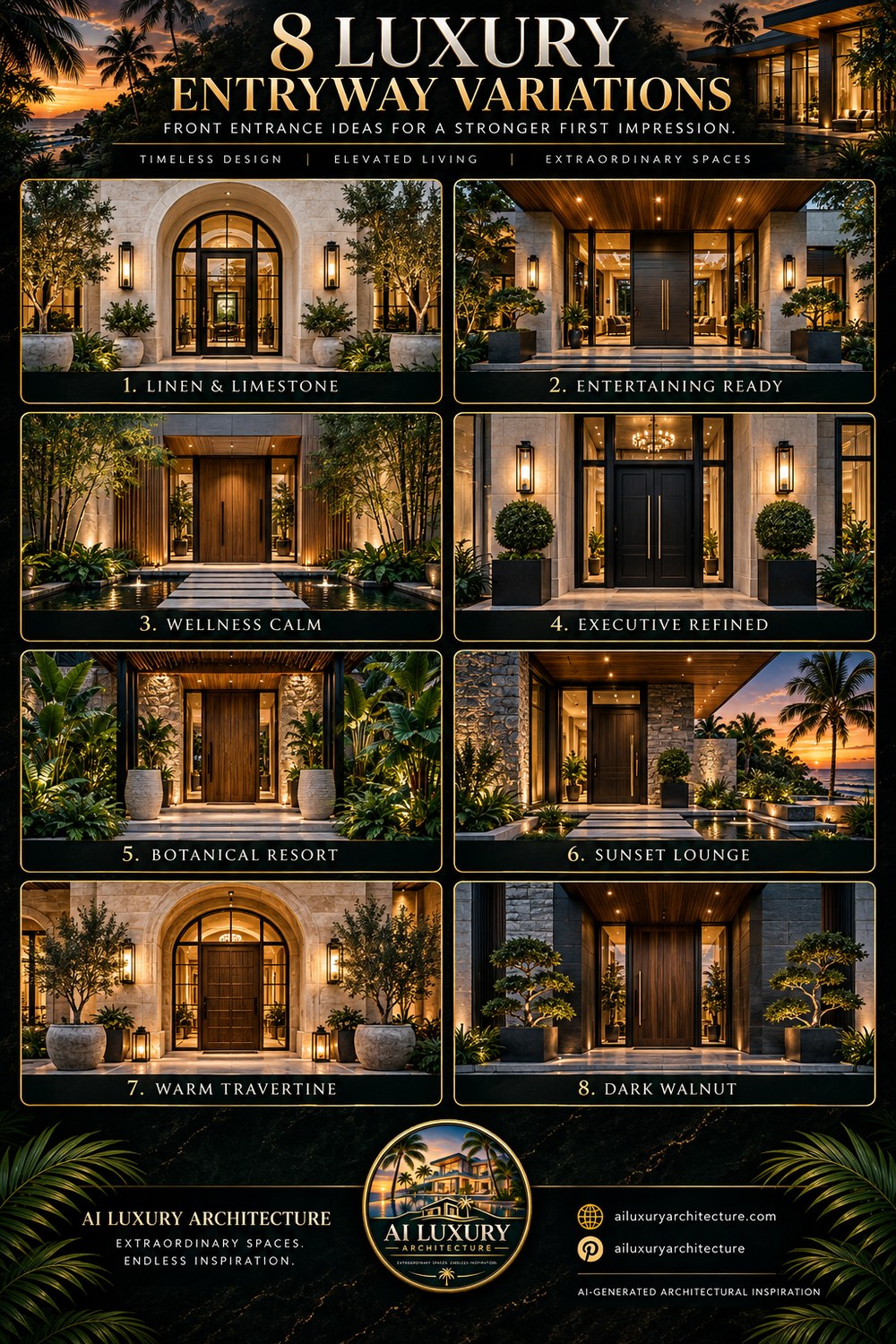
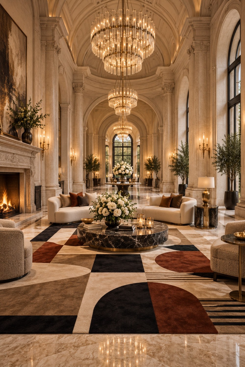
Additional AI-generated architectural studies connected to the ideas explored in this article.
AI disclosure: This article explores AI-generated architectural inspiration and conceptual design ideas. It does not describe a claimed real-world property, client, architect, or built project.