
Luxury architecture can be rich in stone, water, light, timber, and sculptural form without becoming visually chaotic. This essay examines minimalism as disciplined composition, exploring proportion, hierarchy, materials, circulation, lighting, comfort, maintenance, and the difference between an empty room and a truly ordered one.
Minimalism is often discussed as though it were a visual quantity: fewer objects, fewer colors, fewer lines, less decoration. In residential architecture, that definition is too shallow to be useful. A room can contain a substantial stone stair, a sheet of water, a carefully illuminated wall, generous glazing, and custom furniture and still feel remarkably restrained. Conversely, a nearly empty room can feel visually noisy if its proportions, junctions, lighting, or circulation are unresolved. The more useful question is not how much architecture is present, but how deliberately the architecture has been composed.
The idea is especially revealing in luxury residences because luxury expands the range of things a design can do. A generous budget or a large footprint can permit spatial generosity, unusual materials, integrated landscape, dramatic vertical connections, and highly controlled lighting. Yet those possibilities can easily become accumulation. The architectural challenge is to decide which gestures deserve attention, which should remain quiet, and how they can coexist without competing for the same visual and emotional territory.
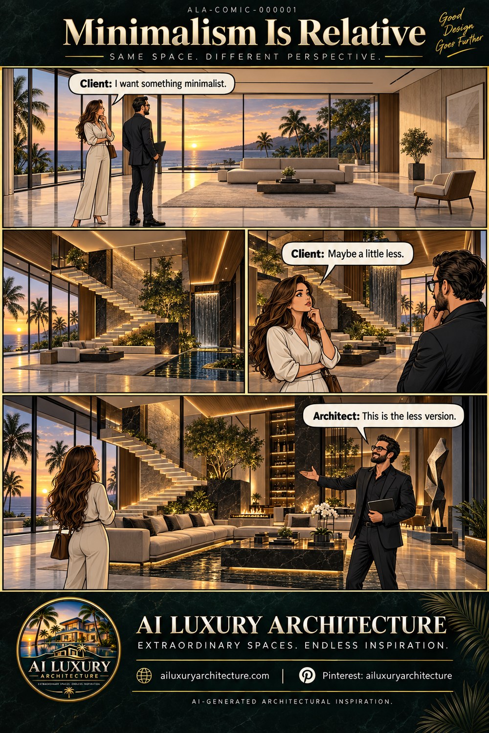
The conceptual residence represented in the accompanying Architecture Comic makes that tension deliberately humorous. Its restrained living room becomes more elaborate through the introduction of a sculptural stair, integrated water, planted elements, rich stone, and layered indirect illumination. The joke depends on a real architectural phenomenon: one designer's idea of “less” may include an extraordinary number of carefully coordinated elements, provided those elements read as one composition rather than as a collection of statements. The image is AI-generated architectural inspiration, not documentation of a real project, but its premise opens a useful discussion about what restraint actually means in sophisticated residential design.
This article treats minimalism as a discipline of relationships rather than a shopping list of omissions. It examines proportion, visual hierarchy, circulation, material continuity, light, water, furniture, detailing, maintenance, and the emotional experience of a room. The goal is not to argue that elaborate architecture is secretly minimalist, nor that minimalism is inherently superior. It is to establish a more precise way of judging restraint: by asking whether every visible decision contributes to a coherent spatial order, whether complexity is concentrated rather than scattered, and whether the residence leaves enough perceptual room for people, landscape, light, and time.
Minimalism Begins With Order, Not Emptiness
The most important distinction in a discussion of residential minimalism is the difference between absence and order. Absence is easy to photograph: remove furniture, reduce decoration, empty a shelf, simplify a palette, and the room immediately appears quieter. Order is harder. It requires decisions about axes, proportions, alignments, repetition, hierarchy, and the relationships between elements that remain. A well-ordered room can be richly furnished and still feel calm because the eye understands how its parts belong together. An empty room can feel unsettled when door openings, ceiling planes, lighting points, furniture edges, and structural lines seem to have been placed independently.
This distinction becomes particularly important in luxury interiors because large rooms expose weak organization. In a compact space, a wall, sofa, or pendant may establish an obvious center. In a generous living room, there can be several competing centers: a view, a fireplace, a staircase, an artwork, a dining table, a water feature, and a circulation route. The architectural task is to establish a primary hierarchy among them. Minimalism, in this sense, is not the elimination of centers but the controlled ranking of centers.
The comic's transformation from a relatively sparse living room to a room containing stone, water, planting, a sculptural stair, and dramatic light illustrates this principle. None of those elements is inherently incompatible with restraint. The question is whether they are given equal visual weight. A staircase can become the principal vertical gesture while the water remains a low reflective plane. Planting can soften a hard stone wall without becoming a garden room. Indirect lighting can reveal the geometry of a ceiling or stair edge without turning every surface into a glowing object. When hierarchy is clear, complexity can be perceived as composition.
Architects often create this order through a small number of governing decisions. A central axis may connect an entry to a view. A ceiling recess may align with a stair or fireplace. A continuous floor material may allow several rooms to read as one field. A repeated vertical module may connect cabinetry, doors, glazing, and wall panels. These decisions do not necessarily make the room visually empty. They make it legible. The eye encounters fewer unrelated instructions because many individual elements participate in the same underlying system.
This is why the phrase “minimalism is relative” has a serious architectural meaning beneath its humor. A designer may see a room with several extraordinary components as minimal because the components have been subordinated to a larger order. A client may see the same room and count the components instead. Both perceptions are understandable. One is measuring quantity; the other is measuring coherence. For design purposes, coherence is usually the more useful measure.
The practical implication is that restraint should be established before decorative decisions are made. Begin by deciding what the room needs to organize: movement, a view, a fireplace, a stair, a conversation zone, or a relationship to the landscape. Then determine which architectural elements can reinforce that order. If the room already has a powerful structural gesture, additional gestures should probably become quieter. If the architecture is deliberately plain, one strong material or spatial feature may provide the necessary character. Minimalism emerges from this distribution of emphasis, not from a universal number of objects.
The same principle applies to the exterior. A residence with broad terraces, deep overhangs, stone retaining walls, generous glazing, and carefully planted landscape may appear more elaborate than a simple box. Yet if its geometry follows the site, its materials repeat coherently, and its openings are carefully proportioned, the overall reading can remain calm. Complexity that is organized becomes character. Complexity that is uncoordinated becomes clutter.
Proportion Determines Whether Luxury Feels Calm or Excessive
Proportion is one of the least visible and most consequential tools of restraint. A room does not become minimal because it contains fewer objects; it becomes calm when its dimensions, openings, furniture, ceilings, and architectural gestures relate convincingly. Luxury residential architecture often operates at a larger scale than ordinary domestic interiors, so proportion becomes even more important. A high ceiling, long wall, or generous stair can be impressive, but each also creates more visual territory that must be composed.
Consider a sculptural stair. Its visual impact depends not only on the material of the treads or the elegance of its railing, but on its width relative to the room, the thickness of its elements, the amount of open space around it, and the way its landing meets the upper level. A broad stair can make a residence feel generous and ceremonial, while an over-scaled stair can consume the room and turn circulation into spectacle. A visually light stair can preserve openness, but if it is too thin or visually unsupported, it may appear disconnected from the architecture. Restraint is therefore a matter of calibrated presence.
The same is true of water. An integrated water feature can introduce reflection, sound, and a sense of continuity between interior and landscape. But a water surface becomes architecturally convincing when its dimensions relate to the surrounding floor, furniture, wall planes, and circulation. A narrow linear channel can act almost like a drawn line, reinforcing a direction of movement. A larger pool can become a spatial field and alter the apparent size of the room. Neither is inherently more minimal. Their success depends on proportion and placement.
Ceiling height is another decisive factor. A dramatic double-height volume can make furniture and people feel small, which may be desirable when the goal is grandeur. Yet the same volume can feel impersonal if there is no intermediate scale. This is where balconies, stair landings, shelving, curtains, furniture groupings, and lighting layers become important. They introduce human-scale references within the larger volume. A restrained luxury interior often alternates between monumental and intimate scales rather than holding everything at one dimension.
Openings require the same discipline. Large glass walls can create extraordinary connections to a landscape, but their effect changes with mullion spacing, sill height, ceiling alignment, and the location of adjacent solid walls. A broad opening can make a room feel continuous with the exterior, while a carefully placed vertical opening can frame a single tree or distant view. If every wall is opened equally, the visual hierarchy can disappear. Selective generosity is often more powerful than universal generosity.
Furniture should be treated as part of this proportional system rather than as an afterthought. A low sofa beneath a tall ceiling can emphasize the volume above it, while a higher-backed chair can establish a more intimate zone. A substantial stone table can balance a large stair, but the same table may feel heavy in a smaller room. Rugs can define conversation zones without building physical walls. The goal is to create a sequence of scales: architectural scale, furniture scale, and human scale, all readable at once.
Luxury is often associated with abundance, but architectural luxury can instead be experienced as the absence of awkwardness. Door heights align. Wall reveals terminate cleanly. Furniture leaves comfortable circulation. A stair begins where the room can receive it. Lighting reveals surfaces without flattening them. Materials meet without unnecessary visual noise. These conditions are rarely noticed individually, yet together they produce a strong sense of ease. That ease is one of the deepest forms of luxury because it suggests that the environment has been considered rather than merely decorated.
A useful design test is to ask what happens if an element becomes larger, smaller, brighter, thicker, or more distant. If a minor adjustment immediately destabilizes the composition, the element may already be carrying too much responsibility. If the room remains coherent while the element changes modestly, the hierarchy is probably robust. Proportion gives restraint resilience. It allows the architecture to contain richness without depending on a single oversized gesture to announce itself.
The Luxury of Material Restraint: Fewer Families, More Depth
Minimalism is frequently reduced to a pale palette, but color reduction is only one part of material restraint. A sophisticated residence can use stone, timber, metal, glass, plaster, upholstery, and water while still maintaining a disciplined material language. The key is to limit visual competition within each family of surfaces and to give materials enough continuity to establish identity.
The stone visible in the conceptual comic is useful as an example because sculptural stone can easily become a statement object. If every wall uses a different veining pattern, every surface becomes an event. If one stone is used selectively across a fireplace, stair wall, plinth, or floor detail, its recurrence can create continuity. The material begins to operate as architecture rather than decoration. The same slab may appear substantial in one location and quiet in another, allowing the room to feel richer without accumulating unrelated finishes.
Timber can perform a similar role. Its warmth is especially valuable in large rooms with extensive glazing or stone, where an entirely mineral palette may feel severe. Rather than using timber on every available surface, it can be concentrated at the ceiling, a wall plane, cabinetry, or the underside of a stair. Repetition then becomes more important than coverage. A warm timber element that reappears at several points can visually connect spaces that are otherwise separated by stone or glass.
Metal requires an even lighter touch. Dark bronze, blackened metal, or another restrained finish can establish a fine line around glazing, stairs, shelving, or doors. Its visual strength comes from precision. Thick or highly reflective metal can become an object in itself, whereas a quiet profile can simply clarify edges. This is one reason luxury minimalism often depends on detailing that is felt more than noticed. The material is present, but its role is subordinate to the geometry.
Glass has a different challenge because it is both material and absence. Its visual effect depends on what it reflects, what it reveals, and where its edges are placed. Large glazing can make an interior appear lighter and more spacious, but the glass itself should not become the only subject. Solid walls, curtains, planting, furniture, and ceiling planes provide visual anchors. When those elements are carefully balanced, transparency becomes a spatial condition rather than a decorative feature.
Water is perhaps the most demanding material because it is simultaneously surface, reflection, movement, sound, and light. A quiet water plane can double the apparent depth of a room, catch the underside of a stair, or introduce a subtle connection to landscape. But water also amplifies everything around it. A cluttered ceiling becomes cluttered twice through reflection. A bright light becomes brighter. A strong material pattern becomes visually multiplied. For that reason, integrating water successfully often requires greater restraint elsewhere.
The goal is not to make every surface uniform. Uniformity can become flatness. Instead, a disciplined palette should contain variation in texture, reflectance, scale, and temperature. Honed stone can sit beside textured plaster; warm timber can meet dark metal; soft upholstery can interrupt hard architectural planes. The materials remain different, but their relationships are controlled. This is a more durable form of minimalism because it does not depend on a sterile absence of texture.
Material restraint also has a temporal dimension. Natural stone changes subtly with use, timber develops character, metal can acquire patina, and fabrics respond to touch and daylight. A successful material palette allows these changes without making the architecture look unfinished. This matters in a luxury residence because a space should not depend on pristine surfaces to remain convincing. If the composition is strong, modest signs of life can add depth rather than diminish it.
A useful rule is to ask whether a new material improves the architecture or merely adds novelty. If a second stone is introduced because it clarifies a transition, that may be valuable. If it is introduced only because the first stone feels too simple, the design may be moving toward accumulation. Restraint is often achieved by asking one material to do more work rather than by continuously adding another.
Light Is a Compositional Material, Not Decoration
The phrase “museum-level lighting” in the comic is intentionally exaggerated, but it points toward a serious principle: light can determine whether an elaborate room reads as disciplined or theatrical. The same architecture can feel quiet in one lighting condition and excessively dramatic in another. For this reason, lighting should be treated as part of spatial composition from the beginning rather than as a final layer applied after materials and furniture are chosen.
Natural light establishes the first hierarchy. Large glazing may create a powerful horizon, while a smaller opening can introduce a concentrated patch of daylight. Clerestories, skylights, courtyards, and deep reveals can make light directional and reveal texture gradually. A minimal room does not necessarily need bright illumination. It needs enough contrast for the eye to understand depth, material, and movement. If every surface receives equal light, the architecture can flatten into a catalogue of finishes.
Indirect lighting is particularly useful when the architecture contains strong forms. Concealed strips can wash a stone wall, reveal the underside of a stair, or define a ceiling recess without exposing the light source as a competing object. The source becomes perceptual rather than visual. This is an important form of restraint because the room appears luminous without being filled with visible fixtures.
However, concealment should not become a reflex. Visible fixtures can have architectural value when their scale and position are carefully chosen. A shaded floor lamp can create a small pool of intimacy inside a large room. A pendant can mark a dining table. A wall light can establish a rhythm along a circulation path. The question is not whether the fixture is visible, but whether its visibility supports the hierarchy of the room.
The conceptual comic uses a dramatic lighting layer to heighten the transformation from “minimal” to “less.” In a real design exercise, the more useful lesson would be to separate lighting into roles. Ambient light establishes general comfort. Architectural light reveals planes, edges, or textures. Accent light identifies selected objects or landscape elements. Task light supports specific activities. Decorative light may contribute character. These layers can coexist without competing if their intensities and positions are coordinated.
Reflection deserves particular attention in rooms containing stone floors, polished surfaces, or water. Every luminous element has the potential to produce secondary images. A ceiling light can appear in a glossy floor; a bright wall can be reflected in glass; a pendant can multiply in a water surface. This means a restrained lighting design often depends on controlling not only direct brightness but also reflected brightness. Matte or honed finishes can be valuable precisely because they reduce visual multiplication.
Night lighting should also preserve darkness. Luxury is not the same as maximum illumination. A room with a deep shadow at the edge can feel more dimensional than one where every corner is evenly lit. Darkness gives the eye somewhere to rest and allows a brighter architectural feature to have meaning. The same principle can apply outside: a selectively illuminated tree, wall, stair, or path may establish depth more effectively than a uniformly bright garden.
Good lighting therefore behaves like editing. It decides what should be seen first, second, and third. It can make a stair feel weightless, a wall feel substantial, or a ceiling seem higher. It can also make an otherwise calm room feel overproduced if every architectural feature is outlined. The most sophisticated lighting often leaves some work undone. It allows material, shadow, and distance to remain part of the composition rather than trying to reveal everything at once.
Circulation Turns Objects Into Architecture
A room becomes architecture through movement. This is particularly important when evaluating a dramatic element such as a sculptural staircase. If the stair is considered only as an object viewed from the sofa, its design may become overly theatrical. If it is considered as a route that changes how people enter, pause, turn, look, and move between levels, it becomes part of the spatial structure of the residence.
The stair in the conceptual image is effective as an idea because it transforms the living room from a single horizontal field into a vertical sequence. The eye can follow the treads upward, while the physical body experiences the same movement. A stair can frame a view, reveal a ceiling, separate public and private areas, or create a pause at a landing. Its architectural value comes from these relationships rather than from the sculptural quality of the stair alone.
Minimalism benefits from circulation that is easy to read. Paths should not require furniture to be pushed aside or visual obstacles to be negotiated. A generous room can still feel crowded if its circulation lines are unclear. Conversely, a room with several elements can feel remarkably open when movement is naturally directed around them. This is why furniture placement matters as much as floor area. A sofa, table, chair, or planter can either reinforce the movement system or obstruct it.
Thresholds are especially important. The transition from entry to living room, living room to terrace, or lower level to upper gallery can be marked by a change in material, ceiling height, light, or view. These changes do not have to be dramatic. A slight compression before a tall room can make the larger volume feel more generous. A darker passage can prepare the eye for a bright living space. A material change at a threshold can indicate a shift without introducing a physical barrier.
Landings provide another opportunity for architectural pause. A stair that rises continuously without a moment of orientation can feel efficient but anonymous. A landing with a window, artwork, seating edge, or change in ceiling height can turn circulation into experience. In a luxury residence, these pauses can be especially valuable because the building has enough space to make movement leisurely rather than purely functional.
Water can influence circulation in the same way. A shallow interior water feature may create a boundary between seating and architecture, but it must be paired with clear routes and carefully resolved edges. Its presence should enrich movement rather than turn circulation into a choreography of avoidance. The same principle applies to planted zones, fireplaces, changes in floor level, and large furniture groupings.
The strongest spatial compositions allow people to understand a room before they understand its details. From the entrance, there should be a readable sequence of destinations and secondary moments. The eye may first find a stair, then a landscape view, then a seating group, then a wall of stone. The body follows a related sequence. This alignment between visual movement and physical movement is one of the foundations of architectural calm.
There is also a psychological dimension. When circulation is generous and legible, occupants feel that the building accommodates them rather than requiring them to negotiate it. That sensation is subtle but central to residential luxury. A room can contain extraordinary architecture and still feel relaxed if movement through it is intuitive. The architecture does not demand attention at every step; it supports the activities taking place within it.
This suggests a useful test for apparently minimalist interiors: remove the furniture mentally and trace the paths. If the underlying geometry still makes sense, the architecture is doing meaningful organizational work. If the room only works because furniture happens to hide awkward junctions or direct movement around poorly placed elements, its apparent simplicity may be cosmetic. True restraint begins with a strong spatial skeleton.
When Complexity Works: Concentration, Contrast, and Hierarchy
There is no reason a luxury residence should apologize for complexity. Architecture has always used layered materials, dramatic volumes, crafted details, landscape, and ornament to create meaning. The issue is not complexity itself but whether complexity is concentrated into intelligible moments. A room can contain one highly elaborate element and remain calm because everything around it is quiet. The same room can become exhausting when every surface competes for attention.
The idea of concentration is visible in the comic's transformation. The upgraded room does not simply receive more furniture. Its complexity is concentrated around a few architectural themes: a strong stair, stone, water, planting, and layered light. Those themes reinforce one another. The stair provides vertical movement. The water introduces horizontal reflection. Stone gives mass. Planting introduces softness. Light connects their surfaces. The result is elaborate, but the elements belong to a recognizable family of ideas.
Contrast makes this concentration legible. Hard stone becomes more expressive beside soft upholstery. A dark stair edge becomes sharper against pale surfaces. A reflective water plane becomes quieter when surrounding finishes are controlled. Warm timber can prevent a mineral palette from becoming severe. Contrast does not necessarily increase visual noise; it can clarify the differences that make a composition readable.
The mistake is to interpret hierarchy as a single hero object. A room can have a primary focus without reducing everything else to background. Instead, hierarchy can be distributed across time and movement. The stair may dominate from the entry, the fireplace may take over from the seating area, and the landscape may become the focus at night. A well-composed residence can therefore have several moments of emphasis without allowing them all to occur simultaneously.
This is particularly useful in open-plan luxury interiors. When kitchen, dining, living, circulation, and landscape are visible together, each zone needs a degree of identity. That identity can come from ceiling height, furniture orientation, a rug, a material change, a light level, or a framed view. If every zone receives a different material and sculptural centerpiece, the result becomes fragmented. If every zone is identical, the plan becomes ambiguous. The art lies in controlled differentiation.
Architectural features should also be judged from multiple distances. A stone wall may appear simple from across the room but reveal texture up close. A railing may read as a thin line in a long view but become tactile at the stair. A ceiling recess may disappear from one angle and become a strong framing device from another. This layered legibility gives a residence depth. It allows the architecture to change as occupants move through it without requiring constant novelty.
The concept of restraint therefore benefits from thinking in terms of bandwidth. Every room can sustain only so many simultaneous signals before the eye begins to struggle with priorities. Signals include contrast, pattern, brightness, movement, texture, color, scale, and novelty. If a room is strong in one or two categories, it can afford more richness in another. A visually quiet palette may support a dramatic stair. A simple ceiling may allow a complex stone wall. A restrained material palette may support expressive planting. The balance changes from room to room.
This is also where editing becomes more difficult than adding. Once an architectural feature has been designed, there is a tendency to protect it. But if two gestures perform the same role, one may be unnecessary. If a fireplace already anchors a wall, a large artwork may compete with it. If the landscape is extraordinary, an oversized interior decorative object may weaken the view. If the stair is sculptural, its railing and lighting may need to become quieter. Subtraction at this stage is not about minimalism as an aesthetic ideology; it is about preserving hierarchy.
A sophisticated luxury interior can therefore be understood as a field of unequal attention. Some things are allowed to be memorable. Others are allowed to be merely correct. That distinction is not a failure of design. It is what makes the memorable elements feel memorable.
The Human Measure of Restraint: Comfort, Maintenance, and Time
Minimalism is often judged visually, but a residence is not a photograph. It is occupied, cleaned, repaired, furnished, rearranged, illuminated at different hours, and experienced from changing viewpoints. A design that appears restrained in a still image can become demanding in daily life if it requires constant maintenance or leaves no tolerance for ordinary use. The most convincing luxury therefore includes operational restraint: the architecture remains calm while life happens inside it.
Furniture is an obvious example. A perfectly aligned composition may look elegant, but seating should still permit conversation, reading, reclining, hosting, and movement. A coffee table can be sculptural while remaining reachable. A rug can define a room without becoming an obstacle. A staircase can be visually light while still providing a reassuring sense of enclosure and a comfortable relationship between steps and handrail. The human body is the final scale against which the architectural composition is tested.
Water features require an especially practical reading. Their visual effect can be extraordinary, but water introduces cleaning, access, evaporation, humidity, splash control, and edge detailing into the design conversation. The architectural lesson is not that water should be avoided. It is that a feature gains credibility when its operational consequences are anticipated. The more seamlessly a feature is integrated, the more important the hidden logic becomes. Luxury is partly the experience of not seeing the infrastructure that makes a refined environment work.
The same is true of lighting. Concealed fixtures create clean surfaces, but concealed does not mean inaccessible. Lamps, drivers, controls, and other components eventually require attention. A good design anticipates access without turning maintenance points into visible interruptions. This is one reason architectural minimalism often depends on careful planning behind the finished surfaces. The visual calm is the result of coordination rather than magic.
Material selection has a similar relationship to time. Highly reflective surfaces can look spectacular when immaculate but may reveal every fingerprint, scratch, or water mark. Very delicate finishes can demand a level of care that conflicts with relaxed residential life. More forgiving materials, including textured plaster, honed stone, natural timber, and durable upholstery, can develop character without losing compositional clarity. The objective is not to eliminate wear but to choose materials whose aging remains compatible with the intended atmosphere.
Climate and orientation also affect this human measure. Large glazing can create a remarkable relationship with landscape, but solar exposure, glare, heat, condensation, and privacy influence whether the space remains comfortable. Deep reveals, shading devices, curtains, planting, and carefully positioned openings can preserve the architectural idea while giving occupants control. Again, restraint is not simply what is visible in the final photograph. It is the absence of problems that would otherwise force the occupants to fight the architecture.
Privacy is another form of comfort. A minimalist room with continuous glass may feel open but can become psychologically exposed if every activity is visible from outside or from neighboring spaces. Layered thresholds, planting, screens, curtains, and carefully oriented openings allow a residence to shift between openness and retreat. The ability to change the visual condition of a room is itself a luxury. It gives occupants agency rather than fixing the house in a single photographic state.
Time also changes how minimalism is perceived. Morning light can make a room feel sparse and fresh. Evening illumination can make the same room feel intimate and layered. Furniture may move. Books may appear on a table. A plant may grow into a composition that was initially very controlled. A residence that accommodates these changes can remain coherent without demanding that occupants preserve a showroom image. This is an important distinction between minimalism as lifestyle performance and minimalism as architecture.
The most durable definition of restraint is therefore generous rather than restrictive. It gives enough space for movement, enough material variation for warmth, enough darkness for depth, enough infrastructure for reliable operation, and enough flexibility for life. A residence feels luxurious when the occupant does not have to behave like a curator of the architecture every minute of the day. The building carries its own order, allowing ordinary life to take place without destroying it.
A More Useful Definition of Minimalism in Luxury Architecture
The central lesson of the “less version” joke is not that architects secretly want to fill every room with expensive features. It is that the word minimalism can describe different kinds of reduction. One designer may reduce objects. Another may reduce colors. Another may reduce visual noise by aligning everything. Another may reduce the number of materials while increasing the scale of a single gesture. These are different strategies, and they can produce very different rooms while all claiming some relationship to minimalism.
For luxury residential architecture, the most useful definition is disciplined richness. The phrase accepts that a home can contain extraordinary materials and spatial experiences without becoming visually indiscriminate. Discipline determines what repeats, what contrasts, what remains hidden, what receives light, what frames a view, and where the body moves. Richness provides texture, depth, comfort, and moments of surprise. Neither side is sufficient alone.
This approach also changes how a design should be reviewed. Instead of asking whether the room looks minimal, ask whether the eye knows where to go. Ask whether the furniture establishes human scale. Ask whether the ceiling supports the room below it. Ask whether the stair clarifies movement between levels. Ask whether the materials form a coherent family. Ask whether light reveals architecture or simply brightens it. Ask whether the landscape remains an active part of the composition. Ask whether the residence would still feel calm when occupied, maintained, and viewed at night.
The review should also include subtraction, but subtraction should be intelligent. Remove an element and observe what architectural work disappears with it. If removing a stone wall makes the stair lose its sense of mass, the wall may be important. If removing a decorative object changes nothing, it may be unnecessary. If dimming a concealed light makes the room more legible because shadows return, the brighter setting was not serving the composition. These tests turn the vague idea of restraint into a series of architectural judgments.
There is an ethical dimension to this as well. Luxury architecture has the capacity to consume enormous amounts of material, energy, labor, and attention. A disciplined design does not automatically solve those issues, but it can resist the impulse to treat every available surface as an opportunity for display. Designing fewer but better-integrated gestures can create a richer experience with less visual and material competition. The aim is not austerity. It is intentionality.
The accompanying image remains fictional AI-generated architectural inspiration, but the architectural questions it raises are real design questions. The illustrated room is deliberately exaggerated so the distinction between a client's idea of “minimal” and an architect's idea of “less” becomes funny. Yet the underlying conflict appears in many forms of residential design: how much openness is enough, how much stone is enough, how much lighting is enough, how large a stair should be, how visible the structure should become, and when a memorable feature starts to dominate the room it was meant to enrich.
A good residence does not answer those questions with a fixed formula. It answers them through relationships. The same stone stair that would overwhelm one room could give another its necessary center. The same water feature that would feel theatrical in a small interior could become a quiet horizontal datum in a generous one. The same lighting detail that looks decorative in isolation can become almost invisible when it clarifies a long circulation sequence. Context, proportion, and hierarchy determine whether an element feels restrained.
This is why minimalism is relative, but not arbitrary. Personal taste will always influence where people draw the line between simple and elaborate. Architecture, however, gives us more precise criteria. We can examine order, proportion, material continuity, light, circulation, comfort, maintenance, and the distribution of attention. Those criteria allow a room to be judged beyond fashion or personal preference.
In the end, the quietest luxury may not be the room with the fewest things. It may be the room in which every significant thing knows its place. A sculptural staircase can belong there. A sheet of water can belong there. A richly textured stone wall can belong there. A carefully layered lighting system can belong there. The achievement is not that these elements disappear. It is that they stop arguing. When architecture reaches that condition, abundance can feel calm, and restraint can become something deeper than emptiness: a carefully composed freedom for the people who inhabit the space.
Minimalism in luxury residential architecture is most convincing when it is understood as an architecture of decisions rather than an architecture of deprivation. The conceptual comic makes the point through exaggeration, but the underlying lesson is precise: a room can contain substantial stone, a sculptural stair, integrated water, planting, expansive glazing, and layered light while remaining composed if those elements share a clear hierarchy and spatial logic.
The strongest measure is not how little the camera can see. It is how little the occupant has to fight. When proportion is calm, circulation is legible, materials age gracefully, light has hierarchy, and major gestures reinforce rather than compete, complexity becomes easier to inhabit. That is where luxury and restraint meet. This article and its imagery represent AI-generated conceptual architectural inspiration, not a real built project, architect, client, or property.
Related Visual Inspiration
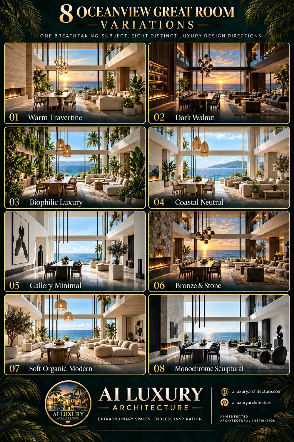
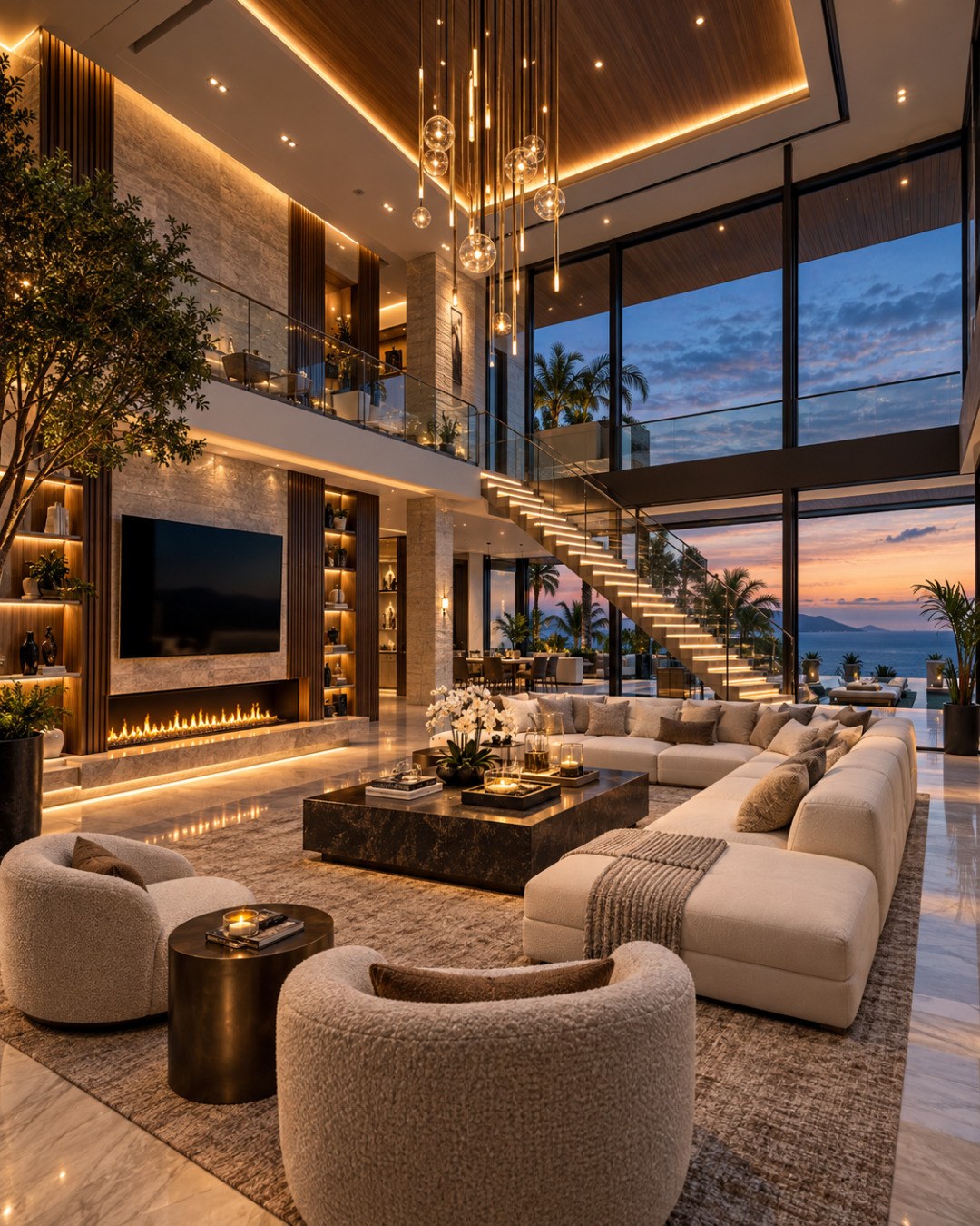
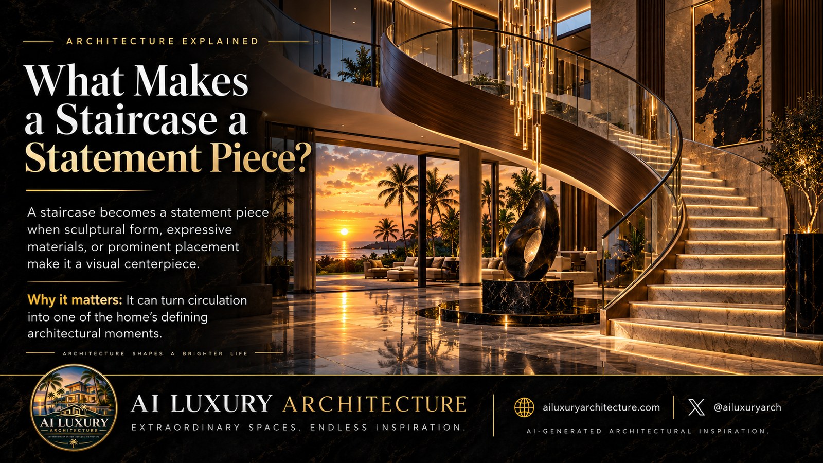
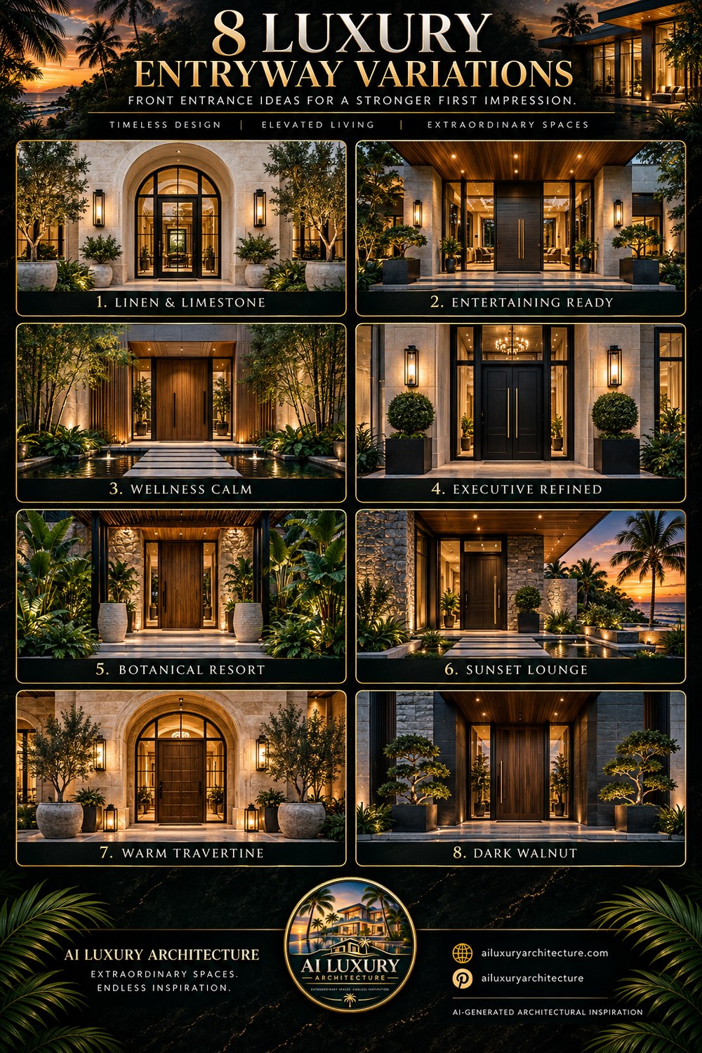
Additional AI-generated architectural studies connected to the ideas explored in this article.
AI disclosure: This article explores AI-generated architectural inspiration and conceptual design ideas. It does not describe a claimed real-world property, client, architect, or built project.