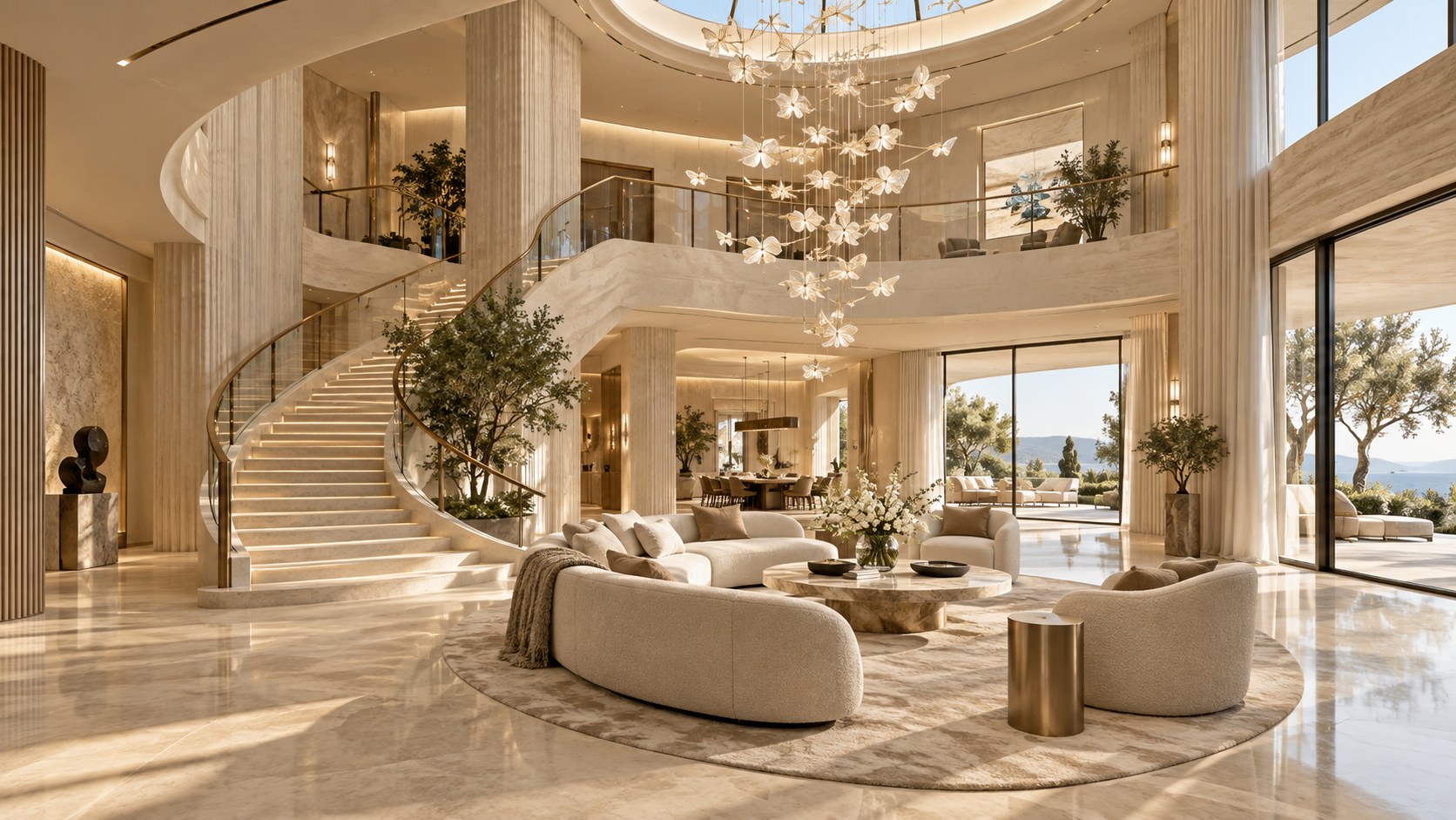
A grand atrium becomes compelling when height, circulation, lighting, materials, and furniture work as one system. This design study explores how curved galleries, sculptural stairs, warm stone, layered light, intimate seating, and landscape connections can turn a monumental interior into a calm and genuinely livable social space.
An atrium can easily become the most memorable space in a large home, but memorability alone is not the same as good architecture. The strongest atriums do more than impress on arrival. They organize circulation, pull daylight toward the center of the plan, connect upper and lower levels visually, and give otherwise separate rooms a shared sense of place. In a luxury interior, that challenge becomes especially interesting because scale, materials, lighting, furniture, art, and landscape all compete for attention. If every element is treated as a statement, the room quickly becomes exhausting. If the architecture is too restrained, the volume can feel empty or anonymous.
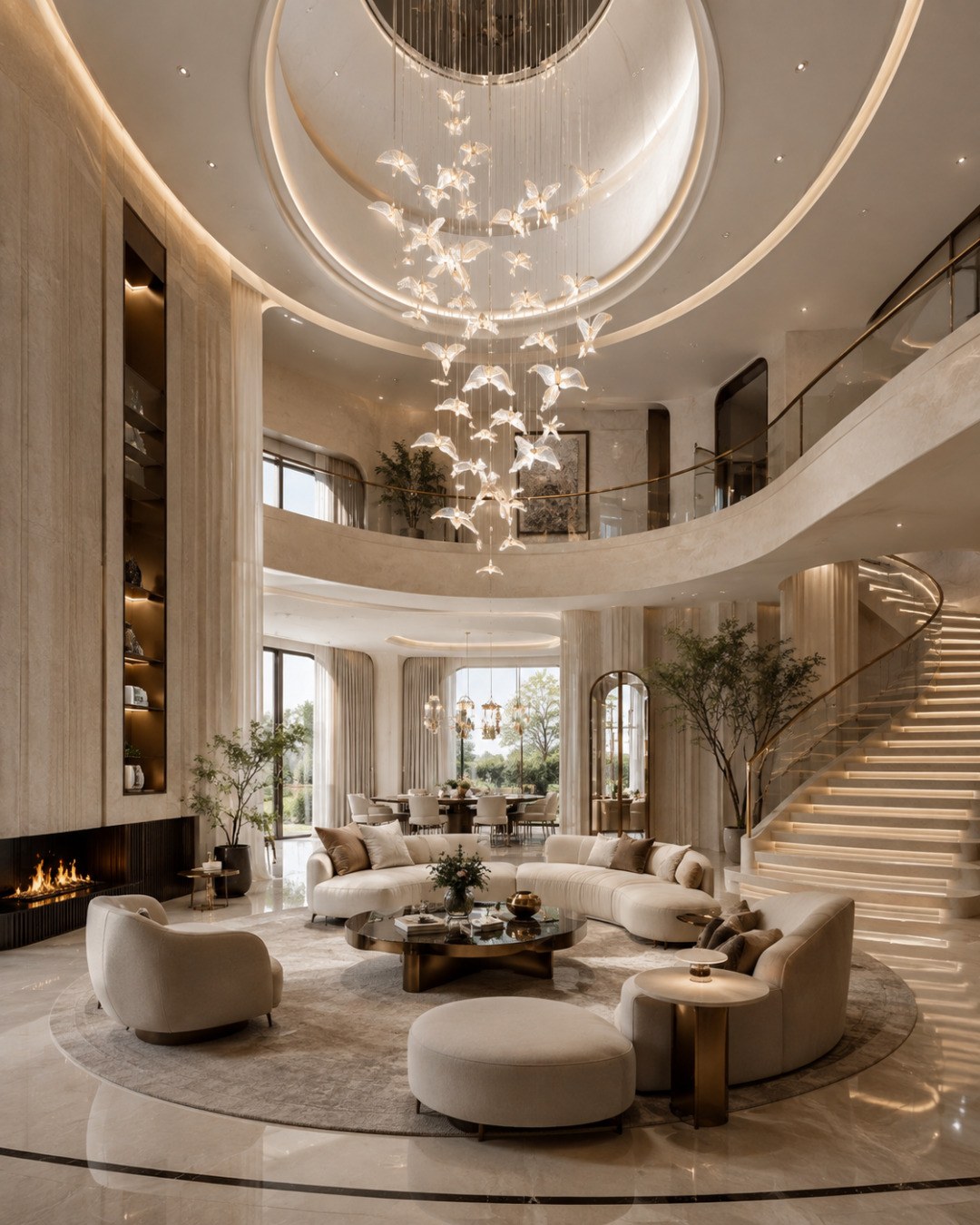
This AI-generated atrium concept offers a useful study in how those competing demands can be balanced. The room is grand in height, yet the lower level is arranged as an intimate lounge rather than a ceremonial void. Curving balcony edges sweep around the upper floor. A luminous spiral stair rises along one side. A large circular ceiling opening frames a cascading installation of translucent forms, creating a vertical focal point that connects the floor, the upper gallery, and the ceiling. Warm cream stone, bronze-toned details, built-in shelving, a linear fireplace, soft ivory seating, indoor trees, and a dining area visible beyond the lounge establish a palette that feels polished without becoming visually cold.
The value of the image is not that it represents a real property. It does not. It is conceptual, AI-generated architectural inspiration. Its usefulness lies in the design questions it raises. How can a very tall room still feel comfortable? How should circulation be expressed when a stair is visible from almost every angle? When does a sculptural light become architecture rather than decoration? How can warm neutrals avoid becoming bland? What kinds of furniture work at the base of a double-height space? And how do adjacent rooms remain connected without sacrificing the atrium’s identity?
Those questions matter because an atrium is rarely a single design gesture. It is a system. Ceiling geometry affects lighting. Balcony shape affects sightlines. Stair placement affects movement. Furniture scale affects comfort. Material reflectivity affects atmosphere. Plants affect softness and perceived scale. The most convincing results come when these decisions reinforce one another. The following sections use this concept as a springboard for a broader discussion of atrium design, with an emphasis on proportion, movement, light, material restraint, and livability.
Making the Atrium an Organizing Space, Not Just a Spectacle
A dramatic atrium often begins with volume. The ceiling rises, the eye travels upward, and the architecture immediately announces that this is not an ordinary room. The temptation is to treat that height as the main event. Yet the most successful atriums are not simply oversized rooms. They become organizational devices that help a home make sense.
In the concept shown here, the atrium sits at the intersection of several experiences. The lounge occupies the lower center. The staircase gives vertical movement a visible presence. The upper balcony forms a continuous edge that allows one level to overlook another. A dining area is visible beyond the seating zone, while shelving, fireplace, glazing, and planting create secondary anchors around the perimeter. This means the atrium is doing several jobs at once. It is a living space, a circulation hub, a visual connector, and a transition between more private and more social parts of the interior.
That layered role is important. A double-height room can feel impressive for a few minutes and still fail as a place people actually want to use. The key is to give the lower level a clear center of gravity. Here, the circular rug, curved sofas, lounge chairs, and low coffee table establish a conversational island. That arrangement is deliberately human in scale. It tells the eye that the room is not merely for passing through or looking up. It is also for sitting, talking, reading, or lingering.
This is a useful principle for any large-volume interior: monumental architecture benefits from a smaller inhabitable zone nested within it. The room can be twenty feet high or more, but the furniture still needs to create a comfortable social radius. A ceiling may be visually distant, but a side table, lamp, sofa arm, or fireplace needs to feel immediately reachable. The contrast between large architectural scale and intimate furniture scale can make a room feel richer because the user experiences both at once.
An atrium also benefits from legible edges. In the image, the upper gallery is not hidden behind walls. Its curved balustrade traces the room’s perimeter and makes the second level easy to understand from below. Likewise, the staircase does not disappear into a back corridor. It announces where vertical circulation happens. Those moves reduce ambiguity and make the interior feel coherent.
For real-world design, the same thinking can be applied without copying any specific form. A rectangular atrium might use a bridge instead of a curved gallery. A compact urban home might use a narrower void with a skylight and a single open stair. A courtyard house might place the atrium beside an internal garden. What matters is not the shape itself but the clarity of the spatial relationships.
The atrium should also have a reason to exist beyond appearance. It might bring daylight deeper into the plan. It might connect a family room with bedrooms above. It might create a visual relationship between a library mezzanine and a living area. It might provide a central orientation point in a complex floor plan. When the void supports circulation, light, social connection, or wayfinding, its drama feels earned.
That distinction is especially important in luxury design. Expensive materials and large dimensions can produce visual impact, but they cannot substitute for purpose. A truly refined atrium feels inevitable, as if the rest of the house naturally organizes itself around it. The goal is not to make visitors ask how large the space is. The goal is to make them understand, almost instinctively, how the home works.
Using Curves to Shape Movement and Soften Monumental Scale
Curves are one of the most noticeable architectural ideas in this concept. The balcony sweeps around the atrium rather than forming a rigid rectangular edge. The spiral stair echoes that motion. The circular ceiling feature reinforces it from above. Even the sofas and rug below participate in the same family of shapes. Because the curves appear at multiple scales, the room feels composed rather than decorated.
This kind of repetition can be powerful. A single curved element may read as a novelty. Several related curves can establish a design language. The key is to avoid making every object curvilinear. Contrast gives the composition structure. In the image, vertical wall planes, window openings, built-in shelving, and the fireplace introduce straighter geometries. Those elements keep the space from dissolving into continuous softness.
Curves are particularly effective in an atrium because they influence how people perceive movement. A sweeping balcony edge naturally leads the eye around the room. A spiral stair suggests ascent as a continuous path rather than a series of abrupt landings. Rounded furniture can encourage face-to-face conversation more easily than a rigid linear arrangement. These effects are visual and spatial rather than merely stylistic.
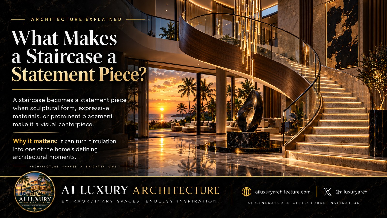
The relationship between the stair and the atrium deserves special attention. In a large central space, the staircase is rarely just a functional object. It becomes one of the most visible pieces of architecture in the room. That visibility raises the standard for proportion, detailing, and placement. A stair that is too heavy can dominate the interior. One that is too delicate can appear disconnected from the surrounding mass. The conceptual stair here uses a light-toned structure, transparent or visually open guarding, and integrated illumination. The result is intentionally sculptural, but it remains readable as circulation.
In real architecture, a spiral or helical stair requires careful technical resolution. Geometry, tread dimensions, handrails, head clearance, structural support, local building codes, and ease of use all matter. The image should therefore be read as a design direction rather than a construction solution. Its broader lesson is that a visible stair should belong to the room’s architecture. Materials, radius, balustrade treatment, and lighting should relate to the surrounding balcony and floor edges.
The balcony itself also affects the experience of the lower level. A curved gallery can make a tall room feel more embracing because the upper floor appears to wrap around the void. It can also create changing sightlines as a person moves through the space. From one point, the ceiling installation may align with the staircase. From another, the dining room might become visible. This creates a sequence rather than a single fixed composition.
However, curved architecture is most convincing when it has discipline. Complex geometry can quickly become expensive, visually busy, or difficult to furnish. One way to control it is to concentrate curves in primary elements and keep secondary surfaces quieter. For example, a home might use one sweeping mezzanine edge and a curved stair, while walls, doors, cabinetry, and flooring remain rectilinear. Another approach is to let furniture repeat the architecture subtly rather than literally.
The concept also demonstrates how curves can soften hard materials. Stone, glass, and metal can feel severe when combined in large quantities. Rounded balcony lines, circular ceiling geometry, and upholstered seating reduce that severity. This creates a useful tension between precision and comfort. The space still feels contemporary and architectural, but not brittle.
For designers, the larger takeaway is that geometry should guide behavior as well as appearance. Curves can direct circulation, frame views, encourage gathering, and make a large volume feel less institutional. When their purpose is clear, they become part of the room’s logic rather than an applied visual effect.
Designing a Vertical Focal Point With Light
In a double-height or multi-level room, the eye needs a reason to travel upward. Without a vertical focal point, the upper volume can feel detached from the living area below. In this concept, the suspended glass installation performs that role. It descends from the circular ceiling opening in a long cascade of luminous, translucent forms. The installation occupies the void without physically blocking it, giving the atrium a center that is visible from both levels.
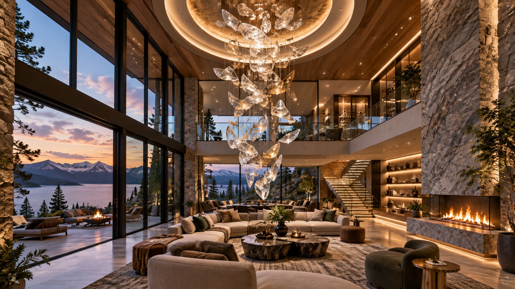
The most interesting aspect is not simply that the fixture is large. Its scale is calibrated to the height of the room. A standard chandelier placed in the same position would likely feel undersized. An excessively dense object, on the other hand, could obscure views across the atrium and make the interior feel cluttered. The conceptual installation uses repetition and transparency to create presence without becoming a solid mass.
This suggests a broader lighting principle: in large spaces, light can be used to define volume rather than merely illuminate surfaces. A pendant cluster, suspended sculpture, or linear composition can reveal the height of a room by occupying the air itself. That is different from recessed ceiling lights, which brighten the space but do not necessarily explain its dimensions.
The circular ceiling element strengthens the effect. Instead of allowing the fixture to hang from an ordinary flat plane, the ceiling geometry creates a visual frame. The concentric forms make the suspension point feel intentional and architectural. Indirect light around the perimeter adds another layer, separating the ceiling feature from the surrounding surface and making the upper volume glow softly.
This layered approach is worth studying. The image appears to combine several lighting types: concealed perimeter lighting, small recessed points, illuminated stair treads, shelving light, decorative pendants, firelight, and the main suspended installation. Each source has a different task. Some reveal architecture. Some support movement. Some add warmth at eye level. Some create atmosphere. The room feels luminous because these sources overlap, not because one fixture is doing everything.
A real atrium would benefit from the same hierarchy. Functional lighting should support safe circulation and everyday use. Accent lighting can reveal stone, artwork, plants, or shelving. Decorative lighting can provide identity. Daylight should be considered separately because it changes throughout the day and can dramatically alter the perceived color of materials. A successful scheme allows the room to work in morning light, late afternoon, and evening rather than only in a single cinematic condition.
Scale is also critical. The size of a pendant or installation should relate not only to ceiling height but to the area it visually serves. In this concept, the cascade aligns roughly with the central conversation zone. That relationship ties the distant ceiling back to the furniture below. The light is not floating arbitrarily in the void; it has an implied connection to the room’s social center.
There is also a useful lesson in restraint. Although the central installation is expressive, many other light sources are visually quiet. The recessed lights are small. The stair lighting is integrated. The shelf lighting is concealed. This allows the eye to understand what is primary and what is supporting. If every fixture were sculptural, the hierarchy would collapse.
For an actual project, maintenance would need to be considered from the beginning. Large suspended installations in tall atriums require access for cleaning, lamp replacement, inspection, and potential repair. Structural support must be coordinated with the ceiling. Glare should be controlled from upper-level viewpoints. The fixture should not obstruct circulation or create distracting reflections. These practical concerns are not visible in a conceptual image, but they are part of translating inspiration into architecture.
The enduring idea is simple: a tall room needs a strong relationship between floor and ceiling. Light is one of the most elegant ways to create that relationship. When a fixture is treated as part of the spatial composition rather than an object added at the end, it can give the entire atrium a sense of unity.
Building Quiet Luxury Through Material Restraint
The palette in this concept is intentionally narrow. Warm cream stone dominates the architectural surfaces. Soft ivory upholstery keeps the furniture close in tone. Bronze or dark metal accents appear selectively in rails, tables, lighting, and trim. Wood and greenery introduce natural warmth. The result is luxurious, but it does not rely on a large number of contrasting materials.
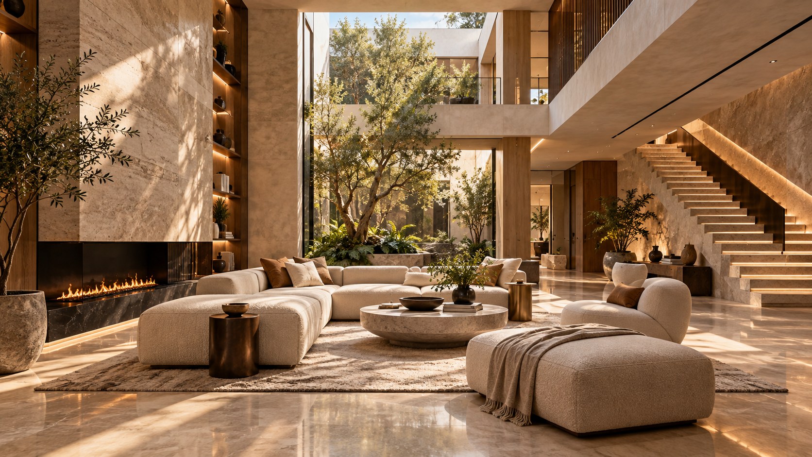
This is one of the clearest ways to understand quiet luxury in interior architecture. The effect does not come from making everything beige. It comes from controlling variation. Similar colors can still have very different textures, reflectivity, grain, and depth. Polished stone behaves differently from honed stone. Bouclé or woven upholstery absorbs light differently from smooth leather. Brushed metal catches highlights differently from mirror-polished brass. A restrained color palette can therefore feel rich when its surfaces are varied carefully.
The image illustrates this through contrast within a narrow range. The floor is glossy enough to reflect light and furniture shapes. The walls and columns appear softer and more matte. Upholstery has visible volume and softness. The fireplace opening is dark and linear, creating a strong horizontal accent. Built-in shelves introduce shadow and depth. Plants add irregular organic texture. None of these elements require a dramatic color change to distinguish themselves.
This approach can be especially effective in an atrium because large surfaces already create visual intensity. A tall stone wall, expansive floor, or sweeping balcony edge has enough presence through scale alone. Adding many competing colors or patterns can make the room feel chaotic. A restrained palette allows the geometry to remain legible.
Warmth is another important factor. Large contemporary interiors often risk feeling commercial when they rely heavily on pale stone, glass, and metal. The concept avoids that by introducing warmer undertones and softer materials. The cream surfaces lean toward sand rather than stark white. Bronze tones provide depth. Upholstery is plush. Trees and plants bring natural color. The fireplace contributes a literal source of warmth as well as a visual one.
Material continuity also helps connect levels. When the same stone or closely related finishes appear on the lower walls, upper balcony, stair, and columns, the atrium reads as one composition. This continuity is particularly valuable in spaces where many architectural elements are visible simultaneously. If every level used a different finish language, the room could feel fragmented.
At the same time, complete uniformity would be dull. Strategic contrast gives the eye places to rest. The dark fireplace, shelving niches, window frames, table bases, and certain trim elements act almost like punctuation. They outline key functions without breaking the overall calm.
For anyone developing a similar interior, it helps to think in terms of material families rather than individual products. One family might be light mineral surfaces: limestone, travertine, plaster, or stone-like finishes. Another might be warm metals: bronze, brass, or darkened champagne tones. A third could be tactile textiles in ivory, oat, camel, or soft gray. A fourth might include medium or dark wood accents. The exact selection will vary, but limiting the number of families creates coherence.
Lighting should be tested with these materials because warm neutrals can shift dramatically under different color temperatures. A stone that looks creamy in daylight may appear yellow under overly warm artificial light. A bronze finish may lose definition if everything around it has the same reflectivity. Mockups and samples are therefore important in real projects.
The concept also shows why luxury is often more persuasive when decoration is integrated into architecture. Built-in shelving, ceiling coves, stair lighting, and a linear fireplace create richness without requiring a large number of freestanding decorative objects. This gives the room a composed quality. The space feels designed at the level of walls, edges, and light, not merely styled after construction.
Ultimately, material restraint is not about minimalism for its own sake. It is about giving scale and form enough breathing room to be appreciated. In a room already defined by a soaring atrium, sweeping balcony, sculptural stair, and suspended installation, the materials do not need to shout. Their job is to support the architecture and make it feel tactile, warm, and believable.
Creating Intimacy at the Base of a Monumental Room
One of the hardest problems in a large atrium is psychological scale. People tend to feel comfortable in spaces that provide some sense of enclosure, orientation, and proximity. A room can be visually impressive yet emotionally distant if furniture floats too far apart or if every surface is many meters away. The lower lounge in this concept addresses that problem by creating a distinct social zone inside the larger volume.
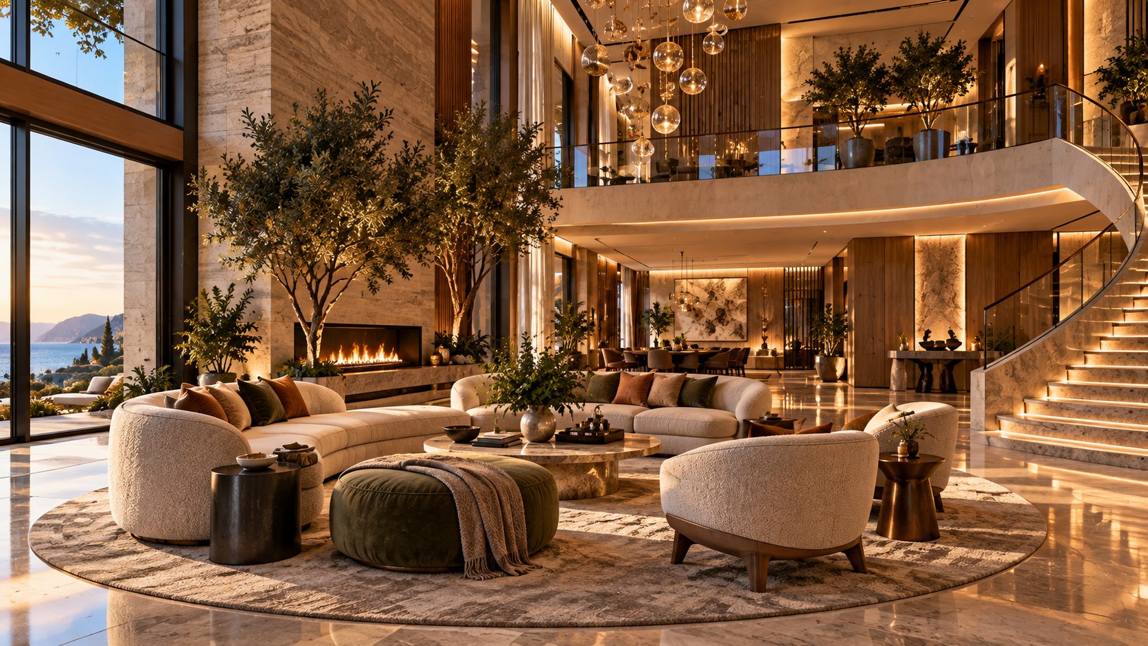
The circular rug is the first boundary. It does not physically divide the room, but it clearly marks the area where sitting and conversation happen. The curved sofas wrap around a low central table. Lounge chairs and an ottoman fill the remaining arc. Side tables bring smaller-scale surfaces close to the seating. This creates a nested composition: a human-sized circle inside a monumental architectural shell.
This strategy is useful in many large interiors. Rather than trying to furnish the entire room uniformly, designers can create islands of activity. A lounge zone might sit near a fireplace. A reading corner could occupy a window bay. A dining table might anchor the transition toward the kitchen. Circulation paths then move between these islands. The result feels more natural than filling every open area with furniture simply because space is available.
The concept also demonstrates why low furniture can work well in an atrium. Because the architecture above is so expressive, tall-backed pieces or bulky cabinetry in the center could block sightlines and compete with the vertical composition. The low sofas preserve views across the room and upward to the balcony and suspended light. Their curved shapes echo the geometry without visually closing the space.
Comfort, however, depends on more than appearance. In a real atrium, acoustics can become an important consideration because hard stone, glass, and large volumes may reflect sound. Upholstered seating, rugs, curtains, textured surfaces, books, plants, and acoustic treatments can help soften the experience. The image contains several of these visually soft elements, even though it does not provide technical information about acoustic performance. The design lesson is that a monumental room benefits from materials that absorb and diffuse as well as reflect.
The fireplace is another intimacy device. Its opening is low and horizontal, positioned close to the seating area rather than high on a distant wall. This brings focus back to eye level. Fire is naturally attention-grabbing, but here it is visually controlled by a dark linear surround. The feature adds warmth without competing with the central ceiling installation.
Indoor planting performs a similar role. The trees are tall enough to mediate between the furniture and the upper balcony. They introduce a middle scale between human height and architectural height. This is often an effective technique in large interiors. A room with only low furniture and very tall walls can feel abruptly scaled. Trees, pendant lights, tall shelving, art, or screens can create intermediate layers.
The dining area visible beyond the lounge also helps the atrium feel connected to daily life. It suggests that the central space is not isolated from the rest of the home. Instead, it participates in a sequence of social rooms. The large windows behind the dining area bring an exterior view into that sequence, extending the sense of depth.
In practical planning, circulation around the seating zone matters as much as the seating itself. A central rug should not force people to cut through conversations on the way to stairs or adjacent rooms. The concept appears to leave generous paths around the lounge, especially toward the dining area and staircase. In a real plan, these routes would need to be measured carefully to avoid conflicts between furniture, circulation, and door swings.
The broader principle is that luxury should not mean distance. Large rooms can still feel intimate when they include clear centers, comfortable proportions, layered lighting, tactile surfaces, and visual anchors at human height. The atrium may be the grandest space in the house, but its success depends on whether someone would actually choose to sit there when no guests are present.
Connecting the Atrium to Dining, Landscape, and Everyday Life
An atrium becomes more useful when it participates in the life of the home rather than acting as a sealed formal chamber. The concept suggests this through several visual connections. The lounge opens toward a dining zone. Large windows bring trees and daylight into the background. Indoor planting echoes the landscape beyond. Shelving and a fireplace give the central room functions associated with everyday living. The staircase and upper gallery connect the space to private areas above.
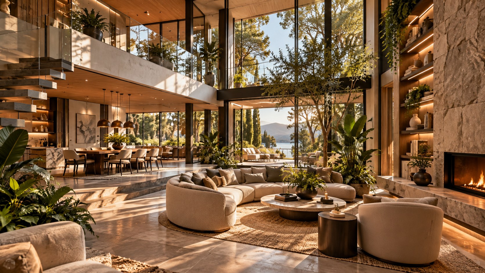
These relationships are subtle but important. If a central atrium is surrounded only by corridors and doors, it can feel like a hotel lobby. If it connects directly to rooms people use throughout the day, it becomes part of domestic life. Sightlines matter here. Being able to see the dining table from the lounge creates continuity. Being able to look down from the upper gallery can create a sense of connection between floors. Views to greenery make the room feel less enclosed despite its substantial stone surfaces.
The transition to the dining area is especially useful because it creates a change in activity without a hard boundary. The lounge is circular and relaxed. The dining zone is more linear and structured. Their furniture types differ, but the material palette remains related. This allows one space to flow into another while preserving distinct functions.
A similar approach can work elsewhere in a house. An atrium might connect a formal living room to a library, a breakfast room to a garden, or a gallery to a home office. The key is to avoid making every adjacent area visually identical. Connection does not require sameness. In fact, a sequence is more interesting when each zone has its own character while sharing enough materials, proportions, or lighting cues to feel related.
Landscape is another powerful connector. The source image uses indoor trees as part of the atrium composition, but their greatest value may be how they visually bridge inside and outside. When exterior greenery is visible through windows, interior planting can make that transition feel continuous. The eye reads a family of forms rather than a hard separation between architecture and nature.
In a real project, planting needs to be selected according to actual light levels, irrigation strategy, maintenance access, drainage, and environmental conditions. Large specimen trees require more planning than decorative potted plants. The image should therefore be interpreted as an atmosphere rather than a horticultural specification. Still, the conceptual point is strong: living elements can reduce the perceived severity of stone and glass.
Built-in shelving on the side wall provides another domestic cue. Books, objects, and softly lit niches bring detail to the human level. In a grand room, these smaller elements matter because they reward close viewing. A space should not only look good from the entry. It should continue to offer texture and interest when someone sits down or walks along the perimeter.
The fireplace works similarly. It is not only a visual feature; it suggests a mode of use. A lounge with a fireplace implies evening occupation, conversation, and seasonal change. The dining room suggests meals and gatherings. The stair suggests movement. The upper gallery suggests observation and transition. Together, these elements give the atrium a narrative of daily life.
Another lesson is that circulation can be visually generous without becoming empty. The open floor area around the seating group allows movement, but the room is still furnished with purpose. This balance is important in luxury interiors, where excessive open space can sometimes read as unfinished rather than elegant. Negative space should frame key elements and support movement, not simply advertise square footage.
The concept also raises the idea of borrowed views. From the lounge, a person can see into the dining zone and toward the landscape. From the upper balcony, the view likely includes the seating group, light installation, stair, and exterior glazing. Each position offers a layered scene. This makes movement through the home more engaging because the atrium changes depending on where it is seen from.
When planning a real atrium, designers can map these sightlines intentionally. What should be visible from the entry? What is revealed from the stairs? What does someone see from the upper corridor? Does the dining room frame a garden? Does a service door interrupt a primary view? These decisions can have a greater impact on perceived luxury than adding another expensive finish.
The atrium works best when it is woven into a network of rooms, views, and routines. Its grandeur may attract attention first, but its relationships to dining, landscape, storage, circulation, and seating determine whether it becomes a meaningful part of the home.
Translating an AI Concept Into Responsible Architectural Inspiration
AI-generated architectural imagery can be valuable because it allows design ideas to be explored quickly and visually. It can combine familiar architectural languages in unexpected ways, test atmospheres, and help people articulate preferences that might otherwise be difficult to describe. At the same time, an image is not a construction document, a code-compliant design, or proof that every visible detail can be built exactly as shown. The best way to use a concept like this atrium is therefore to extract principles rather than copy appearances literally.
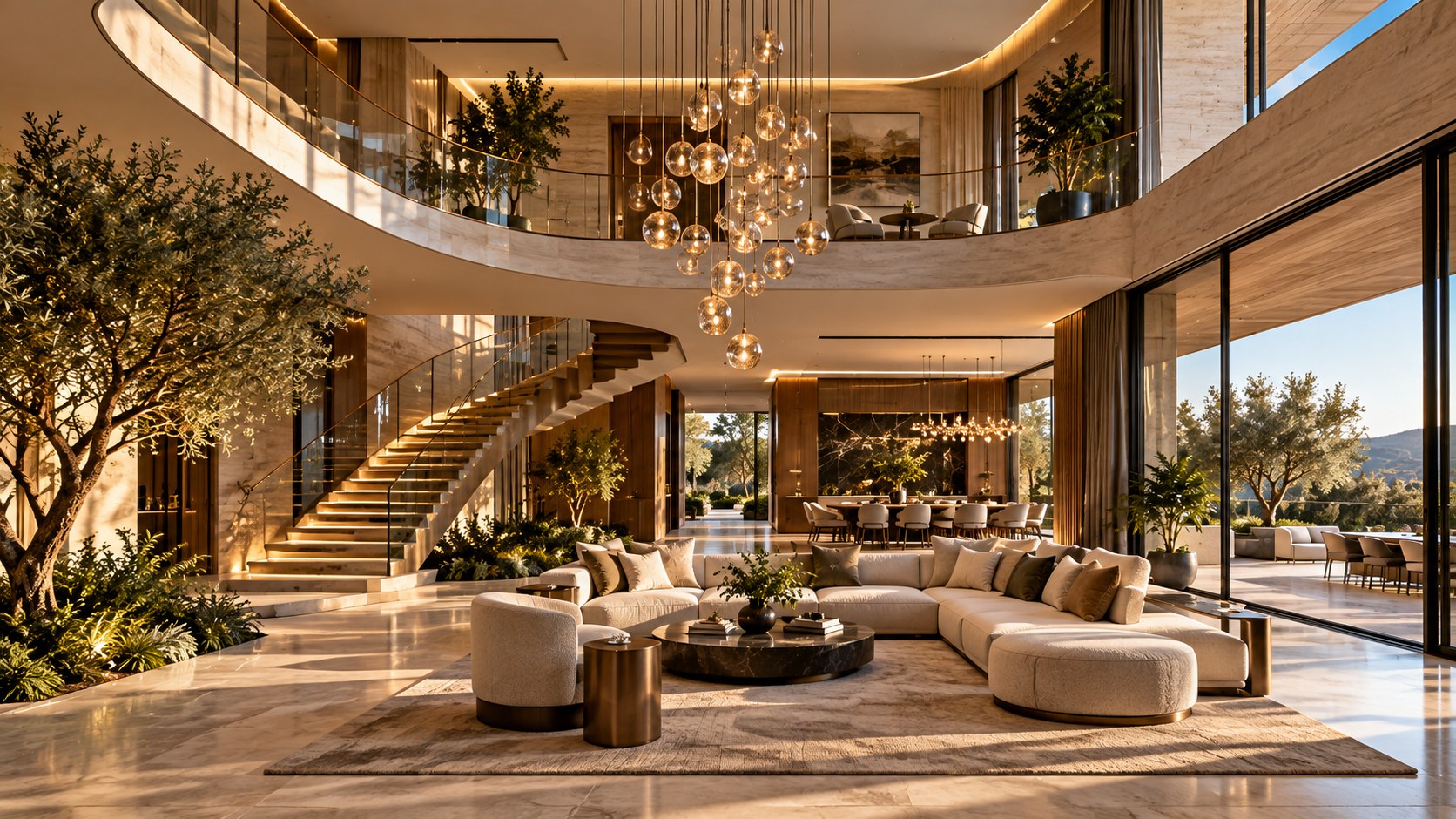
Several principles in this image are transferable. The first is spatial hierarchy: a dramatic central volume is balanced by a smaller, intimate seating zone. The second is geometric consistency: circular and curved forms repeat across ceiling, balcony, stair, rug, and furniture. The third is lighting hierarchy: one major suspended feature is supported by quieter architectural lighting. The fourth is material restraint: a narrow warm-neutral palette gains richness through texture and reflectivity. The fifth is visual connection: upper and lower floors, lounge and dining, architecture and landscape all remain related.
These ideas can be adapted to very different budgets, sizes, and architectural styles. A smaller home might use a two-story void over a compact living room rather than a vast atrium. Curves might appear only in a stair rail and ceiling detail. A sculptural pendant could replace a large custom installation. Warm plaster and timber might substitute for extensive stone. The principle of a central social zone can work in a modest plan just as well as in a grand one.
A real project would also need to resolve issues that an image can ignore. Structural systems must support balconies, stairs, ceiling features, and large openings. Guardrails must meet safety requirements. Stairs must satisfy dimensional and code constraints. Fire protection, smoke movement, and egress may be affected by multi-story openings. Mechanical systems must condition a large vertical volume efficiently. Acoustic behavior should be considered. Cleaning and maintenance access matter, especially for high-level glazing and suspended fixtures.
Material choices must also be evaluated beyond appearance. Stone weight, slip resistance, staining, sealing, thermal behavior, and installation methods can influence where and how a finish is used. Large glass panels require engineering and careful detailing. Integrated lighting needs accessible drivers and controls. Indoor trees require suitable species, soil volume, drainage, irrigation, and daylight. Furniture scale should be tested in plan and, ideally, with full-size mockups or accurate visualization.
This is where architectural professionals become essential. A concept image can help establish direction, but architects, interior designers, structural engineers, lighting designers, landscape designers, and other specialists translate that direction into something safe, functional, durable, and buildable. Their work often changes the design in ways that improve it. A stair may become less dramatic but more comfortable. A ceiling installation may shift to allow maintenance. A balcony edge may be adjusted to improve structure or sightlines. A stone finish may be replaced with a lighter material that achieves a similar visual effect.
There is also value in questioning the concept rather than accepting every element. Does the atrium need to be this tall? Would a smaller void feel more intimate? Is the central installation too dominant for a particular household? Would more color make the room feel personal? Could the dining area benefit from greater separation? Would a different stair location improve circulation? Design becomes stronger when inspiration is treated as a starting point for decisions rather than an answer.
For homeowners and design enthusiasts, one practical method is to identify the three or four characteristics that create the strongest emotional response. Perhaps it is the sense of vertical openness, the warm stone palette, the curved upper gallery, or the combination of greenery and soft lighting. Those priorities can then guide a more realistic design brief. It is rarely necessary to reproduce every visible feature to capture the atmosphere.
For professionals, AI imagery can be useful as a conversation tool when its conceptual nature is made clear. It can help clients react to scale, mood, color, or form before detailed design begins. But it should not be used to imply that an unverified structural or technical condition is feasible. Clear communication protects both the creative process and the expectations surrounding it.
The most interesting future for AI-generated architecture is not one in which images replace design expertise. It is one in which they expand the range of ideas that can be discussed. A concept like this atrium can provoke questions about proportion, circulation, materiality, lighting, and domestic comfort. Those questions are where real design work begins.
Seen in that way, the image is less a proposal for a specific house than a visual essay about what a central atrium could feel like. Its strongest contribution is the combination of grandeur and softness: a large vertical space that still tries to feel calm, warm, and inhabitable. That balance is worth studying whether the eventual project is a mansion, a townhouse, a hospitality interior, or a much smaller home with a carefully placed double-height room.
The most compelling idea in this atrium is not any single luxury feature. It is the coordination between them. The circular ceiling is echoed by the balcony. The balcony is echoed by the stair. The stair’s movement is reinforced by the suspended light. The light draws attention toward the seating area. The furniture then brings the scale back down to the human body. Stone, metal, textiles, fire, books, trees, and daylight add layers without breaking the overall calm.
That is what makes a complex interior feel coherent. Each element has a role, but no element needs to explain the room by itself. The architecture creates the framework. Lighting reveals it. Materials give it character. Furniture makes it usable. Landscape softens it. Circulation gives it life.
For anyone drawn to grand atriums, the most useful question is therefore not “How can I make this space more dramatic?” It is “How can every part of this space support the same experience?” Sometimes the answer will involve a sculptural stair or a suspended installation. Sometimes it will be much simpler: a well-proportioned void, a carefully framed view, a warm material palette, and a seating arrangement that people genuinely want to use.
This AI-generated concept is best understood in that spirit. It is not a real property, a completed commission, or a construction proposal. It is architectural inspiration: a way to explore how light, movement, scale, and quiet luxury might come together in a central interior. Its value lies in the design conversation it opens and in the principles that can be adapted, questioned, refined, and made real through thoughtful professional design.
Related Visual Inspiration
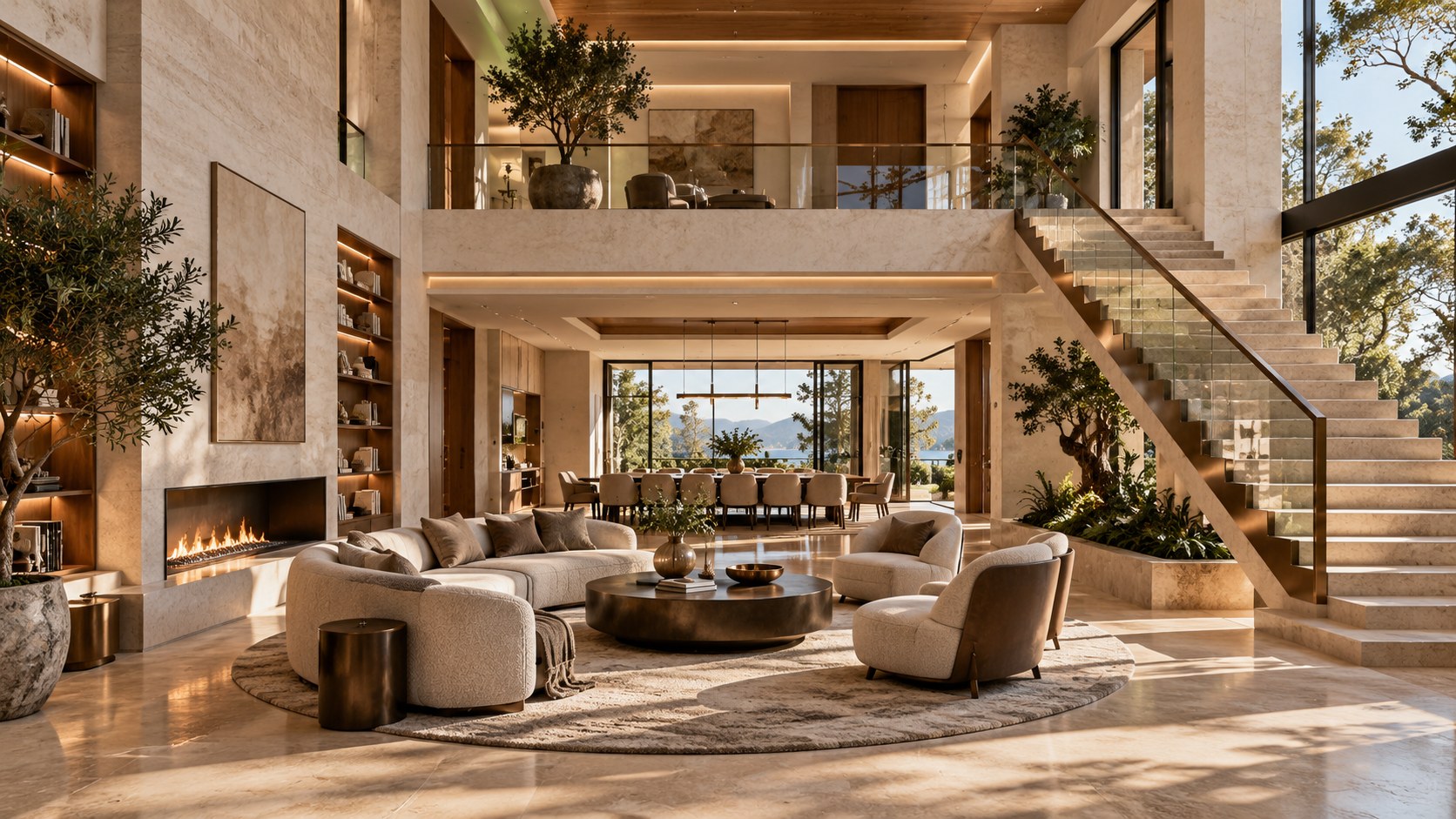
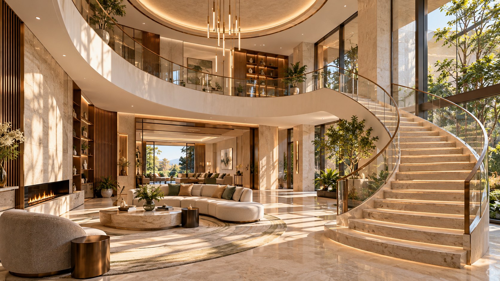
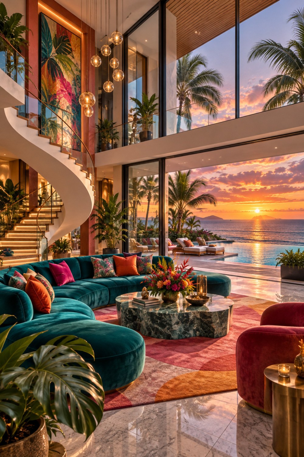
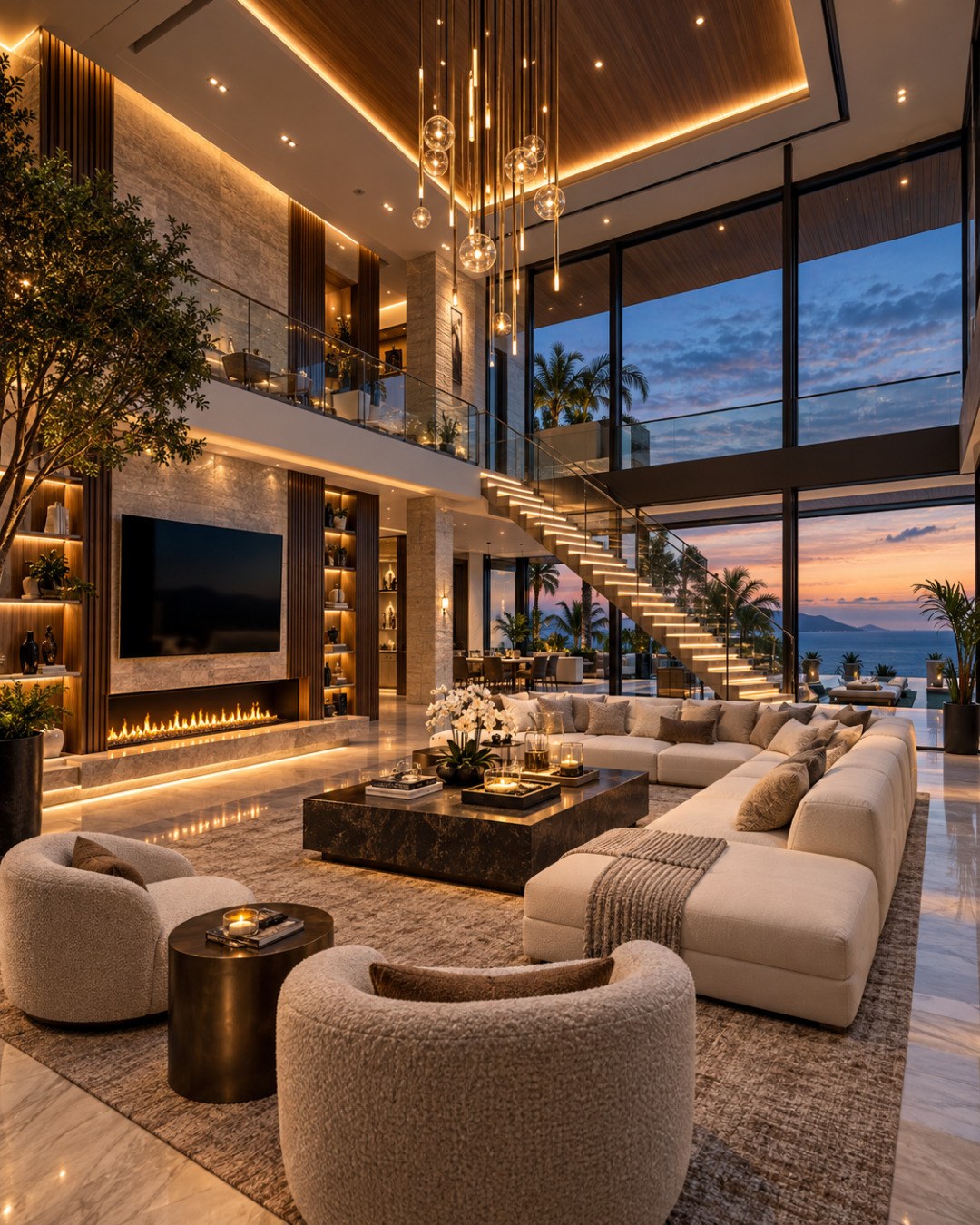
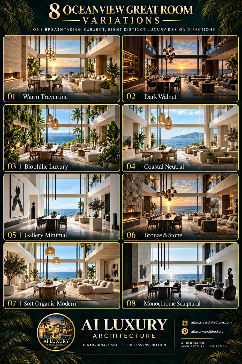
Additional AI-generated architectural studies connected to the ideas explored in this article.
AI disclosure: This article explores AI-generated architectural inspiration and conceptual design ideas. It does not describe a claimed real-world property, client, architect, or built project.